| Image |
Comment |
| 06/07/2006 09:08:52 AM |
|
 Photographer found comment helpful. Photographer found comment helpful. |
| 06/07/2006 08:20:57 AM |
|
| Photographer found comment helpful. |
| 06/07/2006 12:24:59 AM |
|
| Photographer found comment helpful. |
| 06/06/2006 04:54:51 PM |
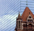
House of godby TheMegalomaniacComment by ericwoo: Hey there from the Critique Club
Camera Work/Technical: It is very difficult to determine if this image is focused or not. There is a great deal of noise in the capture, but the focus looks off to me.
Lighting: Very nice, very even lighting. Nothing is overexposed, and the shadows work nicely to provide contrast to the image.
Composition/Content: I like what you were after here. Old and new together and the tug or urban renewal v. history. I'd really like to see the rest of the church, so backing out from the tight crop would have looked a little better.
My Opinion: A nicely seen image, but the technical side needs some work. The good news is that technical aspects are the easiest to remedy. I think that this one scored pretty close to its potential.
Eric
|
| Photographer found comment helpful. |
| 06/06/2006 04:13:42 PM |
|
| Photographer found comment helpful. |
| 06/06/2006 05:06:56 AM |
|
| Photographer found comment helpful. |
| 06/05/2006 06:52:46 AM |
House of godby TheMegalomaniacComment by TheMegalomaniac: Thanks for the views and comments all .. this was my first entry and I should have been focusing on the church instead of the tower - the clouds were pretty light and I wanted to make sure they came out right.
It was a last minute submission and having never done it I didn't know how to resize and make it web viewable better - I just kept dropping jpg quality to make it smaller. Since then I've read EddyG's tutorial on this so I should do better next time Message edited by author 2006-06-05 06:55:00. |
| 06/04/2006 12:00:50 AM |
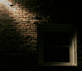
The darkness withinby TheMegalomaniacComment by Man_Called_Horse: I don't know why I like this, maybe because of it's simplicity.
I like the offset of the comp, the lighting works for me, the top of the bricks are a bit blown, and the window is dipping into the abyss, great texture, excellent movement, color a bit flat but it works, minimalistic, nice lines |
| Photographer found comment helpful. |
| 06/03/2006 08:25:58 PM |
House of godby TheMegalomaniacComment by Catherine_B: This image has a lot of noise in it, or it has been overprocessed in Photoshop. It is an interesting idea placing the old and new against each other, but the quality of the image isn't working for me. |
| Photographer found comment helpful. |
| 06/02/2006 11:52:32 PM |
|
| Photographer found comment helpful. |
Home -
Challenges -
Community -
League -
Photos -
Cameras -
Lenses -
Learn -
Prints! -
Help -
Terms of Use -
Privacy -
Top ^
DPChallenge, and website content and design, Copyright © 2001-2024 Challenging Technologies, LLC.
All digital photo copyrights belong to the photographers and may not be used without permission.
Current Server Time: 04/19/2024 06:58:21 PM EDT.