| Image |
Comment |
| 03/28/2008 03:48:35 PM |
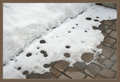
Snow Patioby BlueZamiaComment by Melethia: I think this one is a good candidate to try in B&W - puts a bit more emphasis on the design element of the circles of the drops versus the squares of the bricks. |
 Photographer found comment helpful. Photographer found comment helpful. |
| 03/28/2008 03:47:08 PM |
|
| Photographer found comment helpful. |
| 03/28/2008 03:45:37 PM |
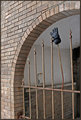
Capitalby BlueZamiaComment by Melethia: How sad to read that it's empty! Often seems that the US is overly concerned with newer! better! faster! etc, while here in Europe things continue to serve a purpose for a very long time just fine. 1922 would be new here. :-) I like the capture of the detail, to include the old style "u" in Public. |
| Photographer found comment helpful. |
| 03/28/2008 03:42:26 PM |
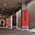
Dignityby BlueZamiaComment by Melethia: I very much agree about the human element and am glad you snapped this when you did. I remarked to someone that when I first started at DPC, I'd go out of my way to avoid having people in my shots; now it's the opposite - I will go out of my way in many cases to INCLUDE people in my shots. This shot has a very good composition with the leading lines (especially the bulbs overhead) and while a bit drab due to the day (I'm very familiar with drab!) I really like that it's in color to show off the reds of the banners. Nicely seen. |
| Photographer found comment helpful. |
| 03/26/2008 05:31:15 PM |
Capitalby BlueZamiaComment by Ken: What would a walkabout be without one of your architecture shots? Glad you included this one here. This really hints at grandness and I like just the partial words above. Hopefully we'll see more one day. |
| Photographer found comment helpful. |
| 03/26/2008 05:28:42 PM |
Dignityby BlueZamiaComment by Ken: I agree with Roger about the noise - not too bad considering where it was at. What makes this shot is the contrast created by the verticals. I wonder how this would like in B&W. |
| Photographer found comment helpful. |
| 03/26/2008 03:59:56 PM |
Snow Patioby BlueZamiaComment by cogerox: Very interesting patterns and design. Again, like how you've framed the shot with the bricks disappearing into the diagonal. Nicely seen. Could use a bit more contrast. |
| Photographer found comment helpful. |
| 03/26/2008 03:57:12 PM |
Anyone Loose a Glove?by BlueZamiaComment by cogerox: A great find for your walkabout. Interesting how the one post with the glove is bent, but none of the others are. Looks as though it's waving its glove at us. |
| Photographer found comment helpful. |
| 03/26/2008 03:55:19 PM |
Capitalby BlueZamiaComment by cogerox: Great architectural detail, and I really like how you've framed this with the bricks disappearing into the corner of the shot. The shortening of the words make them almost appear to be in Latin. |
| Photographer found comment helpful. |
| 03/26/2008 03:51:54 PM |
Dignityby BlueZamiaComment by cogerox: I think the shot works well with the distant walker, and doesn't seem overly grainy due to the high iso. My eye wants to work in two directions - down the signs to the man, or to the man first and back up the signs. Works well either way. |
| Photographer found comment helpful. |
Home -
Challenges -
Community -
League -
Photos -
Cameras -
Lenses -
Learn -
Prints! -
Help -
Terms of Use -
Privacy -
Top ^
DPChallenge, and website content and design, Copyright © 2001-2024 Challenging Technologies, LLC.
All digital photo copyrights belong to the photographers and may not be used without permission.
Current Server Time: 04/24/2024 02:05:14 PM EDT.