|
|
| Image |
Comment |
| 06/03/2007 05:32:29 PM | |  Photographer found comment helpful. Photographer found comment helpful. |
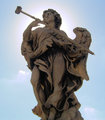
| 06/03/2007 12:12:04 AM | Hiding from the Sun.JPGby TemperpolkComment by dr rick: Actually, I'm guessing the excessive noise here comes from lightening the statue, which I imagine was very dark due to the bright backlighting. One way to avoid this is to use a fill-in flash to make the statue light enough to begin with, but that would also change the shadows considerably, and I do like them the way they are here. (And if this is far away, like on a rooftop, the flash probably wouldn't reach.) A more complex alternative is to use a tripod and take multiple exposures, one with the background exposed properly (but the statue too dark) and one with the statue exposed well (but the background burned out), then combine these in Photoshop to get the best of both. | | Photographer found comment helpful. |
| 06/02/2007 10:44:55 PM | | | Photographer found comment helpful. |
| 06/02/2007 04:29:41 AM | Hiding from the Sun.JPGby TemperpolkComment by taterbug: I like the halo effect. But yeah, seems kind of noisy. Are you shooting at a high ISO? Although it will help get a fast shutter speed, a high ISO will cause noise the more you amp it up. | | Photographer found comment helpful. |
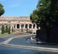
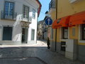
| 06/02/2007 04:26:28 AM | Tower.JPGby TemperpolkComment by taterbug: Yes, this show's a good eye. A tough exposure, dark in the alley, and bright out around the tower, the sky ended up blown out. This looks like another case where shooting at a different time of day could make a difference. Mid day with bright, harsh, overhead direct light is normally not great for photography :-) | | Photographer found comment helpful. |
| 06/02/2007 04:21:59 AM | red.JPGby TemperpolkComment by taterbug: Yep, totally oof, blown highlights, and a very distracting and unflattering background :-) | | Photographer found comment helpful. |
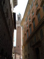
| 06/02/2007 04:18:19 AM | Florence.JPGby TemperpolkComment by taterbug: This is a nice scene. The buildings make for a nice line across the image. That line seems pretty centered though. Sometimes centered works, but as a rule, you want horizons, or lines like that away from the center. this is another case where even a minimal amount of editing could make a difference. I did a real quick 'edit' to this, hope you don't mind, to show what I mean.

just a quick rotate, crop, some levels and curves and NI and smart sharpen. | | Photographer found comment helpful. |
| 06/02/2007 03:42:43 AM | Blush.JPGby TemperpolkComment by taterbug: Yeah, lighting seems kind of flat. Might want to try shooting at different times of day. Try catching some angled early or late light, and see how it can add depth and texture to a shot. A beautiful subject, good for experimenting with :-) |
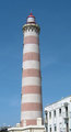
| 06/02/2007 03:38:52 AM | Farol.jpgby TemperpolkComment by taterbug: Looks like lots of noise in this one. A lot of blue can do that :-) It would help to know your settings. Did you shoot with a high ISO? I think this is a case where it is hard to get a good shot with a plain, featureless sky. Also, looks kind of snapshottish with the cut off buildings and stuff. If you look at cool light house images, they normally include some of the surrounding scenery. | | Photographer found comment helpful. |
| 06/02/2007 03:32:02 AM | Agueda.jpgby TemperpolkComment by taterbug: It does seem to have a tilt :-) Not enough to seem purposeful, or 'artistic', but definitely noticeable. Yeah, it is a nice scene, but just doesn't really strongly stand out and peak one's interest. One thing I'd like to point out, that really doesn't help for this specific photo, but in the future, you've caught that person walking up the street, try taking a couple more shots, see if you can catch them in different positions, maybe something would stand out more, like if they had taken a few more steps, and were into the bright area, they might be more prominent and add some interest factor.
edit to add- about the tilt, that is something that in this case, could be fixed in the edit. There looks like there is plenty of room here, you could rotate and crop to straighten up. Message edited by author 2007-06-02 03:33:30. | | Photographer found comment helpful. |
Home -
Challenges -
Community -
League -
Photos -
Cameras -
Lenses -
Learn -
Prints! -
Help -
Terms of Use -
Privacy -
Top ^
DPChallenge, and website content and design, Copyright © 2001-2024 Challenging Technologies, LLC.
All digital photo copyrights belong to the photographers and may not be used without permission.
Current Server Time: 04/20/2024 12:59:11 AM EDT.
|