| Image |
Comment |
| 05/22/2003 02:41:44 AM |
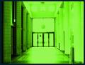
The Portalby bil99Comment by shadow: i like the stuff on the left, but those on the right are over-exposed until they are almost... flat. |
 Photographer found comment helpful. Photographer found comment helpful. |
| 02/24/2003 11:29:34 AM |
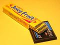
Compact Flashby bil99Comment by jenarom: It's a shame that you did not score higher. From the comments, I guess that people didn't get it.
BTW, I feel flattered that someone would parody a picture of mine. Hehe! You did great!
|
| Photographer found comment helpful. |
| 02/23/2003 12:04:35 AM |
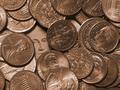
Untitled Iby bil99Comment by karmat: CRITIQUE CLUB CRITIQUE
by karmat
COMPOSITION
I feel that the composition of this is very strong. You have chosen a good subject, and have concealed your "Waldo" well. Though it is visible, it does take the viewer a moment to "see" it. I also think the tight crop, having the coins "spill" out is also very effective, and adds to the interest of the picture. I think George needs to be lower in the frame though. Right now, his center position (even though he is on the left third) makes it appear a bit static. Lowering, or raising may help that. Also, did you try it with all "heads" up or all "tails" up instead of heads and tails? That may have helped to tie your entire composition together better
TECHNIQUE
Great focus and lighting, the detail of the coins is very crisp and clear, and they are shiny without having distracting glare spots all over the place. The coloring of this is very warm, and it is interesting how all of the coins ended up being the same color. It took a second for me to realize they weren't all dimes!
OVERALL EFFECT
Very nice, indeed. You have met the challenge, and met it well, I think. Overall, a good picture. |
| Photographer found comment helpful. |
| 02/20/2003 10:27:24 PM |
Compact Flashby bil99Comment by jenarom: Hi! I don't know if this is pure coincidende or not, but your picture clearly resembles one that I shot for the Technology challenge last year.
Take a look at it here: //www.dpchallenge.com/image.php?IMAGE_ID=8647
But, it you've already seen mine, well, I can tell you that you did a better job in keeping the original colos in the picture and softer lighting. Mine, was in fact, shot at the last minute and didn't have the time to correct the color on the memory stick. I like better the idea with a Sony Memory Stick in the package, but you put a Compact Flash card for your own personal take on this. Nice!
It's a shame that Wrigley decided to modernize their design of the logo for the chewing gum. The older design had lasted generations, and that's why I selected that brand for my picture, because that package is almost recognizable everywhere. The whole idea was that Sony designed their memory cards resembling gum sticks, and the shot I took was the impression I got when I first saw a Memory Stick.
It feels kinda weird of looking at someone else's picture and see that it resembles one of your own. Its a very nice shot that you took! Good luck in the challenge. Can't wait to view the results. |
| Photographer found comment helpful. |
| 02/16/2003 06:22:51 PM |
Untitled Iby bil99Comment by PTLParsons: I hadte to be the one to bring bad knews to you - some of your money is counterfit. The dimes are not silver, they are made of the same material as your pennies. Opps so are your nickles. Better take them back to the bank. While you are there collect your prize for a fantastic photo of hiding Waldo. Great one - photo and hiding Waldo. Good job. |
| Photographer found comment helpful. |
| 02/16/2003 07:33:35 AM |
|
| Photographer found comment helpful. |
| 02/15/2003 11:59:32 PM |
|
| Photographer found comment helpful. |
| 02/14/2003 08:01:14 AM |
Untitled Iby bil99Comment by Harz_Joerg: I like it, One of the few submissions with something to search and find (although it's pretty easy). Like the color, light and reflection. You might have covered the dollar-bill even more. Good luck! |
| Photographer found comment helpful. |
| 02/14/2003 07:26:59 AM |
Untitled Iby bil99Comment by W.R.Miller: I really like this picture. But, I would have turned all of the coins upside down so that their back side was facing up so that there was only one person in the photo (George). None the less, I like it. |
| Photographer found comment helpful. |
| 02/14/2003 04:37:55 AM |
Untitled Iby bil99Comment by kiwiness: Nice idea, certainly different to all the other photos I have seen. The sepia effect works well here. Good one. |
| Photographer found comment helpful. |
Home -
Challenges -
Community -
League -
Photos -
Cameras -
Lenses -
Learn -
Prints! -
Help -
Terms of Use -
Privacy -
Top ^
DPChallenge, and website content and design, Copyright © 2001-2024 Challenging Technologies, LLC.
All digital photo copyrights belong to the photographers and may not be used without permission.
Current Server Time: 04/25/2024 08:31:12 AM EDT.