|
|
Comments Received by bil99
|
Showing 111 - 120 of ~195 |
| Image |
Comment |
| 06/18/2003 04:35:21 AM | Despondencyby bil99Comment by gaja_tz: IMO it is too dark and your eyes with the white points on it does look OK and this type of shot. |  Photographer found comment helpful. Photographer found comment helpful. |
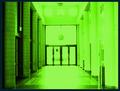
| 06/03/2003 08:49:59 PM | The Portalby bil99Comment by mcrochip: *Critique Club*
FIRST IMPRESSION: Green. Very, very green. Quite bright, and I knew before I even saw the challenge title that this is for "The Matrix" challenge.
CHALLENGE: Given that, it meets the challenge quite well. I can envision the scene from the movie that this shot may be based upon.
COMPOSITION: Framed OK, maybe a little high at the top. The door position within the frame works well, as does the tunnelling effect of looking down the hallway.
TECHNICAL: Seems a good bit blown out on the right side, and through the doors. Because of this overexposure, the floor is washed out, and the contrast between light and dark on the two sides of the photograph is too pronounced.
CONCLUSION: A good interpretation of the challenge, with some technical issues that detracted from the shot. The color adjustments you did to make it green may have been a bit better with a slightly darker color, given the overly bright side of the photo.
Thanks for sharing and good luck in future challenges! | | Photographer found comment helpful. |
| 05/28/2003 07:22:38 AM | |
| 05/27/2003 02:22:09 PM | |
| 05/25/2003 09:08:54 PM | | | Photographer found comment helpful. |
| 05/22/2003 02:41:44 AM | The Portalby bil99Comment by shadow: i like the stuff on the left, but those on the right are over-exposed until they are almost... flat. | | Photographer found comment helpful. |
| 05/21/2003 08:15:37 AM | |
| 02/24/2003 11:29:34 AM | Compact Flashby bil99Comment by jenarom: It's a shame that you did not score higher. From the comments, I guess that people didn't get it.
BTW, I feel flattered that someone would parody a picture of mine. Hehe! You did great!
| | Photographer found comment helpful. |
| 02/23/2003 02:34:57 PM | Compact Flashby bil99Comment by Kavey: Not sure what the CF card is doing in the frame... I must be missing something?
I would have scored this 6 or 7 without the CF card.
5, Kavey |
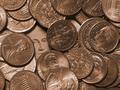
| 02/23/2003 12:04:35 AM | Untitled Iby bil99Comment by karmat: CRITIQUE CLUB CRITIQUE
by karmat
COMPOSITION
I feel that the composition of this is very strong. You have chosen a good subject, and have concealed your "Waldo" well. Though it is visible, it does take the viewer a moment to "see" it. I also think the tight crop, having the coins "spill" out is also very effective, and adds to the interest of the picture. I think George needs to be lower in the frame though. Right now, his center position (even though he is on the left third) makes it appear a bit static. Lowering, or raising may help that. Also, did you try it with all "heads" up or all "tails" up instead of heads and tails? That may have helped to tie your entire composition together better
TECHNIQUE
Great focus and lighting, the detail of the coins is very crisp and clear, and they are shiny without having distracting glare spots all over the place. The coloring of this is very warm, and it is interesting how all of the coins ended up being the same color. It took a second for me to realize they weren't all dimes!
OVERALL EFFECT
Very nice, indeed. You have met the challenge, and met it well, I think. Overall, a good picture. | | Photographer found comment helpful. |
|
Showing 111 - 120 of ~195 |
Home -
Challenges -
Community -
League -
Photos -
Cameras -
Lenses -
Learn -
Prints! -
Help -
Terms of Use -
Privacy -
Top ^
DPChallenge, and website content and design, Copyright © 2001-2024 Challenging Technologies, LLC.
All digital photo copyrights belong to the photographers and may not be used without permission.
Current Server Time: 04/25/2024 03:47:16 AM EDT.
|