LadyHeartby
WarpComment by karmat: CRITIQUE CLUB CRITIQUE
by karmat
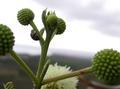
My very first impression of this shot was, "Not bad, but I though flora was over." Then, I saw the ladybug. So, on with the critique.
I think the depth of fied used here is awesome!! I like how the foreground is out of focus, the background is out of focus, but the middle buds and bug are in focus. Very nicely done, and effective, I think. The location of the stem with the ladybug on it also gives it a well-balanced feeling by not being directly in the middle, and the vertical "shoot" of the stem helps to lead the eyes from the bottom towards the top of the frame.
The colors here are simple, but fairly nice. The white sky, normally, would be detracting, but with the nice green of the plants it works okay, I think. (A blue sky would be nice too, though.) I do think, like many of your commenters, that the picture would be much more effective if the bug was colorful. He/she (whatever it is) looks muted gray to me, so it does blend into the background and doesn't seem to be the main focus of your shot, but rather a subsidiary part of it. If the thing had any color at all, it may have helped to desaturate everything but it in post processing. Since it isn't immediately noticeable, many voters don't or can't take a lot of time to vote, and they may not have seen it, and just assumed it didn't meet the challenge. That is unfortunate because it really is a nice shot.
Best to you in future challenges.