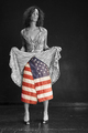
kisha showing her patriotic sideby
weiszComment by klstover: Hmm. This is an interesting image for me. My first thought was that the flag shouldn't be used like that. I know people do stuff like that all the time but it still kind of gets to me. However!! I'm putting that completely aside because that really doesn't have to do with your photo. I mean yeah, it's possible to present something in a way that is more offensive and maybe worthy of a score drop, but this is not it. So. On to the actual photo.
The first thing that jumps out at me about the image itself is that there is color. But I think that you used it well. This still fits the "B&W portrait" idea for me. Plus, there really seems like there is a good visual reason to have the selective desat (as opposed to a couple other images I have seen in this challenge where it seemed a bit to me like the color was in there "just because").
Tones are good, I like the composition a lot - the negative space seems to be just the right amount, and positioned in the right place. Everything is nicely lined up (the lines of the floor and the wall are very balanced / symmetrical). The wall and floor give the model a good context to be in - I would not have liked this image as much if it had been like some of the studio shots you see with a pure white or black background where it looks like the subject is floating. The pose is good. The way that she is standing, tilting her head, the expression on her face.. everything just works together very well I think. Even the irregularities on the floor and the spots on the wall add to the image for me.
The only negative thing I have to say is that I feel that the title does not have as much of an impact as would fit an image of this calibur.
I really feel like this is one of those images that I come across on DPC periodically - one that deserves to be in a news magazine's "photos of the year" edition. Congrats on a wonderful photo and good luck in the challenge.