| Image |
Comment |
| 05/10/2006 01:11:01 AM |
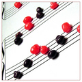
Band Nerdsby RebeccaComment by ladyhawk22: When I saw this photo I laughed out loud!!! Being a "band nerd" myself, I thought it was great! Pretty decent placement and score too! |
 Photographer found comment helpful. Photographer found comment helpful. |
| 05/09/2006 04:18:53 PM |
|
| Photographer found comment helpful. |
| 05/09/2006 04:04:45 PM |
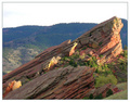
Backlit Under Cloudsby RebeccaComment by Oddfrog: Hi from the CTP2 club!!
I wouldn't have centered this pic.
The focus is good except for the front rock (But I personaly struggle with focus)
The border is a bit distracting.
I like the lighting, it reminds me when I used to hike with my parents:)
The best of luck for the future:) |
| Photographer found comment helpful. |
| 05/09/2006 02:20:25 PM |
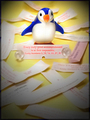
"Determined Penguin Caper"by RebeccaComment by UNTITLED: Cute photo, the dodge/burn treatment really focuses the attention on the subject, but seems a little extreme in the corners. Doesn't transition smoothly, might be a better way to say it. The composition and arrangement are good also. |
| Photographer found comment helpful. |
| 05/08/2006 08:46:11 PM |
Backlit Under Cloudsby RebeccaComment by Gunnsi: Comment from a member of your own commenting club :-)
This is a picture showing a stone in front of a hill far away.
Although it is a beautiful stone it is not something that makes you want to see it again. Maybe an animal or a person in front of it or on top of it would make a big different.
What is good?:
1. Good use of rule of thirds.
2. Leading lines make you look at all the picture.
3. Colours are good.
4. Focus is good.
5. Frame colour/darkness fits the picture well.
What could be better?:
1. The sky, like in many of my own pictures is blown, probably not because of wrong adjustments but just because it is like that when you take the picture.
2. Wait for a better day to take pictures :-)
Hope this helps!
Edited: Deleted an empty line Message edited by author 2006-05-10 20:26:47. |
| Photographer found comment helpful. |
| 05/08/2006 02:06:10 PM |
Backlit Under Cloudsby RebeccaComment by xianart: hiya from the ctp2!
First Impression:
nice. a good starting point of an image, but... it could be much much more.
Composition:
very good composition. the angle of the rock formations works well, as wel as the slightly anthropomorphic face at the peak.
Technical:
all fine, but, again, i want more! ;-) if the saturation were up, the rocks would pop - the reds and yellows would glow. the atmospheric perspectve works quite well, but more contrast and darker for the background hills would really bring the rocks out.
the sky is very bright, and brings the viewers focus away from the rocks to...white. i can see a tiny bit of detail in the sky, again, more showing would be great. either really bumping it and turning it into a threatening sky, or just enough to focus on the rocks.
if the foreground grass were burned a bit, this would draw the viewer's gaze in more. again, the whole thing should be more saturated. redder reds, greener greens.
Summary:
a nice image with the potential to be much, much more. Message edited by author 2006-05-10 19:01:04. |
| Photographer found comment helpful. |
| 05/08/2006 02:49:28 AM |
Backlit Under Cloudsby RebeccaComment by yanko: Greetings from your own critique club.
First Impression:
Lacks contrast. That's probably more to do with staring at so many DPC images that push that to the max however. If that wasn't the case I might have been attracted to the framing of this more so.
Composition:
Speaking of framing I like this the most in your photo. The horizon isn't in the middle which is good and the main focus, the top of the rock is located in the "rule of thirds" area. I don't think there is anything I would change in the way you composed this shot.
Subject:
Is interesting. Good texture although I probably would have sharpened it or boosted the contrast a tad more. However, I may not be the best judge for this since I'm often accused of doing that too much to my images. :)
Technical (Colour and light):
A bit overexposed and there's a haze in there that saps the color somewhat. Also, it would have been better if you managed to get more light raked over the bottom part of the rocks like how the top part is. However, that may have been impossible given the environment or timing of this shot.
Improvement:
Really just remove the haze and boost contrast a bit. If you us photoshop I suggest using the unsharp mask tool which can help with both. If you are unfamilar with using that tool for that purpose here is a link that explains it. Also, I might add if you want to appeal more to the DPC voters I'd also suggest boost the saturation. In a lot of images I've seen do well the "wow" factor is carried or supported heavily by bright bold colors. However, that's something for you to decide if you want to cater to that. The image in my opinion doesn't need it but that's just me.
Summary:
A good image. Looking at the voting pattern of this photo it seems to me that even the slightest of tweaks (like the contrast/haze adjustment) could have really helped the score by turning those 4 votes into 5s and 6s. When it comes to these challenges that's all you're really trying to do (i.e. minimize the low votes). Anyway, I hope this critique is helpful and didn't come off as harsh. If you have any questions feel free to email or PM me. I look forward to seeing more of your work! |
| Photographer found comment helpful. |
| 05/08/2006 01:14:46 AM |
Backlit Under Cloudsby RebeccaComment by margiemu: This isn't as good as some of your other shots, but it's not bad.
The lighting on the rock in the forground is actually really cool, and I like the way the greenery in the cracks contrasts with the red. What holds this back, I think, is the background. It seems over exposed, and just sort of 'blah'. It does make a nice contrast to the foreground though. Maybe if you could have arranged for some blue sky that day Ü. |
| Photographer found comment helpful. |
| 05/07/2006 05:53:22 PM |
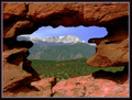
Pikes Peak framed by a natural window - (using Wikipedia's def. of window - check it out)by RebeccaComment by DigiFotoBuddy: Greetings from your own critique club.
First Impression
Very Nice shot.
Composition:
Very good composition.
Subject:
I really like the subject. Nice take on the challenge.
Technical (Colour and light):
The color and lighting in the front is perfect, but needs to be bumped little bit in the backgroud.
Improvement:
Color saturation in the background, contrast and lighting. Some voters on DPC are very strict about meeting the challenge. Tha challenge said Window like a building window, just wondering that may be the this didn't finish higher.
Summary:
Little bit more PP, try to please majority of voters by meeting the challenge criteria.
Over all very nice image. Congrates on your Personal Best. Message edited by author 2006-05-07 17:54:17. |
| Photographer found comment helpful. |
| 05/07/2006 11:13:29 AM |
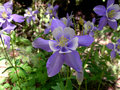
The Welcoming Committeeby RebeccaComment by smilebig4me1x: since Im such a flower nut myself i thought i would return your comment on one of your flower shots. you have a great work posted here.
I love the subject you chose here. for me it has alot of interest plus its my fav color(besides pink). good focus and great color saturation. one thing i think i would do is crop off the left of the photo. the bright flower there only pulls the eye away from your main subject. Just by doing that it will make this wonderful photo fall right into the "rule of thirds" i think. I like the the flower on the right too as it gives a different view of the same flower and for me it adds even more interest to the main one. very well done here...keep up the great work
~~Cher~~ :o) |
| Photographer found comment helpful. |
Home -
Challenges -
Community -
League -
Photos -
Cameras -
Lenses -
Learn -
Prints! -
Help -
Terms of Use -
Privacy -
Top ^
DPChallenge, and website content and design, Copyright © 2001-2024 Challenging Technologies, LLC.
All digital photo copyrights belong to the photographers and may not be used without permission.
Current Server Time: 04/18/2024 11:36:52 PM EDT.