| Image |
Comment |
| 05/18/2006 12:35:54 AM |
|
| 05/17/2006 04:53:08 PM |
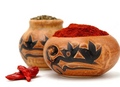
Add a little spiceby BlindBatComment by madcrabber: did you try this without the pot in the background? It distracts a bit for me from the one in the foreground. Also, the foreground pot is toughing the edge of the image, it would be nice if it were entirely in the frame of the image. Great clarity, saturation and clarity on the foreground are its strentghs, the distractions are minor but would score higher for me. keep it up.-8- |
| 05/17/2006 02:11:32 PM |
|
| 05/17/2006 11:19:08 AM |
|
| 05/05/2006 04:33:23 AM |
|
| 05/04/2006 08:28:08 PM |
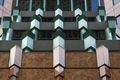
facadeby BlindBatComment by rkligman: Nice find. Very symetrical. Next time make the image the full size it can be. - 6 |
| 05/04/2006 06:51:18 AM |
facadeby BlindBatComment by Tim: good composition but you lose marks for not using the full 640 pixel allowance |
| 05/03/2006 12:25:09 PM |
|
| 04/25/2006 03:22:03 PM |
|
| 04/25/2006 08:59:45 AM |
|
Home -
Challenges -
Community -
League -
Photos -
Cameras -
Lenses -
Learn -
Prints! -
Help -
Terms of Use -
Privacy -
Top ^
DPChallenge, and website content and design, Copyright © 2001-2024 Challenging Technologies, LLC.
All digital photo copyrights belong to the photographers and may not be used without permission.
Current Server Time: 04/24/2024 07:55:15 PM EDT.