| Image |
Comment |
| 05/15/2006 01:21:44 PM |
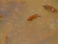
Dirty Pond Crisis (A documentary on the effects of water pollution on fish)by KelliComment: Trading POst -
Hmmmmm. I guess congrats on the brown. To be honest I don't think this was the worst shot inthe challenge. The worst was (deleted title). But I will admit this wasn't that great. The water definitley looks polluted, but the fishies seem to be hanging in well. The fish arent really in nice positions in the frame. The color is blah ( I know - it is supposed to be brown). THere just wasnt much to make me want to look at it for any longer than it took me to find a number to vote it. Hope that isnt too harsh. But again - you ahve a brown - and thats better than a DQ. Hang in there - it can only get better. |
 Photographer found comment helpful. Photographer found comment helpful. |
| 05/15/2006 12:11:01 AM |
|
| 05/14/2006 10:24:37 PM |
levelsby dockieComment: Greetings from the Critique Club -
At first glance I had a hrad time figuring out what I was looking at. Upon realizing what it is I see that you have a cool angle on this stairwell. The rotation works really well to make me wonder.
Beyond that I think my biggest issue with this shot is the focus. This may be a result of the image not being the maximum size the site allows. A loss of 160 pixels can make a huge difference on the focus of the shot. THere is a tutorial somewhere on this site on how to Save for Web that would give you thebest bang per buck on pixels for challenge entries.
Your lines, lighting and shadows all work good on this shot. The geometric perspective is cool and fits the challenge. Either more crop on the right or less on theleft would have brought the shot more into balance. Abit too much dead space on the right compared to the left.
Hope these help. Congrats ona personal best and I hope you see many more.
Tim |
| Photographer found comment helpful. |
| 05/14/2006 10:12:33 PM |
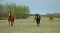
Thundering Hoovesby shphotographyComment: Greetings from the Critique Club -
I will begin by saying that you have some beautiful scenery to be working with up there. Unfortunately there are some issues with this shot.
First off - the shot is soft overall. A sharper focus on a horse would have been nice. I realize they are all running but separation between the middle two would have been good as well. If you were able to find them spaced in a more balanced way the shot would have been more effective. The colors are a bit flat as well. Upping saturation on blues and greens may have increased the background colors without affecting the colors on the horses much at all.
As far as meeting the challenge it may have been a bit of a stretch in my opinion. A side angle on the horses allowing you to se ethe hooves more may have brought it closer.
Looking at your portfolio you have some very nice shots. The man and horse series are beautiful. It can be hard shooting for challenges especially in basic editing mode. Keep going at it and your scores will go up as you grow and learn.
Tim |
| Photographer found comment helpful. |
| 05/12/2006 03:17:16 PM |
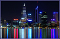
Reflectionsby QikiComment: Greetings from the Critique CLub -
Now this is one cool shot. I have no personal experience with long shutter speeds so from that technical point of view I cant make anyt serious comments outside of the fact that whatever you did worked really well. The lines in the reflection are pretty wild.
Your detail and focus on the cityscape is very nice. A part of me thinks that it might be just a tad bit better had you cropped a little more on the left hand side or had some extra space on the right. It feels a bit off balance with the building on the far right and nothing on the left to counter it. But overall this is just nitpicking on my part - I think you have a tremendous shot and so did the DPC audience.
Well done and congrats on your top 20 placement.
Tim |
| Photographer found comment helpful. |
| 05/12/2006 03:09:39 PM |
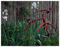
Days Gone Byby msdoubletroubleComment: Greetings from the Critique CLub -
I think you have an interesting main subject. The tricycle has some good character to it. Unfortunately it seems lost among the irises. I think that a closer cro on the left to get rid of the flowers would have helped bring the focus to the trike. Maybe even a higher angle for the shot instead of looking straight on would have helped as well. I want to see the trike more so than the flowers or the greenery.
From a focus/sharpness point of view there seems to be something funky going on. The picture overall has an odd texture to it (if that makes any sense). Even the blurred background feels off but I dont know why. A slight bump up in saturation, especially on the trike would have been nice I think. Even a bit more on the green as most of the colors seem a bit flat. More light may have taken care of this as well.
THere are alot of different textures, lines and shapes going on. I think the composition is just a bit too busy. Isolating the trike more would have given you a higher score I believe.
You have some nice work in your portfolio and I look froward to seein gmore of your entries inthe future.
Tim |
| Photographer found comment helpful. |
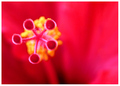
| 05/12/2006 02:30:19 PM |
Fuzzy Fiveby sammigurlComment: Greetings from the Critique Club -
You have a very interesting pic here. At first I wasn't sure what it was but that didnt really matter to me. This has a funky feel to it and works pretty good as a macro shot.
The colors are wild and I think they work well with the composition. THey attack the eyes when you open it up and thats ok. I think my biggest issue with this overall is the focus on the fuzzy five and the yellow inderneath. A crisper focus I believe would have helped them to stand out better. Maybe even a slight desat on the background to give a little bit more separation on the main subject and its background. It just seems a bit too blurry for me. Possibly a little bit of burning to bring out the shadow lines in the background may have been nice as well. Increase the BG texture without really adding any major detail.
The off cenetered position works really well IMO. And the shapes of the flower are very cool. Overall you have a nice shot here. I think some slight changes in postprocessing could have raised your score up a bit more.
Looking at your portfolio I can comfortably say that you have alot of potential here and I really look forward to seeing your future work.
Tim |
| Photographer found comment helpful. |
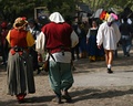
| 05/12/2006 09:15:42 AM |
Forget Something?by ecdillonComment: Greetings from the Critique Club -
Let me begin first by saying "lol". I have been to many Renaissance fests and don't remember ever seeing something like this.
Now on to the comments. I think that the front two characters draw away from the one I belive you want to be the focus. At first reading the title my eyes go right to the front two and then I wonder how they correlate. It makes sense once I see the third character but he is secondary. I think if you had made the pantsless man a layer and everything else a layer, dropped the saturation on the everything else layer and kept the colors and sharpness on pantsless man the shot would have been different. It would have put the focus on the person you wanted. The front two people just dont seem to have anything to do with the other and thus takes away from the impact of no pants.
Beyond that - your layer work looks pretty good. The blur and desat is a good balance to the main characters. Its not painfully obvious that you did this work. Its just enough. The focus could have been a bit sharper on pantsless man. I think your score suffered because of the composition and the candid feel. Its too much of a snapshot to really do well in a Free Study. I do expect that most everyone who looked at this got a chuckle, which may have been your primary goal. Success comes in many forms. Goo dluck in your future entries.
Tim |
| Photographer found comment helpful. |
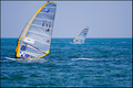
| 05/12/2006 09:00:09 AM |
E-71 wins again the World Championship of Windsurfby alexgarciaComment: Greetings from the Critique Club -
I like many aspects of this shot. The front board is in great focus along with the water trail behind him. The details on the sail are sharp. I like the soft focus on the back board - it is a good compliment. The colors work well also.
I think the only thing that needs adjustment is the crop. I would have liked to have seen a little bit more to the left and top of the front boat and/or a little less on the bottom. It just feels a bit tight on the top and left. The extra space may have given an even better sense of the vast ocean expanse (if that makes any sense).
Beyond that I think this shot works very well. I could see this shot in the sports section of a paper or magazine. Great capture.
Tim |
| Photographer found comment helpful. |
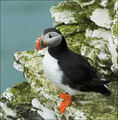
| 05/11/2006 11:32:33 PM |
Worth the 4 hour waitby sjturnerComment: Greetings from the Critique Club -
First let me welcome you to DPChallenge. I expect the addiction to grab you quick.
You got yourself a shot of a cool looking bird here. There are a couple of things that it is lacking though to give it a higher score. The shot overall is a bit blurry. The lines on the bird arent crisp and the detail overall is lacking. A sharper focus would have helped out. I think tweaking some of the colors and saturating them a bit more would also do well to make the little birdie stand out a bit better. Maybe even desaturating the green on the rocks might have helped out some.
Your crop is also a bit off. Its not quite centered but at the same time it is not offcentered enough to have a positive impact. I probably would have gone with a true square crop with him in the center. This also would have gotten rid of some of the (what I believe is) water inthe upper corner. The waters color and noise doesnt do much for this shot.
Please dont let my critique deter you. A 5+ score for your second entry is nothing to complain about. Keep playing, experimenting and sucking up as much knowledge as you can from this site and you will be ribboning sooner than you realize. Take it from me.
Tim |
| Photographer found comment helpful. |
Home -
Challenges -
Community -
League -
Photos -
Cameras -
Lenses -
Learn -
Help -
Terms of Use -
Privacy -
Top ^
DPChallenge, and website content and design, Copyright © 2001-2025 Challenging Technologies, LLC.
All digital photo copyrights belong to the photographers and may not be used without permission.
Current Server Time: 08/06/2025 04:51:58 PM EDT.