| Image |
Comment |
| 01/30/2003 04:49:44 AM |
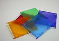
Plastic Rainbowby jgillardComment by Harz_Joerg: Good choice of color in your submission. Somehow you had bad luck that the topic is choosen by other submitters. This usually leads to lower votes. The colors could be more vivid and the image itself a little brighter though. I like the arrangement of the disk covers and the simplicity of the picture: its a one-view-fully-captured-image. |
 Photographer found comment helpful. Photographer found comment helpful. |
| 01/29/2003 08:35:28 PM |
Plastic Rainbowby jgillardComment by KimInNB: Red Orange Yellow Green Blue Indigo Violet (I still remember Roy G. Biv from elementary school) - seems like you're missing a couple of colors. But I like the overall effect of the photo, and the uneven cropping. |
| Photographer found comment helpful. |
| 01/26/2003 04:26:12 PM |
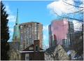
Lanscape became Cityscapeby jgillardComment by LanSnake: Greetings from the Critique Club,
Your landscape photograph is a very nice composition. I especially like how you've framed the left and right edges with trees -- this works very well, and reinforces your "Landscape became Cityscape" idea.
You've captured the sky color very well, good exposure and focus. A minor point (that will bother some of the DPC voters more than others) is your misspelling in the title (lanscape vs landscape).
Some of the comments below mention that the composition seems a bit crowded. I agree somewhat with this, but also realize that most cities look crowded. It might be interesting to try a wide-angle lens, and moving further away might open up other compositional ideas that work. This is a creative photograph for this challenge -- great idea to capture a landscape photo within the city!
LanSnake
|
| Photographer found comment helpful. |
| 01/19/2003 08:14:13 PM |
Lanscape became Cityscapeby jgillardComment by HBunch: Did you take this with a wide angle lens? Your buildings are strangely tilting inward. That sometimes happens with wide angle lenses. Not much landscape, but i understand your point. The sky is a nice color. The photo doesn't make me jump out of my seat with excitement, however it is very nicely done. Good focus and clarity, nice color, and the framing/cropping are alright as well. it's nice how you have the trees framing the edges of the photo. Good luck in the challenge. |
| Photographer found comment helpful. |
| 01/14/2003 10:55:05 PM |
Lanscape became Cityscapeby jgillardComment by Lustre: Looking at those buildings I'd say it became cityscape a long time ago (100 years or more), but I still like the photo. It has an interesting mix of building types and colours and is nicely framed by the two trees. Good work |
| Photographer found comment helpful. |
| 01/13/2003 05:36:39 PM |
Lanscape became Cityscapeby jgillardComment by KimInNB: I like the contrast of the little old houses and the shiny new big buildings, but it's a bit cramped. Not too crazy about trees on either side as well - cropping out the fir tree on the left side would have helped anyway. |
| Photographer found comment helpful. |
| 01/13/2003 12:01:41 PM |
Lanscape became Cityscapeby jgillardComment by Harz_Joerg: I like the variety of buildings in your cityscape, it's almost like a historical review with the old church and the brig house, the older and the new office building. Also the trees frame the picture well. They are of course needed to make it fit to the title of your submission. Sky fits well too.
My major concern with this image is that it is very tight, i.e. all elements are so close together and fill the whole picture that there is no space. IMO space is an important element in landscape pictures. A wide-angle shot or a shot from the distance would have probably reduced this issue. Colors could be stronger too (or maybe B&W?!).
|
| Photographer found comment helpful. |
| 12/19/2002 12:26:32 AM |
Evil Exam Preparationby jgillardComment by kandyj: What are all the things hanging off the ceiling? The evil exams?? ha!! Would like to have seen that window glare toned down a bit, like the angle of the shot. |
| Photographer found comment helpful. |
| 12/17/2002 12:41:23 AM |
The Stairwalkerby jgillardComment by sulamk: Critique Club
Composition Too centred with to much uneeded space at the sides. Shows motion.
Background - The background is too dull!
Camera work The image is technically good but very dark.
Digital processing The colours needed some hue and saturation to lift them a bit they all look rather washed out
My Opinion
The image meets the challenge but needs some life the colours are too dull and the image doesn't say look at me! |
| Photographer found comment helpful. |
| 12/10/2002 06:34:55 PM |
Crackedby jgillardComment by RiderGal: Critique Club
First off congrats on your first submission... it's exciting when you get those first week's results back!
Composition - The main focal point is very centered in this picture, which usually isn't desirable in photography. I think had you moved the egg and silly putty somewhere else in the picture (rule of thirds) it might have made for a more interesting photo. I also think that the main subject could have filled the frame a lot more. As it is it doesn't do much, visually.
Exposure - don't really see anything wrong with this, looks ok to me.
Color - the colors are vibrant blue, very pretty, and you caught them pretty well.
Focus - your focus is really good. No problems there.
Background - your background is very distracting, not only is it blue, and competeing for attention with the intended subject, but also it is very in focus. I would have suggested, maybe something pure white to really make the blue egg and putty stick out!
Fit for challenge - all blue, what can I say?
Lighting - the lighting is uneven, and very bright on some spots. It's hard not having a studio, or the setup to take a good picture in. Believe me, I know... I'm at college
Wowability - I don't see much here... it just doesn't catch me
Final Comments - good job.... try the shot over, and experiment... it can be a real learning experience... and besides its digital, your not wasting any film :-) Good luck!
|
| Photographer found comment helpful. |
Home -
Challenges -
Community -
League -
Photos -
Cameras -
Lenses -
Learn -
Prints! -
Help -
Terms of Use -
Privacy -
Top ^
DPChallenge, and website content and design, Copyright © 2001-2024 Challenging Technologies, LLC.
All digital photo copyrights belong to the photographers and may not be used without permission.
Current Server Time: 04/23/2024 12:18:06 PM EDT.