| Image |
Comment |
| 06/03/2007 10:58:06 AM |
|
 Photographer found comment helpful. Photographer found comment helpful. |
| 06/02/2007 01:58:02 PM |
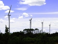
Between the Earth and the Air Exists Windby m_sarzynskiComment by EstimatedEyes: Oh this is nicer than I thought. First view was a 5. But second time through I like the way you've composed this, with three windmills facing one way set off by the fourth facing opposite, and a nice exposure on the sky. Would have liked to see more detail in the foreground or a stronger fade to black, but this is still nice. Bumping up to a 6 |
| Photographer found comment helpful. |
| 05/31/2007 09:03:27 PM |
|
| Photographer found comment helpful. |
| 05/31/2007 05:42:50 PM |
|
| Photographer found comment helpful. |
| 05/31/2007 05:13:23 AM |
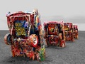
The Cadillac Ranch on Route 66by m_sarzynskiComment by Nuzzer: Hi from the Critique Club
Fit: Almost any picture will fit this challenge but the question is does the image benefit from the treatment. Your image fits but lets see if I think it benefits...
Composition: Composition is ok but there are areas for improvement. One of the "rules" (I say that in quotes because rules are never fixed in stone) is that horizon should be level. In this case it should. You have a nice sight line formed by the cars as they recede into the distance but the titled horizon competes for our attention as it slopes down to the right.
Technical: This image is one that is fitting for the selective desaturation. There are some aspects that mean that this has not been realised to the potential ot could have been. First, outside of the colour areas we have no intest. This means that while you have the cars in colour, that is all we see in the image to it almost feels as if nothing has been desaturatd. Secondly, the sky is blown out a bit. More detail in the sky would have aided the above point but also not given us that bright area at the top that we can't help but be drawn to. Do you shoot in RAW? If so then maybe it's time to think about HDR and Tone Mapping. Do you have photoshop CS2? If so then the Shadow/Hilights tool may have brought some detail out in the sky. I also wonder if this isn't overexposed a litte.
Feel: I didn't vote in this challenge but I do like this image. The subject is unique (that is getting harder and harder on DPC). The colours are vivid. The image has interest. It's just that once my eye has run along the line of cars I feel like there should be more but that is all there is. I think this would have easily passed a score of 6 if there was more detail outside of the cars.
PM me if you have any queries and good luck in future challenges. |
| Photographer found comment helpful. |
| 05/30/2007 02:37:12 PM |
|
| Photographer found comment helpful. |
| 05/29/2007 07:04:20 AM |
|
| Photographer found comment helpful. |
| 05/29/2007 01:27:55 AM |
|
| Photographer found comment helpful. |
| 05/26/2007 05:00:50 AM |
|
| Photographer found comment helpful. |
| 05/25/2007 07:54:50 PM |
Annular Accoutermentsby m_sarzynskiComment by dtremain: This would be more effective with a tighter crop - you could easily lose the empty brown foreground, and the dark left 1/3. This could also use something in the lighting department - your subject is a common, ordinary item, so it needs something to attract and hold your attention (curiosity?). |
| Photographer found comment helpful. |
Home -
Challenges -
Community -
League -
Photos -
Cameras -
Lenses -
Learn -
Prints! -
Help -
Terms of Use -
Privacy -
Top ^
DPChallenge, and website content and design, Copyright © 2001-2024 Challenging Technologies, LLC.
All digital photo copyrights belong to the photographers and may not be used without permission.
Current Server Time: 04/23/2024 10:29:46 PM EDT.