| Image |
Comment |
| 05/08/2007 02:36:10 AM |
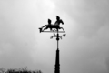
Pigeons and Windby danthesquidkidComment by mpreslar: Composition is weak. The trees at the bottom distract from the main point of the image. The pigeons and weather vane are too centered in the image. Some judicious cropping would solve both of these problems. The bird to the right of the frame is nicely captured, the one on the left is a bit indistinct. The black and white presentation is nice, but it might be better with a bit of levels adjustment to give more life to the image. |
 Photographer found comment helpful. Photographer found comment helpful. |
| 05/07/2007 10:18:21 PM |
|
| Photographer found comment helpful. |
| 05/06/2007 03:16:08 PM |
|
| Photographer found comment helpful. |
| 05/06/2007 01:49:50 AM |
|
| Photographer found comment helpful. |
| 05/05/2007 05:20:45 AM |
Pigeons and Windby danthesquidkidComment by dewdodesign: i like this is black and white and it's a good shot, the only thing that lets it down IMO is the composition.
The trees are distracting and should have been cropped out completely or you could have use them to play a greater part in the scene.
I also dislike the way the wind dial is in the center of the shot and I think perhaps offsetting it to the left or right would have improved the overall composition. |
| Photographer found comment helpful. |
| 05/01/2007 02:58:24 PM |
|
| Photographer found comment helpful. |
| 05/01/2007 10:25:05 AM |
|
| Photographer found comment helpful. |
| 03/24/2007 08:08:13 PM |
|
| Photographer found comment helpful. |
| 10/14/2006 01:04:53 PM |
|
| Photographer found comment helpful. |
| 10/03/2006 01:01:07 AM |
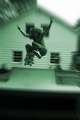
Backside olieby danthesquidkidComment by digitalknight: dodge the front side of him so we can see him better - this is a great shot - love the zoom blur! These are not that easy to get, maybe you realize that! :-)
Nice work. |
| Photographer found comment helpful. |
Home -
Challenges -
Community -
League -
Photos -
Cameras -
Lenses -
Learn -
Prints! -
Help -
Terms of Use -
Privacy -
Top ^
DPChallenge, and website content and design, Copyright © 2001-2024 Challenging Technologies, LLC.
All digital photo copyrights belong to the photographers and may not be used without permission.
Current Server Time: 04/25/2024 09:45:11 AM EDT.