| Image |
Comment |
| 05/22/2006 05:53:41 PM |
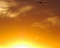
Heated Approachby crazedfost78Comment by Titia: Pity the plane is way at the top, I missed it the first time I looked. I think a different crop would've looked better, cropped out the white of sun and ad a little more above the plane. 6 |
 Photographer found comment helpful. Photographer found comment helpful. |
| 04/23/2006 07:03:54 PM |
|
| Photographer found comment helpful. |
| 04/21/2006 07:39:15 PM |
Keeper of the Flameby crazedfost78Comment by Azrifel: Cool shot, grains works well. It seems to tell something about the character of the one being portrayed. Nice subtle light. The red background works well with the hat and skin colors. |
| Photographer found comment helpful. |
| 04/19/2006 02:21:54 AM |
Keeper of the Flameby crazedfost78Comment by crayon: very poster-like. I like the grains treatment and colours. Reminds me of a record cover! good job Message edited by author 2006-05-17 23:53:48. |
| Photographer found comment helpful. |
| 03/25/2006 11:01:26 AM |
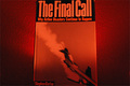
Educated Flyerby crazedfost78Comment by sfalice: Greetings from the Critique Club
I see this is just your second Challenge. Welcome to the land of DPC.
Your image is an interesting one, but I suspect its meaning was lost on our viewer/voters. It may be you were going for an edgy composition with the book in the exact center of your frame, but to our viewers it looked like a 'mistake' and they voted accordingly. And to get your point across, it might have been better to use more than one book so your educated flyer would be a 'well rounded one'and you would not get dinged for perceived copying of an existing artwork. Of course you interpreted, not copied it with your unique lighting. I am assuming your lighting and unusual camera settings were meant to give a feeling of 'impending doom' to your image.
So, all in all, a gallant try, but not an image with which our viewers were able to connect.
I'll look forward to seeing more of your images on DPC.
|
| Photographer found comment helpful. |
| 03/21/2006 05:36:25 PM |
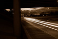
Comets on the Freewayby crazedfost78Comment by wheeledd: This doesn't quite work for me. There is a large dead area on the lower left. I thought about cropping it out but then you would lose the point of the triangle formed by the sky and road. |
| Photographer found comment helpful. |
| 03/21/2006 03:02:13 PM |
|
| Photographer found comment helpful. |
| 03/21/2006 09:12:40 AM |
|
| Photographer found comment helpful. |
| 03/16/2006 11:23:40 AM |
|
| Photographer found comment helpful. |
| 03/15/2006 12:38:05 PM |
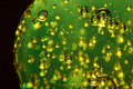
Molecular Realmsby crazedfost78Comment by Claya: Very interesting image and a real techinical challenge I'm sure, but without the title it just doesn't say "education" to me. |
| Photographer found comment helpful. |
Home -
Challenges -
Community -
League -
Photos -
Cameras -
Lenses -
Learn -
Prints! -
Help -
Terms of Use -
Privacy -
Top ^
DPChallenge, and website content and design, Copyright © 2001-2024 Challenging Technologies, LLC.
All digital photo copyrights belong to the photographers and may not be used without permission.
Current Server Time: 04/19/2024 05:45:09 PM EDT.