| Image |
Comment |
| 04/07/2006 07:31:23 PM |
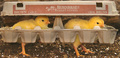
The Great Escapeby TransitComment: lol, very humorous & creative picture = )
Might benefit from a little contrast but otherwise great.
*edit to fix spelling Message edited by author 2006-04-10 05:42:16. |
 Photographer found comment helpful. Photographer found comment helpful. |
| 04/07/2006 07:29:36 PM |
Duplicityby PatrolComment: Great exposure on both the flowers and the sky. A little smaller depth of field might help with the slight softness in the foreground flowers. |
| Photographer found comment helpful. |
| 04/07/2006 07:28:34 PM |
Jammy Timeby timfythetooComment: A nice expression - the shirt and the girl's smile match right on = )
Focus and composition are both good. Lighting could be improved imho. The shadow under her chin should probably be eliminated, but overall the lighting looks flat to me. The skin tone is a little warm for my taste, yours may be different. |
| Photographer found comment helpful. |
| 04/03/2006 09:41:41 PM |
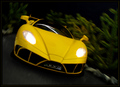
Yellow Goes Fasterby seebrownComment: Is that a model? Nice work, it looks pretty real. I'd suggest making the background a little darker to further emphasize the car. |
| Photographer found comment helpful. |
| 04/03/2006 09:40:12 PM |
|
| Photographer found comment helpful. |
| 04/03/2006 09:39:16 PM |
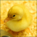
Just Duckieby brizmamaComment: I like the angle and the composition. The softness is great, but a little more separation of the duck from the ground (color-wise) might strengthen this imho. |
| Photographer found comment helpful. |
| 04/03/2006 07:32:00 PM |
Stroke of Insanityby jwillertonComment: This shot could work, but I think the sharp part of the image should be the top of the brush - Where the focal point is now, there isn't much detail to see. As a whole, the shot needs more texture to work imho. |
| 04/03/2006 07:30:52 PM |
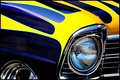
Chevyby dahkotaComment: I like the idea, the leading lines and crop, but the contrast is a little overdone to my eye though. |
| Photographer found comment helpful. |
| 04/02/2006 08:51:42 PM |
|
| Photographer found comment helpful. |
| 03/19/2006 07:04:58 PM |
|
| Photographer found comment helpful. |
Home -
Challenges -
Community -
League -
Photos -
Cameras -
Lenses -
Learn -
Help -
Terms of Use -
Privacy -
Top ^
DPChallenge, and website content and design, Copyright © 2001-2025 Challenging Technologies, LLC.
All digital photo copyrights belong to the photographers and may not be used without permission.
Current Server Time: 07/20/2025 04:42:58 PM EDT.