| Image |
Comment |
| 02/20/2006 07:56:24 AM |
|
 Photographer found comment helpful. Photographer found comment helpful. |
| 02/20/2006 02:13:08 AM |
Purple Rainby bowhennComment by hotpasta: great as a flower shot, but not really relevant to the challenge in my opinion...it doesn't depict the 80's except for your title |
| Photographer found comment helpful. |
| 02/14/2006 05:38:43 PM |
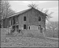
Barnby bowhennComment by zanfar: I like the composition, but the image feels a bit overexposed. Maybe a bit of levels adjustment would help? |
| Photographer found comment helpful. |
| 02/13/2006 09:59:46 PM |
|
| Photographer found comment helpful. |
| 02/13/2006 07:49:06 PM |
Barnby bowhennComment by SDW: Your photograph lacks in contrast very flat. The processing does very little to bring out the subject. I would suggest more contrast. I wish you the best in this and future challenges. |
| Photographer found comment helpful. |
| 02/12/2006 03:00:03 PM |
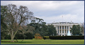
Right of Center (for a while)by bowhennComment by loseme: *Critique Club*
"Right of Center (for a while)" fits into the Off Center challenge. At first glance I really do like this, especially because it is something different to see. Also I think creativity for the title was a very excellent element of this piece, in the challenge.
The composition of this image is very lovely. There is a very nice overall feel to the shot. Also I like that you were able to include the fountain and give the shot some movement. One thing that is a little unsettling is there seems to be a tilt from the bottom left side, I think it wouldn't be so obvious if it were for the house. Since the viewer is drawn to the house they start to look at the top and wonder if the shot is uneven. It is a small enough title not to make the image completely unusable, but probably noticeable. Good work.
|
| Photographer found comment helpful. |
| 02/11/2006 01:38:01 PM |
|
| Photographer found comment helpful. |
| 02/11/2006 11:52:07 AM |
Fluidby bowhennComment by temba: I love the blues here and the whole fluid feeling. However, it would have been even better with the background cropped out. |
| Photographer found comment helpful. |
| 02/10/2006 11:22:08 AM |
|
| Photographer found comment helpful. |
| 02/10/2006 09:55:03 AM |
Barnby bowhennComment by tommyd65: Hi. I like the mood of the picture - B&W does it well. IMO it could use a bit more contrast. |
| Photographer found comment helpful. |
Home -
Challenges -
Community -
League -
Photos -
Cameras -
Lenses -
Learn -
Prints! -
Help -
Terms of Use -
Privacy -
Top ^
DPChallenge, and website content and design, Copyright © 2001-2024 Challenging Technologies, LLC.
All digital photo copyrights belong to the photographers and may not be used without permission.
Current Server Time: 04/19/2024 04:17:06 PM EDT.