DPChallenge: A Digital Photography Contest You are not logged in. (log in or register
 
Browse Settings
Currently viewing:
Registered Usersylandrix

Show comments:

Per page:

Order:

Comments:


Comments Made by sylandrix
Pages:   ...
Showing 1 - 10 of ~108
Image Comment
Sunny
10/19/2006 07:16:50 AM
Sunny
by mosa

Comment:
Very evocative portrait, and like others of its kind, gives us a glimpse of the subject's personality while making us want to learn more.

Technically, I think it would stand out much more with more contrast (more specifically, darkening a bit - the equivalent of moving the left arrow on a levels adjustment to the right some), and then lowering some of the resulting saturation that occurs after the contrast change. - or alter lighting so that its less flat, not that I'm an expert at knowing what to do differently.

Technical aspect aside, it stands out as one of my favorites of the challenge just because its a portrait that goes beyond the superficial. Hard to articulate in words I suppose.

Excellent work!
Photographer found comment helpful.
Voyeur
09/06/2004 01:02:58 AM
Voyeur
by Bassie

Comment:
Nice concept, like the execution and pose of the subject, looks authentic... I think it would be more pleasing to view with a color balance adjustment to take out the orange cast and render the model with more natural colors.
Photographer found comment helpful.
Henry RIP
07/24/2004 12:31:35 AM
Henry RIP
by Ecce_Signum

Comment:
Lost mine a year ago. Very sorry for your loss - Seems like quite a special little guy :(
Photographer found comment helpful.
November 22, 1963
09/01/2003 12:14:09 AM
November 22, 1963
by crabappl3

Comment:
I was so shocked to see this on the forth page of results! Excellent image, one of my three top faves for this challenge.
Photographer found comment helpful.
Right-Angle Wire
08/18/2003 09:43:07 PM
Right-Angle Wire
by Girl from OZ

Comment:
Greetings from the Critique Club!

COMPOSITION...While your composition suits the challenge topic overall, I think your score ultimately took a hit for a weak composition. I'm not trying to sound negative here, because I've seen the work you do and you can tell you do have an eye for composition... but comparing your shot here to your "Country Life" entry, the difference is apparent.

Over the months I've been here, offering input to people's images, I've seen the "wow" factor mentioned, and referred to myself, but never explained well, so here's my first attempt...

It breaks down to have a a) wonderfully executed photo and b) meaning

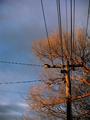
a) Good lighting, contrast, etc. Yours fits this well. You follow the rules of thirds pretty well. The blue and orange tones complement the photo well, the sunlight is used at its best, during the "magic hour"... everything done right here...

b) Maybe this is less important for highly commercial (stock, studio) images, where more focus is placed for a good lighting and something that hits the viewer...an interesting or unusual situation, a dramatic and interesting setup of objects... but generally, what is your image saying to the viewer? What feelings and thoughts does it invoke... can someone sit and study your image and think "Why did they take this? What is the photographer trying to communicate to me?"

So, though composed in a decent manner, the image just failed to communicate with me on any level, Your other images, however, seem to have a common theme... they place me in a particular time and place, that I feel part of... I could imagine being in the middle of the county with your country cliche shot, resting in a barn after a long day's work with the sunlight pouring through a window...or being immersed in Australia's landscape in your magazine cover challenge, or experiencing autumn's magic with your "Secondary colors" entry.

Anyway, thats my thoughts in a nutshell...images are successful when they provoke the viewer, usually in a way that resonates with them and not in a negative manner (which is why most people don't like pictures of roadkill)

And take it all with a disclaimer, which I think people should already know when being part of the CC - we're not experts ourselves, and I hope we don't come off as thinking we know more than anyone else. I myself am just trying to describe how I feel about the images I see...

TECHNIQUE... like I already mentioned, your image was taken well, some limitations can be seen with digitals trying to capture fine lines, such as the wires - they have come out jagged. Unless that is a result of the % compression you used.

Photographer found comment helpful.
Bountiful Temple
07/06/2003 08:23:50 PM
Bountiful Temple
by Yomi

Comment:
Beautiful light to light your temple! I think its very off topic though... I wouldn't want to rely on the title to make me think of 'B'. Great shot otherwise.
Photographer found comment helpful.
Behr Paint
07/06/2003 08:22:04 PM
Behr Paint
by ChrisW123

Comment:
Wonderful product shot. Could see it in a magazine! Very sharp focus, great texture - I can almost feel the brush and the pain on the can!! Excellent work! 10
Photographer found comment helpful.
Blue Skies, Beach Sand - Colorado Sand Dunes
07/06/2003 08:20:18 PM
Blue Skies, Beach Sand - Colorado Sand Dunes
by K-Rob

Comment:
Great perspective and sky - I like the fact that this photo looks like it could have been taken on another planet :) Therein lies the uniqueness of the photo. Definitely among my favorites this week.
Photographer found comment helpful.
Busy Bees
07/06/2003 08:17:48 PM
Busy Bees3rd Place
by jerrft

Comment:
Wonderful colors. What really gets me though is the feeling of movement in the picture, on top of that one bee remains sharp - you really captured the essence of what it must feel like to bee in a hive :) One of my favorites this week -10
Photographer found comment helpful.
Black Cat on Black velvet
07/03/2003 11:50:32 PM
Black Cat on Black velvet
by ladpupmoe

Comment:
Greetings from the Critique Club!...

COMPOSITION... Well, I know the frustrations of shooting animals (photograohically)... they hardly want to pose for you... but say this cat could follow direction properly, I would propose to have the cat a little off centered... if it is looking into the frame as it is here, then the cat should be to the left looking inwards... since the cat is looking up, then I would bring the cat's head slightly into the lower left hand corner.. Right now the photo has a snaphotty feel that imparts on the viewer that the cat was just quickly centered into the frame and the shutter was pressed...if you find its hard to position the cat and still not have enough time to take the picture before the cat runs away to play, you can always crop an image like the one above so that the cat's head falls in the frame the way you want it...

TECHNIQUE... I like the fact the fur manages to stick out... the captured texture makes this photo fit the challenge well... technically though, the photo suffers from a lack of focus... I'm not sure why...could the cat have been moving? did you exceed the minimum focus distance required by your camera? The cat's eyes also stand out a bit too much... the flash is causing this and lighting the subject with some nice, diffuse, controlled light could make a world of difference...
Photographer found comment helpful.
Pages:   ...
Showing 1 - 10 of ~108


Home - Challenges - Community - League - Photos - Cameras - Lenses - Learn - Prints! - Help - Terms of Use - Privacy - Top ^
DPChallenge, and website content and design, Copyright © 2001-2024 Challenging Technologies, LLC.
All digital photo copyrights belong to the photographers and may not be used without permission.
Current Server Time: 04/23/2024 10:14:51 AM EDT.