|
|
| Image |
Comment |
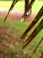
| 04/24/2003 09:41:35 AM | To Bring May Flowersby GraciousComment: Greetings from the Critique Club!...
COMPOSITION... Love the blurred out background here, with the image in the drop seeming to be in focus, I think it adds a nice touch. Problem is, we are just to far away from the drop. These kind of shots are best suited to macro mode, or even with a macro lens attached so you can get the closest shot possible. That brings up another problem though, and that's ensuring that the photographers themselves are not in the reflection... The reflection in your shot is so small its not a problem, but its something to worry about as you get closer.. Unless its the effect you want you'll have to experiment with different angles or trigger the camera from afar while its being camouflaged in leaves or whatnot. Perhaps in this case it would have been nice for the other branches in focus too, there's maybe too little for the eye to focus on, maybe a vibrant color like a flower in the foreground could help...:) Just pulling ideas here
TECHNIQUE... A histogram of your shot shows good tonal range. A little soft, some very slight unsharp masking may help...
OVERALL... This kind of shot is something I want to try ... with the difficulties involved in finding the right spot, time, and location, I appreciate any clear shot of a reflective dew drop :) Keep trying it every-time it rains :) Good luck on your future dew shots as well :) |  Photographer found comment helpful. Photographer found comment helpful. |
| 04/20/2003 10:30:58 AM | Lean GREEN cricket-eatin' machineby leko2kComment: Greetings from the Critique Club!...
COMPOSITION... Not too much I can impart here. The background is not cluttered and effectively looks like part of the anole's natural habitat, though it probably isn't. Most of the anole is sharply in focus.. what's most critical is the eyes - they look a little soft but nothing too serious. The only thing that I would change is including the tail... I don't mind when certain elements are cropped, but in this case it looks like the anole is anchored to the right side of the photo. Cropping off more to the left would probably balance it and eliminate this feeling also. Though you've made green your dominant color, it isn't the kind of shot that would immediately think that color is the most important aspect of the photo. The topic is open to a wide degree of subjectivity though and everyone's got their own ideas as to what fits the challenge and doesn't.
TECHNIQUE...Focus and clarity are good, the only thing I could say is that the light looks slightly harsh (or photo a tad over-sharpened?) just around the feet and belly areas.
OVERALL...depending on an animal's hyperactivity, animal shots can be a difficult thing to get done right, and I like the pose and setup of your cricket-eating machine :) It's definitely is a subject I'd want to go back to and capture again and again :) |
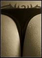
| 04/11/2003 11:39:36 PM | Seductive Symmetryby AnastasiaComment: Greetings from the Critique Club!
COMPOSITION... I really like the tones in this image, as opposed to keeping it in its original color. Also would work well in black and white! Cropping's okay... I would lean toward's briphoto's comment on the image being cropped too tightly. Symmetry works here, maybe not as strongly as some of the other challenges but its still there, despite the asymmetry of the tattoo - its close enough not to count in my books. Not sure if there is too much water - its just an unnatural part of the body for drops of water (simulating beads of sweat) to appear, so maybe sparser drops of water could have been called for, or maybe even none...
TECHNIQUE... There's an overall softness to the photo that I can't account for. Perhaps its the inherent softness of digital images, as opposed to shaking the camera or other errors... You can try a little unsharp masking to correct this. Contrast in the photo can be enhanced in the highlights range if you look at a histogram of the image. A minor levels adjustment can correct this.
OVERALL... A very artistic and interesting abstract... Nicely toned and appealing to the eye :) | | Photographer found comment helpful. |
| 04/08/2003 01:14:16 PM | Clay Flowers at Dawnby DougPazComment: Greetings from the Critique Club!...
COMPOSITION... Composition here is mostly good - I am slightly distracted from some of the background elements that are not part of the flowers - a piece of glass, etc... but fortunately the surrounding environment is dark and so the flowers stand out more.. I don't know how moveable these flowers were, but I imagine the probably could have been arranged so that the glass object is hidden, and maybe cropped a little tighter on the upper right to remove the distractions there.
TECHNIQUE... The lighting is sort of a catch-22... As it stands, it feels too uneven, with highlights in the photo blown out. But increasing exposure would have shown more of the background, which may have also hurt the picture. I'm just not sure here... If this is natural light (and I'm making the assumption it is), there is not much else to do other than trying to shift the placement of the object to photograph so it is in less direct light, or diffusing the light itself by hanging any translucent material (drapes?) over the windows to soften the light. Lots of shadows here too. Can make a dramatic photo, I like them in there anyway, but if thats not your intent, then setting up reflectors to throw some of the light back might be a good idea as well. (or if not to reduce the amount of shadows, it may also help in evening out the applied light). |
| 04/07/2003 12:22:11 PM | | | Photographer found comment helpful. |
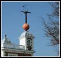
| 04/05/2003 07:57:26 PM | Greenwich Time Ballby Geo_GriffinComment: Greetings from the Critique Club!...
COMPOSITION... Perhaps a little static in this area. (subject is dead center, no leading lines, not filling frame, etc.). I would also say the tree is a distraction in the photo but if you remove it then there's not much else to look at - I think a closer crop altogether that would just focus on the tower and the vane may be interesting - how about an extremely narrow (panoramic if you will) vertical composition which crops out the other tower head and the tree and basically just presents the tower and vane?
TECHNIQUE...Exposure and image quality are good. Only thing I think you could do is try this shot at a dramatic time of day (morning or evening) or on a day with scattered clouds and a polarizer to give a dramatic backdrop to your photo. Other than that everything is good...
OVERALL... I tend to have also the same opinion as you, that many people didn't "get" the image and subsequently gave you a lower score than you would have normally gotten otherwise. But I would dissuade at the same time from not submitting a shot you really like or even fulfills the challenge on a personal or abstract level... If your aim is solely to win, then yes, the tie to the challenge topic needs to be more explicit... But if you're participating for fun and for learning to improve photography, I wouldn't worry too much about satisfying the masses :) |
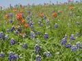
| 04/04/2003 11:52:13 PM | Sprint Timeby MusicmanComment: Greetings from the Critique Club!...
COMPOSITION...I think this overall a very nicely composed photograph that captures the essence of spring, which I am eagerly awaiting in my corner of the world :) Maybe the flowers are a bit too sparsely placed - I mean perhaps there is an angle where they would look closer together... I think this could be achieved using an SLR system with a telephoto lens, if you had something like that available, but regardless I like how the scene was captured. I was going to suggest removing the sky part but I'm leaning towards liking the little splash of blue that you've included in your photo.
TECHNIQUE... Depth of field could have been greater. If you had a tripod handy and it was a relatively calm day you could have closed down your lens a bit further, and if that still didn't render the front flowers in focus, then perhaps manually setting the focal point closer to the foreground,,, might be nicer to have most of the foreground flowers in focus than having the front and back ones out of focus. Other than that, great image quality.
OVERALL...when I first looked at your score, I was quite surprised but then I realized the reason your score ended up so low was most likely your loose interpretation of the challenge. I've always felt the photo itself should support the challenge topic and not rely on the title or vague interpretation to support its inclusion in a particular challenge topic... only to do better in scoring of course, not for any other reason. |
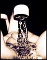
| 03/28/2003 09:20:13 AM | Liquid Lifeby TarbiniComment: Greetings from the Critique Club!...
COMPOSITION...I found that this image particularly stood out among the competition in kitchen art. The high contrast and monotone colors are what give the image its appeal I find, and having an undistracting background and purely frozen motion helps a lot :) I think also the angle and closeness the hands were shot at also suggest an intimacy with the subject - it really feels like the photographer and their camera is not present, and we're viewing the scene from the owner of the hands (though not really, the angle's a bit too low, but still, that's what it feels like). Perhaps the only advice I would impart here, is that the way the hands are positioned, with the faucet almost centered, suggests a symmetrical composition, and yet that symmetry is broken because of the angle the picture was shot at... Shooting the faucet straight on may have enforced the symmetry better and added some more strength to the composition.
TECHNIQUE... You lose some focus towards the back and front of the hands, but not enough to hurt the photo. Highlights are blown but it creates a surreal, high-contrast image that is still appealing.
OVERALL... A highly effective image. Would have just tried enforcing the symmetry that is already present. Kudos! | | Photographer found comment helpful. |
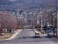
| 03/27/2003 08:43:33 PM | Down the Hill and Across the Cityby PHOTOCHlXComment: Greetings from the Critque Club!...
COMPOSITION... Although I like the idea of shooting an area from suburbia from a unique vantage point, compositionally the image can be stronger.There are some elements that immediately catch the eye - the car, the street sign, the little house on the lower right, but all these things compete for my attention and no one specific element is drawing me in... More probably due to the jumble of trees, wires and shadows. Perhaps one solution would be to introduce a dominant element in the photograph to detract the rest of the elements, such as the looming figure of someone looking down at a multitude of houses. A kid racing down on a skateboard? At that point, you could probably crop out the car and other extraneous elements and focus on your dominant element.
TECHNIQUE... Nothing amiss here. The shot could be a little warmer. Sharpness and focus are good.
Overall, a good concept, would take me some scouting to find a good vantage point. Just needs a strong focal point with a less cluttered background. |
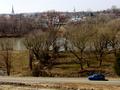
| 03/24/2003 11:59:14 PM | Spring Above Fredericksburgby BAMartinComment: GREETINGS FROM THE CRITIQUE CLUB!
INITIAL THOUGHTS...Ahh Fredricksburg!! I live in Montreal Canada but work brings me, when I do get to travel, usually to the small town of Fredricksburg (or Waldorf, one of the two :) Nice to see it on DPC :)
COMPOSITION... I like the placement of the car, the road, and the angle chosen to take the shot. gives a nice view of the town... but overall the composition could have been a little stronger - just mainly because the scene is a little cluttered, nothing that really draws the eye in, and the sky's a little washed out. Would be nice with some nice blue water as well, but I think the number of rivers in the US, or even North America, that are clear and blue are quite few. To improve the composition? I'm not really sure, I'd have to check out the landscape to see if there was a better viewpoint, but perhaps one that had a flatter terrain with a view of the town in the background... I think when I mentioned the scene being cluttered, I seem to think its the trees, or placement of the trees that's causing this feeling. I imagine the scene with the trees not included and it already feels better.
TECHNIQUE... The image is well exposed, and of good quality. I would have set for even a faster shutter to make sure the car was completely sharp. A little afternoon light might have given the photo some extra punch as well. | | Photographer found comment helpful. |
Home -
Challenges -
Community -
League -
Photos -
Cameras -
Lenses -
Learn -
Prints! -
Help -
Terms of Use -
Privacy -
Top ^
DPChallenge, and website content and design, Copyright © 2001-2024 Challenging Technologies, LLC.
All digital photo copyrights belong to the photographers and may not be used without permission.
Current Server Time: 04/16/2024 11:19:47 AM EDT.
|