|
|
| Image |
Comment |
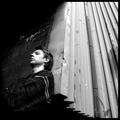
| 06/20/2003 08:15:17 PM | Auraby csokaComment: Very original idea, lighting very good, a little too much on the red side, but some way should have been found to avoid seeing wires and weird lines in the fabric. |  Photographer found comment helpful. Photographer found comment helpful. |
| 06/19/2003 11:59:41 PM | My Weaknessby arnitComment: This is exactly what a successful portrait should look like... an image that reveals, or at least leads us to believe that something is being revealed, about the subject, with an interesting and uncluttered background/context. Expsosure is right on the nose, and the contrast range is excellent!
Top marks from me... |
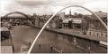
| 06/18/2003 10:56:31 PM | Our State -- North Carolinaby karmatComment: Greetings from the Critique Club!...
COMPOSITION... A very smooth, clean composition... the image horizon formed by the clouds and distant mountains both fall on lines that are 1/3 into the frame... I really like the effect caused by the haze, causing veer muted colors in the distance but brighter colors as you approach the camera... also the fact that the sky looks overcast but just as you reach the top of the frame, it suddenly breaks and a clear blue sky is showing! My only wish would be to have a slightly more interesting foreground, mainly because you have such a strong and compelling background... don't really know what, a bright flower that would be up close? The silhouette of someone looking into the valley? Just some foreground element basically that would add interest to the immediate foreground...
TECHNIQUE...Foreground foliage is a little too dark... if spot editing was allowed you can make two separate exposures for the background/sky and the foliage and then combine them in PS. Apart from that, I think you obtained an excellent exposure in the mountains and sky. (small section of the clouds are a little blown out).. but if you needed that exposure anyway so that some detail of your foreground foliage would show up... excellent focus as well...
MILESTONES... As an aside, your critique is officially the 200th comment I've made since I've joined the site in October!! I know its a small milestone compared to other users but it is one nonetheless! :) Message edited by author 2003-06-18 22:59:05. | | Photographer found comment helpful. |
| 06/17/2003 05:59:52 PM | | | Photographer found comment helpful. |
| 06/17/2003 05:57:33 PM | Kissed by a Roseby StevePaxComment: Really neat photo, great mood! Love the subdued colour, I just think the contrast is a little too low with a little too much negative space (ie crop a little more closer to rose while still maintining its off-centeredness) | | Photographer found comment helpful. |
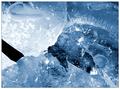
| 06/14/2003 12:33:29 PM | Schismby KonadorComment: Greetings from the Critique Club!...
FIRST REMARKS... Wow, your prediction is so accurate! I think you are the person I've critiqued the most, this being the third critique done, and every time, your own comments are pretty on the mark :)
COMPOSITION... This abstract appeals to me also, but not with the screwdriver inside the shot... its just so dark that it looks like an unecessary or obtrusive object in the photo. Perhaps you could have shone a small light onto it. Maybe if the screwdriver was more discernable as one, then it would convey the feeling of sound more strongly. Adding slight motion blur with the screwdriver as it strikes the ice can also help with that feeling of "sound" while still maintaining the photo's abstract qualities.
TECHNIQUE...Excellent exposure, with a good range of tones from the highlights to the shadows, niceley saturated blues. The light seems to be coming from behind the ice, always an interesting way to light things :) Of course, ice will always appear "messy".. I wish I knew of a way to make it smooth and flowing, since i'm not crazy about all the specks and other obtrusions in the ice...
OVERALL... I do agree its a nice abstract but the fact that it doesn't covey the feeling of sound as much as other entrys is what ultimately hurt your score. | | Photographer found comment helpful. |
| 06/13/2003 10:31:59 PM | "sounds of silence"by helgihelgiComment: Greetings from the Critique Club!
COMPOSITION... Lighting, placement of objects, DOF, photo's interest are all very good... I'm glad you went with black and white - it seems suited to the mood of the picture and I'm sure the color version is not as powerful. Some could debate if this really does fit the challenge theme. In an abstract way it does, but if this image is presented to a regular dpcer, and you ask them what challenge do they think it belongs to, I don't think 'sound' would be their first answer... so I would conclude its a little weak on fitting the challenge theme. Not that I mind the more abstract entries..they add interest to a little variety to the otherwise literal entries...
TECHNIQUE... It is possible that technique is what killed your score...your image is very low on contrast and the top portion of your image has very intense light... Adjusting contrast, or playing with curves and levels could help the situation, but if you really want to make an effective image, I would suggest trying dodging and burning (not good for the competition, but for your own use)... I would [very carefully] dodge the pattern on the tombstone with a fine brush until it was bright enough so its stone texture would still be visible. Would also dodge the bird with a larger brush so its feathers looked whiter. Then I would burn in the sky with a large brush to make it less overpowering... You could continue dodging and burning other elements at your discretion but I mentioned the important elements.... |
| 06/08/2003 08:52:49 PM | In Her Roomby progersctComment: Greetings from the Critique Club!...
COMPOSITION...Overall I think you've managed to achieve a very effective portrait for several reasons: The figure has a very intent and relaxed looking expression for one. An expression that's a bit enigmatic which causes me to look at the photo longer than I habitually would. Duotones and background isolate and emphasize the subject. There are just some elements in the background that distract a bit... the black piece in the bottom left and what looks like a bevelled edge on the far right. A bit of her bracelet is also visible - all can be eliminated by cropping a little closer to the face, but still maintaining space for her elbows.. This also results in a less square frame and more of a portrait one... which also works nicely
TECHNIQUE... Very well exposed... Though the highlights on the background and a bit of her shirt are blown out, her face, skin, etc. are almost perfectly exposed.. On my calibrated monitor, the shadows on her hair seem just a little light and I would darken those a bit using a levels adjustment... Its nice getting those catch-lights in the eyes also :) | | Photographer found comment helpful. |
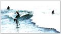
| 06/05/2003 11:11:45 AM | Surfby JPRComment: Totally washed out highlights... but it works in this photo! When my highlights are blown in my entries, I get picked apart for it... hope it doesn't happen to you - this is a really unique image that's interestingly composed and nicely conveys the sound of the waves. | | Photographer found comment helpful. |
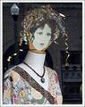
| 06/01/2003 06:20:05 PM | Vintage Ladyby giseleComment: Greetings from the Critique Club...
COMPOSITION... I think the shot has a sort of "snapshot" feel to it, though the lights and bricks in the background (or reflections) add some interest to it. This could also be another issue of shooting artwork... A window display is set up by someone else, and the photo is using someone else's 'composition'. I understand though that shooting artwork, displays, allows you to crop and place elements in your own photo the way you envision it, plus I think the main reason many shots of this nature are taken are because they are arranged by someone else with the intent of being pleasing to the eye. I started off by taking sections of grafitti artwork and paintings ariynd my parents homes...
TECHNICAL... All I can say here is that the image overall looks soft. Try applying an unsharp mask filter in this case. A little saturation could have given the shot more color..
OVERALL..what killed your shot ultimately, was the fact that there wasn't that strong a theme of "complementary colors" going on. Complementary colors are surely there but in this case it should have been a dominant aspect of the photo. Perhaps if you had boosted the color saturation of the shot some of those complimentary colors would have stood out more... Good luck on your future challenges!! |
Home -
Challenges -
Community -
League -
Photos -
Cameras -
Lenses -
Learn -
Prints! -
Help -
Terms of Use -
Privacy -
Top ^
DPChallenge, and website content and design, Copyright © 2001-2024 Challenging Technologies, LLC.
All digital photo copyrights belong to the photographers and may not be used without permission.
Current Server Time: 04/25/2024 12:49:44 PM EDT.
|