| Image |
Comment |
| 10/04/2006 12:05:49 AM |
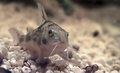
Day 2: The Nameless Catfishby freakin_hilariousComment: Not a bad shot. A little more light would have let you increase the depth of field a bit. One good way to take pictures of fish is to use glass or plastic panels to put around the fish and isolate where they can go (for fish that move around more). If you use a rubber lens hood on your lens (one of those collaspable ones that don't cost a whole lot) you can put the lens right up on the glass, with the rubber lens hood up against the glass. Then you can use flash or additional light and you won't get a reflection from the glass in front of your lens.
The rubber lens hood trick works pretty good for taking pictures out of airplane windows and through other windows where you might get reflection back from it.
Mike |
 Photographer found comment helpful. Photographer found comment helpful. |
| 10/02/2006 01:05:52 AM |
Plungeby xianartComment: LOL! I was going to say the same thing, 4 all lined up in a row. But Pug beat me too it. :D
Nice job on the sequence.
Mike |
| Photographer found comment helpful. |
| 10/02/2006 12:51:15 AM |
Day 1 - here's Jackby TJComment: The one up, one down is a dogs way of saying, "Yea, I'm listening to you, but what you are saying isn't worth my full attention." LOL!
Nice shot.
Mike |
| Photographer found comment helpful. |
| 09/16/2006 11:33:39 AM |
YPNGroup.jpgby ecameronComment: I agree about the woman in white being a distraction. Her white blouse just stands out too much. Also, it looks like the couple sitting are detatched from the rest of the group because of the free space around them. It would have been better had you filled that space (a good candidate is the woman in black standing on the lower right in front) or moved them over and up one step. Usually, if you have someone sitting and everyone else standing, the sitters are placed in the middle and everyone else grouped around. These are usually people a little more important than the others... for instance the parents or grandparents, the boss, etc.
The steps are a good idea, you did very well with exposure, lighting, focus, etc. And you almost did a very good job with placement.
Mike |
| Photographer found comment helpful. |
| 09/16/2006 11:14:08 AM |
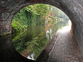
P1030712-bridge.jpgby obsidianComment: I agree that the sidewalk on the right is blown and detracts from the rest of this excellent image. That doesn't mean it can't be fixed by someone that knows Photoshop though.
When you are shooting from within a dark area into a lighted area, even if it doesn't look like it to your eyes, you are going to get a situation like this. The reason is the high contrast between your shadow area and your lightest highlight area (the sidewalk). In some cases, even film might not have the lattitude to cover both areas successfully. What I do is take 2 or more pictures. I'll take one metered for the shadows, one metered for the highlights and if the lattitude is several fstops apart I'll take one for the mid-tones. I think combine all the images in Photoshop using a action I got from Fred Miranda's site (his action does it a lot smarter and quicker than I could ever do) which takes the best parts of all images and combines them into one.
You can do this with one image as well... take two copies and adjust one for the shadows. Then take the 2nd copy and adjust it for the highlight area. Then merge the two together. Photoshop CS2 has the builtin HDR feature that can do this although I've not used it yet. I just use my action.
It's a great shot and I think it's worth your time in trying to tone down the sidewalk a bit and see if you can bring out it's full potential.
Mike |
| Photographer found comment helpful. |
| 08/05/2006 09:52:47 AM |
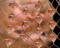
Net Shot Robby banmornComment: This is a real neat effect. What would have been really neat also, is if you could have had different poses inside each water section. :D
Great job.
Mike |
| Photographer found comment helpful. |
| 06/09/2006 12:50:11 AM |
..., 15,16,17, ... by SherwinJamesComment: I like how the floor lines and the lines of the moulding all lead the eyes to the girl in the corner. Even when I first looked at it and got the impression of her having to stand in the corner for being bad, I still had to smile at it. Then I saw your title and realized she was counting, which made it better. The only nit is I think you cropped it to close to her head. I think a little more room would have been better. Still an excellent job. |
| Photographer found comment helpful. |
| 06/09/2006 12:49:21 AM |
Dirty Little Biker Boyby ShutterPugComment: This image would have had a lot more impact had you been able to take out the heating register along the wall. But a cute picture anyway. |
| Photographer found comment helpful. |
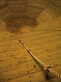
| 06/09/2006 12:47:36 AM |
Only one way out- UP!by dabidejpnComment: I like how you used the rope to lead the eye down and then how the lines lead your eyes around and around. I really like this picture. |
| Photographer found comment helpful. |
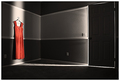
| 06/09/2006 12:46:27 AM |
She LEFT by edmengComment: I think this is a very good use of light, shadows and lines. I think it was very well thought out. Nice job. |
| Photographer found comment helpful. |
Home -
Challenges -
Community -
League -
Photos -
Cameras -
Lenses -
Learn -
Prints! -
Help -
Terms of Use -
Privacy -
Top ^
DPChallenge, and website content and design, Copyright © 2001-2024 Challenging Technologies, LLC.
All digital photo copyrights belong to the photographers and may not be used without permission.
Current Server Time: 04/24/2024 06:58:29 PM EDT.