| Image |
Comment |
| 10/10/2007 12:20:22 AM |
|
 Photographer found comment helpful. Photographer found comment helpful. |
| 09/10/2007 05:07:50 PM |
|
| Photographer found comment helpful. |
| 09/07/2007 07:28:02 PM |
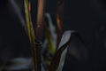
Strong or fragile power ?by SimpaComment by redxmidnight: I wish I could better understand your take on this. I understand that there's a comparison between electrical power and fragile power. I like the idea, but I feel like it could be better depicted. |
| Photographer found comment helpful. |
| 09/07/2007 04:57:19 PM |
Strong or fragile power ?by SimpaComment by The_Dentist: Interesting... I tend not to agree with the interpretation of "power" as "strength / resistance" but I do have to say this is original approach. Very good juxtaposition of opposites... Extra points for originality. However, other than the concept, this photo does not have much going for it. |
| Photographer found comment helpful. |
| 09/06/2007 03:20:34 PM |
|
| Photographer found comment helpful. |
| 09/06/2007 01:48:38 AM |
|
| Photographer found comment helpful. |
| 09/05/2007 08:07:17 AM |
|
| Photographer found comment helpful. |
| 05/13/2007 11:51:58 PM |
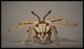
Be Beeby SimpaComment by karmat: CRITIQUE CLUB CRITIQUE
by karmat
It is symmetrical, so you have done well at meeting the challenge. My first impression is that subjects like this don't fair too well on dpc, and I suppose that is because there is an almost unconscious belief that if it is sitting still, everything should be perfect. There may be some validity to that, but it is not always possible. :)
Compositionally, the head on nature of the bee works well. It is easy to see the symmetry involved and makes the crazy thing look almost threatening.
Technically, the focus is good, but the gray-ness of the background makes it appear drab, and this steals the "energy" that the intensity of the bee projects. I think it would have been interesting to have this very obviously not real bee in a real setting out doors somewhere. That may have added an element of interest or drama to it. In the event that you couldn't get out, for weather or whatever purposes, a different color background would have been one more little thing that would have caught the viewer's attention and possibly compelled them to vote a touch higher.
If I need to further clarify or explain myself, please feel free to contact me.
karma |
| 05/07/2007 02:07:42 AM |
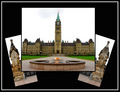
Eternal Flameby SimpaComment by klstover: -Critique Club-
The first thing when I saw it was that I noticed that it wasn't using all of the available image space. Personally I think showing off the subject in larger detail, and having less background/frame, would have been nice. However, you did a *fantastic* job of having it be symmetric and balanced. The arrangement of the three images wouldn't have been my choice BUT you did it very very nicely. I also think voters probably appreciated seeing a non-traditional arrangement of images.
A blue sky would have helped this immensely. Something like that could be accomplished in Advanced editing and I think would have just set the mood a little bit better. Your colors and your contrast are very nice. I also like the white outer border as it matches the images nicely.
I think your presentation of the building was very competent but it did not impress me. Perhaps having a closeup or two for the additional side images would have drawn me in a bit more and caused me to have more interest in the subject. I will say that this is your weakest point - the lack of "wow factor". And I think your strongest point was a nice, crisp presentation of the images. |
| 05/05/2007 02:27:49 PM |
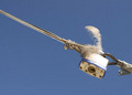
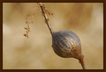
Nature in Actionby SimpaComment by timfythetoo: Greetings from the Critique Club -
There are a couple of things that I do like about this image. I like the background bokeh. It has a smooth paint like feel to it and just feels nice. I also like the simplicity of the image. You met the challenge with both the bulb and the off shooting stems falling into the crosshairs of thirds. I think the score you recieved is pretty much fair for the image. because of these two aspects.
I think more could have been done in postprocess. to help bump this up a bit. The subject seems a bit soft in sharpness. By your description it sounds like the only editing done was adding the frame. I almost always use an Unsharp Mask after resizing my images. 95/.5/1 are the settings that I find work best for me in giving my resized image that bit of sharpness back that seems to get lost in resizing. A slight tweak in levels to bring out some of the shadows on th ebulb or to tweak the blacks a bit could have also given the bulb more body. And maybe just a slight tweak in saturation to make the color a bit stronger may have been nice.
And thick borders can be tricky, especially when using color as you did. I try real hard to use the eyedropped tool on the color I want form inside the pic when choosing border color to make sure I have the proper complmenting color. Your border color feels a bit dark in relation to the colors in your image.
Now please let me say that these are just my suggestions based on the types of images that I prefer and how I would edit it based on my tastes alone. I think you scored where it should have against the images that were in the challenge. These types of challenges tend to be along the lines of a Free Study and to get the higher scores you really need an image with strong power and impact.
Hope some of this helps.
Tim |
Home -
Challenges -
Community -
League -
Photos -
Cameras -
Lenses -
Learn -
Prints! -
Help -
Terms of Use -
Privacy -
Top ^
DPChallenge, and website content and design, Copyright © 2001-2024 Challenging Technologies, LLC.
All digital photo copyrights belong to the photographers and may not be used without permission.
Current Server Time: 04/24/2024 07:33:11 PM EDT.