| Image |
Comment |
| 07/17/2006 12:56:42 AM |
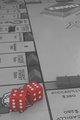
Advance to GOby NuzzerComment by klstover: I agree with the previous comment about the crop - either that, or just under the Y with a bit looser to the right. I like the positions of the dice on the board and relative to each other and the hotels/houses/motels/cities/plastic things. I also like how the plastic housey things are placed on the board - they are in the correct places but not 100% perfectly set. It makes me feel like somebody is actually playing a game, and not that this was a set-up shot, and I like that feeling of reality. |
 Photographer found comment helpful. Photographer found comment helpful. |
| 07/17/2006 12:19:12 AM |
Advance to GOby NuzzerComment by Lorene: I like the use of black and white while keeping the dice red. I think it might look better if you cropped it just below the Chance cards toward the top, avoiding distractions to the foreground/subject. This shot has a lot of potential to be cool. |
| Photographer found comment helpful. |
| 07/16/2006 10:50:22 PM |
|
| Photographer found comment helpful. |
| 07/16/2006 05:18:12 PM |
Advance to GOby NuzzerComment by Tygerr: Needs a bit of a boost in contrast (there's no real black or white in the image - all shades of gray), but otherwise a really nice photo. |
| Photographer found comment helpful. |
| 07/16/2006 03:33:58 PM |
|
| Photographer found comment helpful. |
| 07/16/2006 12:35:24 PM |
|
| Photographer found comment helpful. |
| 07/16/2006 05:03:27 AM |
|
| Photographer found comment helpful. |
| 07/15/2006 09:42:03 PM |
Advance to GOby NuzzerComment by digitalknight: Great creative - love this idea
Would love to see more contrast - whiter whites - blacker blacks - I think this would push your reds too - I would love to see those more saturated.
Maybe from a compositional standpoint, shoot so the lines of the board are at harsher angles to the edges of your frame and I think you'll find a stonger composition.
Great idea though - nice work. |
| Photographer found comment helpful. |
| 07/13/2006 09:06:26 AM |
|
| Photographer found comment helpful. |
| 07/13/2006 07:44:09 AM |
|
| Photographer found comment helpful. |
Home -
Challenges -
Community -
League -
Photos -
Cameras -
Lenses -
Learn -
Prints! -
Help -
Terms of Use -
Privacy -
Top ^
DPChallenge, and website content and design, Copyright © 2001-2024 Challenging Technologies, LLC.
All digital photo copyrights belong to the photographers and may not be used without permission.
Current Server Time: 04/25/2024 03:13:52 AM EDT.