| Image |
Comment |
| 04/21/2010 04:25:19 PM |
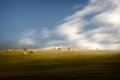
Road Tripby rinacComment: Originally posted by rinac:
Originally posted by Louis:
Is my art appreciation sense broken? Is my critical eye half-blind? |
No, absolutely not Louis. It's perfectly okay to disagree. Though I do think the better question to ask is, "Are you putting this forward as 'art'?". My answer of course is "No". It's just a really cool image I snagged while driving. Sometimes, there's no rhyme or reason why people like certain images more than others. Could really be anything that triggers a positive response - colour fields, light, subject matter... whatever, it's all good. I'm stoked this one piqued so much interest and I hope I can keep pulling these types of shots off in future. |
Nope, it's the sheep - that's what us Kiwi men like ;)
Oh hey, they're cows not sheep. I don't like this shot anymore - where's the button to unfav it gone ;) Message edited by author 2010-04-22 01:31:12. |
 Photographer found comment helpful. Photographer found comment helpful. |
| 04/08/2010 03:38:18 AM |
Road Tripby rinacComment: This is one of the best examples of this style I've seen from you. It is just so engaging. Maybe it's because of the sheep?
Perhaps it is time to get rid of those nappies and try some pull-ups - you're getting to be a big girl at this now :) |
| Photographer found comment helpful. |
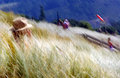
| 03/15/2010 05:01:51 AM |
Summerby rinacComment: Nice result - I gave this one of my top scores and I didn't even know it was your shot :) |
| Photographer found comment helpful. |
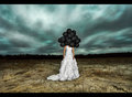
| 03/15/2010 04:58:55 AM |
The Twilight Zone by JaimeVinasComment: Intiguing shot but why is this fine art - I just don't get it. I wish someone would educate me.
Congrats on the yellow, even if i don't understand it ;) |
| Photographer found comment helpful. |
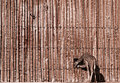
| 03/14/2010 09:13:14 PM |
Ancient Lines and Patternsby pmichaudComment: Greetings from the Critique Club.
First impressions are that the Giraffe is lost in all those lines.
Technically this is ok. Composition is good and I'm a fan of shots where the subject is only a small part of the frame. I agree with some voters that the hue is quite unnatural. The lighting looks like it was in full sun - hence the monotone?
Artistically I like the small in frame concept. I'd like to have the Giraffe's head not in the hole as the Giraffe looks a little awkward like he is. Given the advanced editing rules I'd have cloned a couple of distractions from the fence that seem to be attention grabbers.
In summary a cool shot but an unusual toning.
Feel free to PM me if you have any queries.
Gerry |
| Photographer found comment helpful. |
| 03/14/2010 06:07:37 PM |
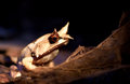
The Witch is back!by tokyoaheadComment: Greetings from the Critique Club.
First impressions are of the eye, it stands out really well!
Technically this is ok. The bright spots are perhaps a little too bright even though they help make the eye stand out. Composition is good. The tones are lovely indeed. Good choice of DOF.
Artistically you have captured what looks like a great expression on the toads face. this clearly appealed to the voters who commented (note their average vote).
In summary a pleasant shot but lacks a "wow" to get a 6 score.
Feel free to PM me if you have any queries.
Gerry |
| Photographer found comment helpful. |
| 03/11/2010 02:26:08 PM |
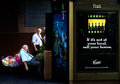
Considering A Change?by Covert_OddityComment: Greetings from the Critique Club.
First impressions are of the nice contrast between the darks and the colours.
Technically this is composed well - follows the rule of thirds largely. Exposure is great as it brings out the contrast nicely. In some areas is appears a little over-sharpened but that may be the resizing? Shutter speed is spot on as it has just a little motion blur in the walking man to give us a sense of movement.
Artistically this is great. Your notes sum up the various plot-lines that are going through this shot. There may actually be too much going on though. A square crop without the beer add would allow us to focus our attention on the men better - that is where the real story is and it's one we can "connect" with - the beer add is just a poster after all. A real bonus is that the mean look similar so my first thoughts upon looking closely were that it's the same man considering an alternative path his life have taken!
In summary this is a great shot that you need to stop and think about. That's the problem score-wise, most voters don't stop long enough. A very under-rated shot IMO.
Feel free to PM me if you have any queries.
Gerry |
| Photographer found comment helpful. |
| 03/10/2010 12:07:29 AM |
|
| Photographer found comment helpful. |
| 03/09/2010 09:22:39 PM |
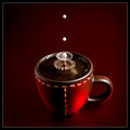
Boom boomby gyabanComment: Great shot, thanks for the details in your notes too! |
| Photographer found comment helpful. |
| 03/09/2010 04:11:44 PM |
|
| Photographer found comment helpful. |
Home -
Challenges -
Community -
League -
Photos -
Cameras -
Lenses -
Learn -
Prints! -
Help -
Terms of Use -
Privacy -
Top ^
DPChallenge, and website content and design, Copyright © 2001-2024 Challenging Technologies, LLC.
All digital photo copyrights belong to the photographers and may not be used without permission.
Current Server Time: 04/23/2024 08:55:39 PM EDT.