| Image |
Comment |
| 02/12/2008 11:18:40 AM |
|
 Photographer found comment helpful. Photographer found comment helpful. |
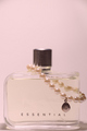
| 02/12/2008 11:15:42 AM |
Pearls of Perfumeby ScomanComment: Great focus on the main body of the bottle, the soft edge around the lid is a little distracting, but I can understand that its difficullt to light a shiny object like that evenly. Inclusion of the pearls really adds to the shot. |
| Photographer found comment helpful. |
| 02/12/2008 11:13:14 AM |
Impulsive highlightingby jparisiComment: Subtle, great positioning of the logo on the pen. It's not immediately obvious whats being advertised, but I think it works well in this case. |
| 02/12/2008 11:11:32 AM |
Nixonby nephotoComment: Wow! This shot could have come out of the Nixon catalogue! Lovely lighting, your model and clothing suits the brand perfectly. Nicely executed. |
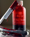
| 02/12/2008 11:08:53 AM |
Guinness but extra coldby smr78Comment: I love the clarity the drop creates on the can, perfect positioning as well- right on the beginning of the brand name. I think this shot would have gone brilliantly at the end of the famous 'Horses' ad they did, nice one! Serve extra cold. |
| Photographer found comment helpful. |
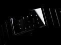
| 02/12/2008 11:04:50 AM |
T I M E P R O O Fby nikuserComment: A few weeks ago I walked down an incredibly expensive road in London, all the biggest names in fashion with their shops next to each other. This could have come straight out of one of their windows. Excellent job, the darkness of the shot really works for the product. |
| Photographer found comment helpful. |
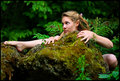
| 02/10/2008 05:39:21 PM |
Crawlerby lovethelightComment: I just love this photo! The rich greens go perfectly with the challenge, and the clarity in the eyes is supurb. You've really inspired me! Now I need to find some ears...(elf/fairy, of course haha), convincing my girlfriend shouldn't be a problem! She absolutely loves fairies (and im sure, those ears to if I can find some!)! Well done indeed. |
| Photographer found comment helpful. |
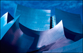
| 01/31/2008 03:38:27 PM |
C i t a d e lby hihosilverComment: My favourite from the challenge, I really hope it ribbons! IMO an excellent architectural photo. I love the shapes and the deep colors. The shadows work perfectly for this shot. |
| Photographer found comment helpful. |
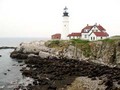
| 01/31/2008 03:34:42 PM |
Untitledby emerygirl25Comment: Did you have some problems with the resizing? Looks like this photo looked great in the original, maybe the main lighthouse filling the frame would have been more effective for the challenge? I think Black & White conversion would have been really great! |
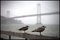
| 01/31/2008 03:19:39 PM |
Tale of Two Bridgesby meyersComment: This isnt immediately what jumps to mind when I think architecture, but I like the alternative subject. Great DOF and I think the muted colors work very well. |
| Photographer found comment helpful. |
Home -
Challenges -
Community -
League -
Photos -
Cameras -
Lenses -
Learn -
Prints! -
Help -
Terms of Use -
Privacy -
Top ^
DPChallenge, and website content and design, Copyright © 2001-2024 Challenging Technologies, LLC.
All digital photo copyrights belong to the photographers and may not be used without permission.
Current Server Time: 04/24/2024 08:29:27 PM EDT.