| Image |
Comment |
| 11/04/2005 08:46:58 PM |
Just Peachyby leeleeoComment: critque club**
very pretty i love the softness and angle you used for this shot, i espically love the texture you captured on the rose, your shadows were also very well done, they arent too hard just soft and nice like the over all picture.just one thing which you might have been aware of from the crowd is that parts of it seem to have turned blown out..although it was the theme your white may have been a tad over but it may just be my monitor,other than that though i really like this picture alot! |
 Photographer found comment helpful. Photographer found comment helpful. |
| 11/03/2005 11:37:31 AM |
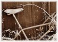
Forgotten Bicycleby JeniYComment: critque club**
I like this shot, it looks like it might be a bit over exposed the weeds are too bright imo. although i cant see what all you did with it in photoshop I think a better frame might have looked a tad nicer.
the lighting on your main subject is ok, the texture is there but it could need a bit more contrast
I like the overall feel to it, its very dramatic, the lines flow nicely but one thing i suggest to you is when you have vertical lines (the background) it is best to have them show up straight up and down. there is a tutorial i believe on this site on making lines straight to help the image a bit. |
| Photographer found comment helpful. |
| 11/02/2005 09:27:43 PM |
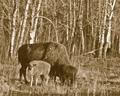
Where the Buffalo Roamby cpanaiotiComment: critque club**
there isnt grain in this shot..the color you used (sepia)doesnt work well with this shot for some reason it needs some tweaking in photoshop. the shot is nice because i like how the baby is staring at you its actually pretty nice that you captured that. I think you might have better results if you had a fstop between 16-22 and a shutter lower to give it a nicer texture and adding some more grain via photoshop would definately increase your odds of gaining a higher score considering the theme was grain :D
|
| Photographer found comment helpful. |
| 11/02/2005 01:40:07 AM |
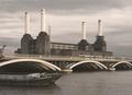
Bygone Eraby AlexSaberiComment: critque club**
I love the clouds but that was not the first thing to come to my attention, the boats are over powering because they play some form of directional line role towards the image..you have nice use of lines but none of them play a role together..you have pipes point upward and then a bridge pointing down the page and a boat pointing to archs..I've learned that the use of lines have to lead you to something and in this photo none of them lead you to anything. what might have worked is have the crane your main subject and have its line lead you towards the pipes OR if you wanted to use the boats as your main subject have it be within the archs to have your main subject the boat. it is hard to work on moving subject like the boat though..
over all you did a excellent job using grain but 1600 is way too high of an ISO |
| Photographer found comment helpful. |
| 11/02/2005 01:21:35 AM |
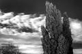
Night and Dayby conglettComment: critque club**
I like how you captured the clouds they look so soft. your exposure was very nice as well. I think what this picture lacks though is turning it into proper black and white. there is a special technique I learned do this in photoshop, you should try it next time here goes
turn your photo into lab colors under the adjustments menu.
then go to your channels (should be where your layers are one of the tabs on there is channels) then you remove A and B by throwing them in the trash. from there you throw alpha i think to the garbage as well.
then you convert it to gray scale and then to RGB and simply play with your contrast/brightness..there you go! |
| Photographer found comment helpful. |
| 11/02/2005 01:07:24 AM |
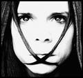
speek no evilby mandyturnerComment: critque club**
I dont know where to even look for anything to critque on this photo, you seem to have captured this image exactly like you probably imagined, I like how your title and the hair over the lips comes together. the image grain is really done well.. not too much like some of the previous entries i've been seeing. one thing that bugs me a bit is the loss of info on the nose, I know it was done intentional but a bit of burning to leave a small out line might have helped but that is just solely my own view to this. you have done a great job on this shot. my favorite part of it is the eyes.they glow beautifully!
congrats on your score :) |
| Photographer found comment helpful. |
| 11/01/2005 11:18:20 PM |
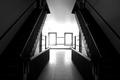
Virtual Mirrorby msieglerfrComment: Critque club**
wow this shot is very very nice!
I love the angle you shot it in as well it just fits in soo smoothly, the flow of directional lines is superb! i mean just look at how the stairs flow down and suddenly turn into the middle right into the window. the only thing i dislike about this photo although probably done intentional was the exposure of the windows. maybe placing a subject in the middle like two people one in each side to block some of the light and create a silouhete between the two..it still gives it the mirror look if they both have the same figure but then agian that may be alot of extra effort. anyway I love the shot! i dont see why it didnt score as high as it deserved, maybe it was overlooked :( |
| Photographer found comment helpful. |
| 11/01/2005 07:32:15 PM |
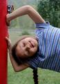
Hangin' Outby crystaldmComment: critque club**
very cute, I dont know why the toy monster truck is in this shot as it does not aide to the shot. the shadow being casted on her cheek is a bit dark but the shot is very nicely exposed aside that. i like how the complection is captured as well. no signs of overexposure as well good job.
although I see no "what" factor to the shot, its a nice snap shot nonetheless. |
| Photographer found comment helpful. |
| 11/01/2005 06:50:14 PM |
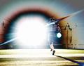
Football Starby Man_Called_HorseComment: critque club**
well my first impression is...this is different. if you didnt expect much from this shot though I dont see why you want it to be criticized but i'll continue doing so anyway.
the flash is way too distracting, it makes the picture very unpleasant to look at, although your cropping is fine, i would like to see more of his shadow cast in this shot.
I dont know what all you did to get the picture look like a negative but its also a bit distracting...perhaps you were just messing around with this shot entirely and wanted to see what we thought. well It is obvioulsy different and thats all it is. |
| Photographer found comment helpful. |
| 11/01/2005 06:06:54 PM |
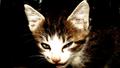
What did you say?by arsenalComment: critque club--
you did an excellent job at capturing a kitten, they seem to be always be hyper when i try to shoot mine. anyway the image is too saturated your whites have NO detail what so ever and in the photography world you must always try to expose your whites to keep detail. i suggest you meter your whites next time...although i'm not sure how your camera (konica-minolta) works. I think a reason it looks as blown out as it does is because you used the on camera flash...thats a big no-no, if the flash isnt doing a good job as i am assuming try bringing your subject into a better lit area.
like everyone on here below me says that you might have gone overboard with the sharpness..I agree with them. dont try to make your picture look soo unnatrual although it may be your style you just went a little over on this picture.
I think cropping it a different way would have also helped, I dont know how the rest of the picture is but maybe cropping in on just the kittens face and leaving the empty space to the left of the kitten would help a little. |
| Photographer found comment helpful. |
Home -
Challenges -
Community -
League -
Photos -
Cameras -
Lenses -
Learn -
Prints! -
Help -
Terms of Use -
Privacy -
Top ^
DPChallenge, and website content and design, Copyright © 2001-2024 Challenging Technologies, LLC.
All digital photo copyrights belong to the photographers and may not be used without permission.
Current Server Time: 04/20/2024 02:36:44 AM EDT.