| Image |
Comment |
| 05/25/2007 12:40:33 PM |
Serenity Foundby idnicComment: I dont know if its a bad illusion but to me the photo seems like it has a horizon problem. The more I look at it the more I think its an optical illusion but when I look at the fountain I find my head tilting slightly to the left to get a feel of being straight. I like the composition and the lighting is a nice effect. I just dont know about having the "feeling" of needing to tilt left. |
 Photographer found comment helpful. Photographer found comment helpful. |
| 05/21/2007 10:18:22 AM |
Ducks Play Lightlyby sfaliceComment: Greetings from the critique club. First I'd like to point out that I'm pretty sure this specimen is a goose not a duck. That may have been a problem with the voters. I like the good focus, lighting and the use of OoF background Bokeh to bring the viewer to the title and to the Subject. I think what really hurt you was the fact that you had the wrong animal for the title. Good luck in future challenges. |
| Photographer found comment helpful. |
| 05/20/2007 12:47:59 PM |
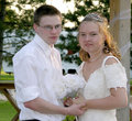
DSCN5560_new.jpgby NowaytotellComment: Decent lighting, pretty good exposure my gosh they dont look old enough to be married. I must be getting old! |
| Photographer found comment helpful. |
| 05/20/2007 12:47:01 PM |
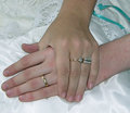
DSCN5570_new.jpgby NowaytotellComment: This looks a bit oversharpened and over neat imaged. Do you have an unedited version we can see maybe some PP tips might help save it. |
| Photographer found comment helpful. |
| 05/20/2007 11:28:14 AM |
One Tree Hillby RebeccaComment: I love this, it reminds me of Windows XP default backgound! Nice colors and composition. |
| Photographer found comment helpful. |
| 05/16/2007 08:21:41 PM |
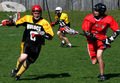
Determinedby drewyramoneComment: Greetings from teh critique club. Let me start by saying you met the challenge. I feel the colors are a bit too saturated on this shot. And way too much depth of field. I noticed you shot @ F16 you need to shoot wide open in your case with that lens F4 so you can try and isolate your subject from the background there is nothing in the background that I need to see that adds to the photo. Also waiting a bit to get closer to the peak action, what we see here is just the beginning of the action. OVerall pretty good challenge entry. Good luck in future challenges. |
| 05/16/2007 08:12:46 PM |
A wedding photoshoot in a very public placeby NalaAndTroyComment: Greetings from the Critique club. First let me welcome you to DPC with your first challenge entry. Now on to the critique. First let me remind you to always take advantage of the largest size available for any challenge. In this case 640 pixels on the largest side. Here is a link to the critique.
Tutorial
Next thing make sure that when you have an entry to make sure you crop out unwanted/needed things. In other words crop out just what you want us to see as your subject. Take the stuff on the bottom, top, left and right that dont add to the photo.
The colors that I can see from the small size look good.
Overall you have some room for improvement but hopefully I've helped you get that start. |
| 05/16/2007 08:05:15 PM |
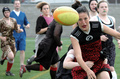
About Rugby (In Dresses)by boxImmortalComment: Greetings from the critique club. First off nice take on the challenge. Its definately sports, although definately a different take on it. I like the stopped action on the ball and the players. Def very close to peak action. The play coming at you is def nice. My biggest fault of this photo seems to be thats its too busy. There are too many things in the photo to take my attention. I think I might have preferred a very tight crop to lose the stuff on the left that doesnt offer much to the photo. I might also liked to have seen just a touch more USM after resizing to sharpen it up a touch. Overall nice challenge entry. |
| Photographer found comment helpful. |
| 05/13/2007 11:46:46 PM |
Almost symmetricby korpenComment: Greetings from the critique club. First let me say that I love the colors, background, the texture and the simplicity of this shot. Its a simple subject usually not doing so well on DPC but the take you have on this has set well with the voters. I think I might have bumped the saturation and the USM levels on this just a bit. Otherwise you did very well on this shot. Scored about where I would have in the challenge had I voted on it. |
| Photographer found comment helpful. |
| 05/13/2007 08:44:36 PM |
The long way to the solution by krasavitsa_1Comment: Well I'm not sure what I can add to a Ribbon winning shot, but here goes. First things first congrats on the first ribbon on DPC. I like the shot and the concept and its wonderfully done. A few quick suggestions. I'd like to see the text wider and not so long because when you resize to fit challenge size the writing becomes tougher to see. I'd also like to see just a touch more contrast in it. Otherwise pretty much great shot. Of course the voters already told you that. |
| Photographer found comment helpful. |
Home -
Challenges -
Community -
League -
Photos -
Cameras -
Lenses -
Learn -
Help -
Terms of Use -
Privacy -
Top ^
DPChallenge, and website content and design, Copyright © 2001-2025 Challenging Technologies, LLC.
All digital photo copyrights belong to the photographers and may not be used without permission.
Current Server Time: 08/06/2025 04:09:17 PM EDT.