| Image |
Comment |
| 11/01/2006 03:59:50 PM |
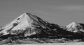
Papa Mountain and Sonby vtruanComment: Even with your given title, this is a landscape in aldscape orientation. IMHO it doesn't fit in neither exclusive challenges. |
 Photographer found comment helpful. Photographer found comment helpful. |
| 11/01/2006 03:57:47 PM |
phonesby k4ffyComment: Well done! The texture on the wall really adds something to the picture, especially by placing the person far away in the corner. The high contrast is also very nice. |
| Photographer found comment helpful. |
| 11/01/2006 03:55:36 PM |
Natalieby stare_at_the_sunComment: The space on the right looks like dead space to me, especially while she is looking to the left. |
| Photographer found comment helpful. |
| 11/01/2006 03:49:40 PM |
|
| Photographer found comment helpful. |
| 11/01/2006 03:43:44 PM |
The Other Side ofby CutterComment: Good use of the landscape orientation in this photo, however I would appreciate this photo more if the guitar was not cut off by the border, i.e. keep the photo wider. |
| Photographer found comment helpful. |
| 11/01/2006 03:42:17 PM |
Sleeping Beautyby bragurComment: Excellent use of the landscape orientation on this high key photo, preserving the details/imperfections in the face. Well done! |
| Photographer found comment helpful. |
| 11/01/2006 03:40:31 PM |
Stayby tomcatComment: The right side gives the idea of dead space. IMHO it would be better to have the dead space on the left, the direction the dog is facing. I also think some more contrast in this picture would improve it |
| Photographer found comment helpful. |
| 11/01/2006 03:38:13 PM |
|
| Photographer found comment helpful. |
| 11/01/2006 03:37:34 PM |
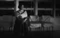
Sitting Out The Last Dance..........by WillSnapsComment: I like the light on the cloth of the woman, however the overall photo seems a little bit too dark. Another way would be to keep the photo as dark as it is now, but use more dodging on the whole person. You made use of the four chairs forcing the photo to have its landscape orientation. Well done! |
| Photographer found comment helpful. |
| 11/01/2006 03:35:12 PM |
Do You Remember?by nixterComment: I like the lightfall, though the photo seems to tend to black quite fast, therefore giving texture to only a small part of the sweater. |
| Photographer found comment helpful. |
Home -
Challenges -
Community -
League -
Photos -
Cameras -
Lenses -
Learn -
Prints! -
Help -
Terms of Use -
Privacy -
Top ^
DPChallenge, and website content and design, Copyright © 2001-2024 Challenging Technologies, LLC.
All digital photo copyrights belong to the photographers and may not be used without permission.
Current Server Time: 04/19/2024 10:19:32 PM EDT.