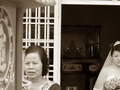
DPChallenge: A Digital Photography Contest You are not logged in. (log in or register
 
Browse Settings
Currently viewing:
Registered Usergerakdepan

Show comments:

Per page:

Order:

Comments:


Comments Received by gerakdepan
Pages:  
Showing 1 - 10 of ~34
Image Comment
Time's Up
01/23/2006 08:39:01 PM
Time's Up
by gerakdepan

Comment by LN13:
There are some strong shadows and some spots right in the middle near to the top
Photographer found comment helpful.
Time's Up
01/23/2006 06:29:34 PM
Time's Up
by gerakdepan

Comment by ShutterPug:
what is time up for? I'm not able to tell much from this image. Harsh shadows to the right of the person. Odd spots on the wall inbetween the clock and the woman are distracting.
Photographer found comment helpful.
Time's Up
01/22/2006 03:57:48 PM
Time's Up
by gerakdepan

Comment by Artyste:
A little too dark, and the composition is too tight.
Photographer found comment helpful.
Time's Up
01/21/2006 08:46:48 PM
Time's Up
by gerakdepan

Comment by mycelium:
Hm. I guess something was scheduled to occur at 10:20.
Photographer found comment helpful.
Time's Up
01/18/2006 11:55:04 AM
Time's Up
by gerakdepan

Comment by Konador:
I like the idea but I think the 2 subjects should be close together more in the middle of the frame. I find how they are each partly out of shot quite distracting.
Photographer found comment helpful.
Time's Up
01/17/2006 10:23:57 PM
Time's Up
by gerakdepan

Comment by rox_rox:
This image would benefit from a better composition and contrast. Not sure what the focal point is. The crop feels a bit awkward.
Photographer found comment helpful.
Time's Up
01/17/2006 09:51:33 PM
Time's Up
by gerakdepan

Comment by saintaugust:
little dark.. .distracting spots on wall/dirt on lens
Photographer found comment helpful.
Time's Up
01/16/2006 07:53:59 PM
Time's Up
by gerakdepan

Comment by cbeller:
You normally do not want the subject looking out of the frame. If the head and clock were swapped, it would probably look much better.
Photographer found comment helpful.
Before the Alter
01/12/2006 01:22:05 AM
Before the Alter
by gerakdepan

Comment by kari1:
::: Critique Club :::

Hi, I am Kari and from the critique club.

I am currently undertaking a critique of your photo "before the alter". I do hope you find this helpful.

Interesting to do a critique on your image but it is difficult if you don't give us any information in your photographers comments. When we do a critique, we go past just the photographic result, that's what voters comments do. The critique looks at what you were trying to achieve, how you wanted it to look and what issues you had in getting the image captured and ready for voting.

First Impression - the most important one:
What an awesome picture and situation - the caputre of both the mother and the bride is lovely and the crop is interesting and putting the focus on the mother rather than the bride.

Composition:
This is good. My thoughts are that the mother is the subject of the picture, therefore it would have been nice to have her eyes working on the thirds lines a little more. Also the fron object is straight but the doors behind and the ledge above the door is quite crooked - cropping our the ledge may have helped to reduce the feeling of crookedness.

The depth of field here is working really well.

Subject:
Nice choice of subject matter, which defiantely meets the challenge.

Technical (Colour and light):
This is lovely and balanced picture, I get the feeling that it may be in the black and white overkill ... but it may not depending on the colours that are there in the original.

To grow its vote?:
I don't know completely what you were going for without the comments, so am unsure how to comment too much on this. I would think about the cropping, and also consider if colour would have worked to push it into voters faces a little.

Summary:
Well done, keep it up.

If you've got any questions about this critique, please feel free to contact me via the PM system.

Cheers

Kari
Photographer found comment helpful.
Before the Alter
01/08/2006 03:15:05 PM
Before the Alter
by gerakdepan

Comment by jan5500:
a stressfull time for all, nice photo, would like to have seen more of the beautifull bride
Photographer found comment helpful.
Pages:  
Showing 1 - 10 of ~34


Home - Challenges - Community - League - Photos - Cameras - Lenses - Learn - Prints! - Help - Terms of Use - Privacy - Top ^
DPChallenge, and website content and design, Copyright © 2001-2024 Challenging Technologies, LLC.
All digital photo copyrights belong to the photographers and may not be used without permission.
Current Server Time: 04/18/2024 08:13:15 PM EDT.