| Image |
Comment |
| 11/29/2006 10:55:34 AM |
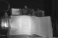
Keeping a Proper Perspectiveby jasonlpriceComment: You've got a couple of problems here. Given your intent, you haven't zoomed in close enough -- the print is so small that I can't read any passages, or even reliably identify the book as the Bible. While you've blurred the presents, they so recede into the background that they look more like accidental distractions than part of the intended composition. The presents might have had more impact if you'd kept this in color and lost the manger scene, which is not needed given the other elements. The lamp doesn't add anything to the composition or your intended message, IMO.
I think this could be greatly improved by getting up close to the Bible, so that just PART of the passage (but enough to identify it) you want is in the photo. Maybe but the Bible a flatter angle, but I'd have to play with it to see what's the best position. Bring the presents in a bit closer, so they're more a part of the composition. Lose the manger scene. This arrangement also adds a VISUAL aspect to "perspective" which I think would score better than a photo based just on a more abstract definition of perspectiveas you've done here.
|
 Photographer found comment helpful. Photographer found comment helpful. |
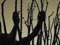
| 09/02/2006 05:04:06 PM |
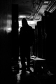
Aloneby xcharrierComment: Very ominous. At first glance it seems overly dark, but the more I look at it more more I like it. I might suggest a different title such as "Trapped", though. |
| Photographer found comment helpful. |
| 09/02/2006 05:04:01 PM |
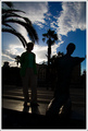
Looking at the statueby alexgarciaComment: Normally I would complain that the background shadows are obscuring the lines of your subject, but here the background appears to be PART of the subject. The whole image makes me think of those intensely bright days where you have to squint to see. I think you've done an excellent job capturing this. |
| Photographer found comment helpful. |
| 09/02/2006 05:01:32 PM |
A Call for Craftby raishComment: Not really thrilled with the post-processing here. You appear to have pushed the saturation too far for my tastes. Compositionally, the buildings in the back are really competing with your subject. It might have been better to pick an angle where they are framing rather than directly behind the sculpture. |
| Photographer found comment helpful. |
| 09/02/2006 04:59:12 PM |
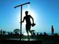
High Flyerby alucardComment: A bit less dark on the top of the photo would have made a better silhouette of the kite. I like the composition and the subject. A blue sky would have been better emotion-wise for the shot. |
| Photographer found comment helpful. |
| 09/02/2006 04:55:35 PM |
Summer Fountainby banmornComment: Would have been much better if your subject had been in the lighter area to the right of the image, rather than the darker left side. |
| Photographer found comment helpful. |
| 09/02/2006 04:55:02 PM |
Lazy, sunny afternoonby parallaxComment: A nice shot that captures the harsh brightness of the day. I wish you'd caught a bit less sun and more of the backlit water. |
| Photographer found comment helpful. |
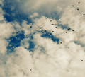
| 09/02/2006 04:52:50 PM |
25by arsenalComment: The birds silhouettes are very striking. My only complaint is you've got a lot of empty space without birds, especially in the lower half of the image. This might be stronger if you had cropped it down to the upper right quarter of the image.
[Edit] I take that back. After looking at some of the other bird shots, the empty space is what really sets the picture apart -- the smallness of the birds against the vastness of the sky. I get it now. Excellent! Bumping up. |
| Photographer found comment helpful. |
| 09/02/2006 04:45:04 PM |
Evening Fireby missinseattleComment: Love the composition and colors. The subject matter is very iconic for a summer sunset scene. The subject isn't in good focus, though, marring an otherwise superb picture. |
| Photographer found comment helpful. |
| 09/02/2006 04:39:08 PM |
Pain or Pleasureby BlackboxComment: Great out-of-the-box choice of subject matter. I don't like that the person is not as in focus as the thorns. Your crop is way too wide as well. A single hand griping (or appearing to grip -- ouch!) the thorns would make for a much stronger image. |
| Photographer found comment helpful. |
Home -
Challenges -
Community -
League -
Photos -
Cameras -
Lenses -
Learn -
Prints! -
Help -
Terms of Use -
Privacy -
Top ^
DPChallenge, and website content and design, Copyright © 2001-2024 Challenging Technologies, LLC.
All digital photo copyrights belong to the photographers and may not be used without permission.
Current Server Time: 04/18/2024 04:27:40 AM EDT.