| Image |
Comment |
| 04/24/2007 12:36:48 PM |
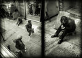
Jesus Shoes Through Devil Eyesby JPRComment: I like it, but I'm trying to figure out the good and evil theme here, nor can I overtly see any sort of dichotomy at play here either. Maybe I'm just stupid at the moment... |
 Photographer found comment helpful. Photographer found comment helpful. |
| 04/20/2007 12:30:17 PM |
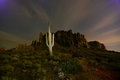
saguaro light paintby thegrandwazooComment: Okay, I didn't want to put this on your ribboner, but I would have much prefferred this if your were about 10 feet to the right, and the cactus stood out more from the outcropping and was in roughly thirds position. Actually this, which increases the visual weight of the cactus by increasing contrast is much better IMO. Just sayin. :) |
| Photographer found comment helpful. |
| 04/18/2007 11:49:32 PM |
Urban Series 4by rasdubComment: what up dave! I like this one. and the other ones, but mostly this one. |
| Photographer found comment helpful. |
| 04/18/2007 12:40:49 AM |
|
| Photographer found comment helpful. |
| 04/16/2007 11:21:20 AM |
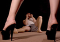
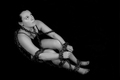
Tough Loveby UbersteinyComment: Okay, I'm going to be critical here, only because you have real potential. You did not reach even your current potential here.
I'm almost 99% sure that you were dinged becuase the chains in the picture weren't really sufficiently part of the composition, or part of an implied idea. Yes, I know, you can tell he's handcuffed, but the idea of "tough love" doesn't represent chained, and then the literal representation of chains isn't really clear in the picture.
Think of it this way, if a paying client asked for concept photos that included chains, would they toss this or send it up for consideration?
Personal preferences:
You should have been bowing, face down, with the handcuffs in clear visibility right in front of her feet.
Not everyone is meant to be a foot model, her feet are pretty wrinkled and her heels are a bit cracked around the edges. Should have smoothed them out, or used fishnets to distract. Including more leg would make this more sexy, feet aren't sexy (well, to most) but legs ARE.
|
| Photographer found comment helpful. |
| 04/16/2007 11:07:19 AM |
my love has become an afflictionby elmomarieComment: Unfortunately, you got so close to the subject that everything on the body but the hand becomes an abstraction of humanity. You have to leave enough of the subject in to make a visual and emotional connection. At the very least the mouth should be here, preferably with smeared lipstick to add to the story.
I'm not saying that I don't like this, I do. The comments you received were all from pretty accomplished photographers, people who have been examining these things for a long time. You have pleased the artists, the abstract thinkers.
Unfortunately to please the crowd, you have to take your artistry and distill it into a club and beat them over the head with it. ;) |
| Photographer found comment helpful. |
| 04/16/2007 11:00:57 AM |
Chainedby JeniYComment: I have to agree with the other commenters, well composed and well captured do not always an interesting picture make. The worst flaw is that she looks bored. Boredom only looks interesting in counterpoint to something in the picture that the viewer should NOT be bored at, and then you have to over-act it a bit, kind of a dramatic boredom.
Of course, this could have been your point, but the psyche of western culture is so ingrained in the thought of being chained only being a very bad thing (or a sado-masochistic adventure) that the look just doesn't make sense. |
| Photographer found comment helpful. |
| 04/16/2007 10:53:09 AM |
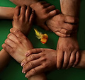
Circle of Friendsby StructorComment: I think the only thing that hurt you here was the strange texture of the skin, like you over-used neat image or something. I would LOVE to see how this looks without that one flaw. Unfortunately it's so pervasive and distracting that it otherwise ruined it. I didn't vote, but in answer to Sandy's question: I believe they were thinking just that. "Dammit, killed a great picture."
The yellow thing in the middle has meaning to you, but it's not obvious enough to most people (confirmed by other commenters) to really work. At first glance it completes the the composition, then it becomes a distraction because of confusion. Message edited by author 2007-04-16 11:23:33. |
| Photographer found comment helpful. |
| 04/07/2007 01:22:13 AM |
karissa07.jpgby nomad469Comment: I like the background lighting, leads the eyes nicely. Only nitpick is that the chair, instead of being a useful part of the composition, is just sitting there doing nothing. I'd say have her interact with any object or get rid of it as a distraction. |
| Photographer found comment helpful. |
| 04/07/2007 01:18:04 AM |
karissa06.jpgby nomad469Comment: I'm thinking her face is pointed a bit to up and too the left. It looks like she's skeptical of me, where I think you might have been going for "I'm checking you out"
When resizing for web, you should run a pass of USM on low setting. If she's sharp full-size, she's not here. |
| Photographer found comment helpful. |
Home -
Challenges -
Community -
League -
Photos -
Cameras -
Lenses -
Learn -
Prints! -
Help -
Terms of Use -
Privacy -
Top ^
DPChallenge, and website content and design, Copyright © 2001-2024 Challenging Technologies, LLC.
All digital photo copyrights belong to the photographers and may not be used without permission.
Current Server Time: 04/25/2024 05:05:52 PM EDT.