| Image |
Comment |
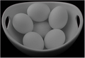
| 01/26/2008 11:18:58 PM |
Half-A- Dozenby sfmorrisComment: I'm not sure this quite works. The very flat contrast has made it have a sort of flat impact. What does a higher contrast one look like? |
 Photographer found comment helpful. Photographer found comment helpful. |
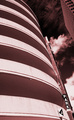
| 01/26/2008 11:16:48 PM |
Six Levels of Parkingby bvyComment: I'm personally fond of high contrast architectural shots. For comparison, I'd really like to see this also without the tilt or without the right hand building too. |
| Photographer found comment helpful. |
| 01/26/2008 11:14:44 PM |
|
| Photographer found comment helpful. |
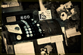
| 01/26/2008 11:12:17 PM |
6 Bucksby roby21112Comment: Hmm, I'm struggling to find a 'point' to the pic even though I like the imagery. It might be the distraction of the stuff to the right of the register that is distracting |
| Photographer found comment helpful. |
| 01/26/2008 11:10:43 PM |
A tulip for every yearby hajekaComment: Lovely. Perhaps a little too centred for my taste, I might have felt like another point had it maybe been hard left in frame |
| Photographer found comment helpful. |
| 01/26/2008 11:09:32 PM |
Hexby DrAchooComment: Superb. I think I could happily have an A1 print of that on my wall. The symetry, colour and toning are all damn fine work. The only thing that demotes it from a 10 to a 9 is the mirror - and that's not your fault.
Because the silver backing is throwint the double reflection which just spoils it a little but I know that a surface mirror or polished metal or using water is the stuff of commercial photography and not DPC |
| Photographer found comment helpful. |
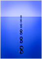
| 01/26/2008 11:05:45 PM |
Six Life-Savers Pieces as Number 6by jere2201Comment: I didn't 'get' it for a long time. I kept thinking that if you meant they were a graphic representation of a 6 then the top two would have curved to the right.
I'm not sure how many camera and light angles you tried here to add some perspective ... but I have the feeling that there is more there somewhere :) |
| 01/26/2008 11:02:57 PM |
Six Years Old (Also)by cloudsmeComment: Nice and sharp, highlights almost blown around the nose although it may not have looked like that before you uploaded it. I love the clarity of the hoodie's stitching, I keep getting drawn to it. Would be interesting to see it a stop or stop and a half darker |
| Photographer found comment helpful. |
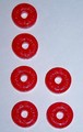
| 01/26/2008 11:00:48 PM |
Panesby posthumousComment: I think for this to work properly, the six panes had to be symetrical and I think it loses impact because of that.
The colour, toning and imagery are very strong but just lack "impact" |
| Photographer found comment helpful. |
| 01/26/2008 10:58:54 PM |
|
| Photographer found comment helpful. |
Home -
Challenges -
Community -
League -
Photos -
Cameras -
Lenses -
Learn -
Prints! -
Help -
Terms of Use -
Privacy -
Top ^
DPChallenge, and website content and design, Copyright © 2001-2024 Challenging Technologies, LLC.
All digital photo copyrights belong to the photographers and may not be used without permission.
Current Server Time: 04/18/2024 12:23:04 PM EDT.