| Image |
Comment |
| 04/15/2005 03:03:04 PM |
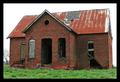
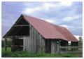
Old Farm Houseby ace flymanComment: I feel this framing is much too tight. One especially misses the rightmost part of the roof which is missing. In addition I'd love to see the rest of the tree on the right.
Actually I believe you should be much further away from the building and should have included the whole building in the shot together with its enviroment.
However, if you wanted to get a tight framing of the house I think it would have been better to shoot it straight on, either the front face or the side of the house.
I also notice you seem to have had a problem with sky as it is pure white on this photograph. Now, my picture in this entry had the same problem with the sky so I waited for a few days until the weather got better and went back for a reshoot. I don't know whether it was possible in your case but it is at least something to keep in mind for future shoots.
There is a tad too little contrast in the picture for my taste. Some use of levels, curves and unsharp mask (try 20%, 50.0 and 0 as a starting point) would have helped this pictured a lot. |
 Photographer found comment helpful. Photographer found comment helpful. |
| 04/15/2005 03:01:56 PM |
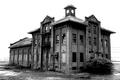
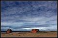
Stoney Creek Schoolhouseby moswynComment: As I see it this is an extremely cool looking subject for the challenge but unfortunately you somewhat fail to use it to it's maximum potential!
For starters I think it was a wrong decision to shoot the building from an angle. A shot straight on the front side would have been stronger, in my opinion. Or, if you wanted you shoot from an angle you should have gone even further right and shoot from a steeper angle.
Another thing I would have liked to see here would be to include more of the enviroment around the house. Only having a picture of a terrific looking building is simply not enough for this challenge - the photographer has to be really creative to differentiate his entry from those 500 other pictures where one sees a building but not much more. What I'd have liked you to do here would have been to make the tree to the left of the house more prominent. A good framing would be to shoot the picture from further back and having the house to the right of the frame and the tree to the left.
Another option would have been to go real low to the ground, use a wideangle lens, and try to include some nice foreground in the picture - a flower, a rock, or simply the green grass.
I also think you should have done a reshoot of this picture when the weather was a bit nicer. For my entry in this challenge
I took an interesting photograph last week for this challenge but it was almost ruined by the white sky as is the case with your picture. What I did was that I traveled back to the same spot on Tuesday when the weather was nicer and shot it again - the exact same shot as last week but with nicer sky. Doing this would also have helped your picture enormously in my opinion!
For this photograph I also think it would have been nice to tone the colors down a tad. |
| Photographer found comment helpful. |
| 04/15/2005 04:20:04 AM |
Port of Portlandby MickComment: This picture is overexposed but it might have been fine if exposure had been correct and the sky had been a bit nicer - e.g. a blue sky with clouds.
Learn to dial down the exposure with your camera. |
| Photographer found comment helpful. |
| 04/15/2005 04:17:21 AM |
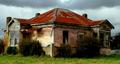
Forgotten Dreams (built Circa 1920)by kiwinickComment: Nice house. What I don't like about this picture and few hundreds of other photographs in this challenge is that this is 'just' a photograph of a house and there doesn't seem to much value added by the photographer.
One thing I would probably have tried here would to be to close to the building and shoot it straight on and show the the texture of the walls, those nice windows and the bushes in front of it. (The rightmost window seems particularly interesting.)
Another possibility would have been to wait for nicer weather and go back for a reshoot with some blue sky and clouds and perhaps take a vertical photograph showing the sky.
I'd also have tried to move a bit back and try to show the house in it's surroundings and keeping the house to the left or the right part of the frame instead of having it dead-center.
Including some foreground in the picture might also have helped it.Perhaps there was a sign here or a fence or a nice rock on the ground and if not, one could at least go lower and include more of the grass. |
| Photographer found comment helpful. |
| 04/15/2005 04:07:02 AM |
this old houseby scott photoComment: You should try to keep your pictures close to the size limit of 640 by 640 pixels (like most of the other shots in this challenge).
I see you have probably kept the size down for the reason that this picture is not in focus. I'd say you should have gone back to the same spot for a reshoot if that were the the case. |
| 04/14/2005 12:55:08 PM |
twisted and brokenby frogletComment: Well, at least we have a composition here - something sorely lacking in many of the shots in this challenge. The sky is nice as well.
I don't like how you block the top left part of the building with the foreground - it's a bit distracting.
|
| Photographer found comment helpful. |
| 04/14/2005 11:52:15 AM |
Opportunity for DIY Enthusiastby ArtanComment: I don't really get the title. Do you mean that it's a nice house kit as in airplane model kit and such?
Anyway, I like the green color on the ground and the building is somewhat interesting. The sky looks a bit strange and is a tad too blue, I think.
I like the composition though I'd peronally probably have tried a shot with a longer lens and from a greater distance. |
| Photographer found comment helpful. |
| 04/13/2005 05:57:17 AM |
alone by the seaby JohannesFrankComment: Hehe, haven't I seen these houses somewhere before? ;-)
Anyway, I feel this picture would have benefitted from some noise reduction and I find the red color of the houses to be bit too saturated for my taste. I think a bit of shadow/highlight might have benefitted the image.
Composition is nice. |
| Photographer found comment helpful. |
| 04/13/2005 02:01:50 AM |
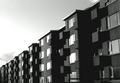
Icelandic blockby leifurComment: I don't this block is abandoned ...
However, this is a pretty nice shot - a fun pattern you saw there. The sky is, of course, sadly overexposed. |
| Photographer found comment helpful. |
| 04/13/2005 01:58:48 AM |
|
| Photographer found comment helpful. |
Home -
Challenges -
Community -
League -
Photos -
Cameras -
Lenses -
Learn -
Prints! -
Help -
Terms of Use -
Privacy -
Top ^
DPChallenge, and website content and design, Copyright © 2001-2024 Challenging Technologies, LLC.
All digital photo copyrights belong to the photographers and may not be used without permission.
Current Server Time: 04/19/2024 05:53:03 PM EDT.