| Image |
Comment |
| 09/16/2005 04:48:03 PM |
|
 Photographer found comment helpful. Photographer found comment helpful. |
| 09/16/2005 04:46:05 PM |
|
| Photographer found comment helpful. |
| 09/16/2005 04:45:16 PM |
|
| Photographer found comment helpful. |
| 09/16/2005 02:49:10 PM |
cherene001.jpgby GreenGiantComment by christie3: Yes, like Kevin said--perfect DOF, and you have a nice model. :)
My only problem with this shot would be the strange highlights on her face (lips/mouth/chin area especially) from the sidelighting. The hotspots really distract the viewer from her pretty eyes (at least for me they do).
Other than that, I really like it! Nice pov and angle and all that, it's really neat! :)
|
| Photographer found comment helpful. |
| 09/16/2005 02:40:42 PM |
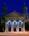
Church001.jpgby GreenGiantComment by BrennanOB: Had you moved a few feet down the block for a more dramatic angle or a few feet up to get truly square with the facade I think you would have had a stronger image.
The road traffic isn't strong enough to make an impression as it would if your camera was wider open for less time, but it does shift the lighting. The Fairmont traffic dwindles after midnight, but those street lighs stay on all night long. Perhaps a longer exposure with some sort of flashlight light painting could balance out the bounce light in the lower frame with a few picked out details in the towers.
I like the elements of the image but the blue light on the rose windows, the dim glow on the towers and the warm street light on the steps create very different feelings. I can imagine how different it would be if you picked out the crosses on the towers with a bluish high powered light, creating a counter balance to the repeting arcs of the rose windows. |
| Photographer found comment helpful. |
| 09/16/2005 02:40:40 PM |
Church001.jpgby GreenGiantComment by elee3009: Personally, I like it a lot, imperfections, streaks, stripes and all ... For me, these little details give it that added difference. But I agree that getting lower for a more imposing perspective could be more interesting. Don't know how it would have played out on the streaks tho'. |
| Photographer found comment helpful. |
| 09/16/2005 02:36:36 PM |
Church001.jpgby GreenGiantComment by digitalknight: the towers still feel squashed horizontally to me, and the whole building seems to be "tipping" back. Looks like you leveled the photo with the street curb, but the architecture around the words still feels slanted. I often pull up a grid, and use the skew transform tool to level all lines throughout my wide angle shots. Love the colors - level it up and go sell a print to the leaders of this church! |
| Photographer found comment helpful. |
| 09/16/2005 02:31:32 PM |
Church001.jpgby GreenGiantComment by LoudDog: Very nice, good idea. If you didn't take it from ground level, getting a little lower will make the church seem even larger and more impressive. I think I'd like it better if you could get in in a span where no cars drove by (I'm assuming those streaks are car lights). Also, using a lower aperture can give you the starburst effect on the lights, just for some added flair. |
| Photographer found comment helpful. |
| 09/16/2005 02:06:27 PM |
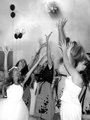
Boquet_toss001.jpgby GreenGiantComment by smilebig4me1x: lovely shot and i like the added blur as it give this a more of a romantic feel but one tiny nit pick is the blur for the flowers seems to be going the wrong way. they look like they are just being thrown when they should be landing in one of the girls hands. great shots u have posted and i look forward to seeing more of your work. :o) Message edited by author 2005-09-16 14:06:53. |
| Photographer found comment helpful. |
| 09/16/2005 01:51:58 PM |
Church001.jpgby GreenGiantComment by SDW: Very nice color as mentioned. I believe you took this picture with your 17-55mm lens wide open causing the distortion. The shot is nice but I believe you would of had a better picture if you would of used you 50mm f/1.8 lens and stood back a distance. That would of took care of the distortion lines.
Things I would do to this picture.
1. Level the horizon. I would level with the line below the text.
2. Sharpen the text only
3. First door to the left, dodge to make it as bright as the 2nd and third door at top.
4. Do a little (about 5%) dodge on the left steeple to make it as close in lighting as the right.
Nice shot but I think another lens would of rendered a better quality photograph if that was possible. I don't know how much distance you had to play with. Overall a nice shot. |
| Photographer found comment helpful. |
Home -
Challenges -
Community -
League -
Photos -
Cameras -
Lenses -
Learn -
Prints! -
Help -
Terms of Use -
Privacy -
Top ^
DPChallenge, and website content and design, Copyright © 2001-2024 Challenging Technologies, LLC.
All digital photo copyrights belong to the photographers and may not be used without permission.
Current Server Time: 04/24/2024 06:59:25 AM EDT.