| Image |
Comment |
| 11/28/2005 10:16:29 AM |
|
 Photographer found comment helpful. Photographer found comment helpful. |
| 11/11/2005 04:51:50 PM |
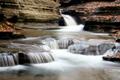
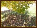
Buttermilk Falls 1by wrosenbergComment: this would have been such a nice photo if only you used the 640 pixels provided to you.. at this low resolution i can't see any details :( |
| 11/11/2005 04:43:35 PM |
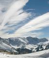
Lovelandby russbbrinkComment: Oh this really calls for some advanced editing !! well basic edting challenges dont' allow you to get the most of it |
| 11/11/2005 04:41:26 PM |
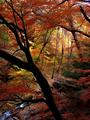
Fall!by traserComment: Really nice colors.. I wish you could go beyond this tree in front to get a much better view and no bloackage .. 8 |
| Photographer found comment helpful. |
| 11/11/2005 04:40:05 PM |
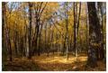
Goldengroveby sibelingComment: Nice colors, If you could use a polarizer, the sky would look more blue and add a lot of contrast to the yellow of leaves.. 7 |
| Photographer found comment helpful. |
| 11/11/2005 04:39:15 PM |
|
| 11/11/2005 04:38:32 PM |
|
| Photographer found comment helpful. |
| 11/11/2005 04:37:54 PM |
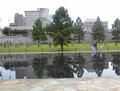
Eileby gemeitComment: the composition looks quiet scattered, or may be lacking balance... seems to have more yellow on my monitor.... dof can be increased |
| 11/04/2005 06:07:24 PM |
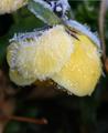
A Late Frostby TwylaComment: Hello from the critique club!
Great subject and fits the challenge very well.
As you have questioned yourself, the focus seems a bit off, or atleast not sharp enough. Also looking at the picture, doesn't look like you sharpened it after resize, which you should always for presentation. Colors can take a little more saturation to make them pop out. Since its basic editing you can't do much about somewhat distracting branch at the bottom. A little more contrast will also enhance the subject.
Once again a good entry which can be improved will a little editing.
If you have any questions, feel free to contact me via pm
thanks,
Gaurawa |
| 10/31/2005 09:15:30 AM |
Rebel by gaurawaComment: Thank you everyone for the wonderful comments and votes. I am glad this scored so well as I really liked this one.
|
Home -
Challenges -
Community -
League -
Photos -
Cameras -
Lenses -
Learn -
Help -
Terms of Use -
Privacy -
Top ^
DPChallenge, and website content and design, Copyright © 2001-2025 Challenging Technologies, LLC.
All digital photo copyrights belong to the photographers and may not be used without permission.
Current Server Time: 07/20/2025 06:31:59 PM EDT.