| Image |
Comment |
| 12/21/2005 10:51:44 AM |
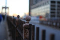
Brooklyn Bridge DOFby digitalpinsComment: I wouldn't score this too high. This has a shallow dof, but that doesn't add much to the image. A lot of distractions from subject and very centered subject. |
| 12/21/2005 12:14:30 AM |
|
 Photographer found comment helpful. Photographer found comment helpful. |
| 12/20/2005 06:28:18 PM |
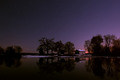
Summers End.jpgby Rachel34Comment: Agreeing with other posters, its soft. You haven't noted down the camera settings which could tell us why.
Again here also you could possibly get more with saturation increase |
| Photographer found comment helpful. |
| 12/20/2005 06:26:53 PM |
Where Has Summer Gone.jpgby Rachel34Comment: its a bit low on contrast. You can possibly use a smaller aperture to slow down shutter and get a silky smoothe water. Increase the color saturation a bit |
| 12/20/2005 11:52:44 AM |
|
| Photographer found comment helpful. |
| 12/17/2005 03:00:52 PM |
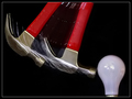
Friendsby conglettComment: ** Critique club **
first impression: oh cool !! the knife almost looks transparent. Great angle selection.
A few things I think could be improved are; first the sharp reflected light from knife on the paper just on the right. If you used a more diffused light, this can be avoided and will help the knife look more transparent.
the background seems to have some red, a whiter background could add more ot the image.. a white paper used as background may provide you better results.
If you have any questions, feel free to pm me
-gaurawa
|
| Photographer found comment helpful. |
| 12/17/2005 02:55:56 PM |
The Green Faerie and Her Spoonby JonLudComment: ** Critique Club **
The first impression was where's the spoon ? the empahasis in this image is not on the spoon. Also I can't relate to this image, so it doesn't appeal to me.
composition: very scattered, not a single subject emphasized in the image. I find the tilt good as it gives a different perspective and make the image dynamic.
blown out highlights are a bit of distraction
If you have any questions, feel free to pm me
-Gaurawa |
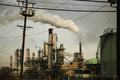
| 12/10/2005 10:16:37 PM |
A limited resourceby ThomLeeComment: **Critique Club**
Nicely processed. I like the subdued colors in this shot. The power lines on the top, horizontal, could have provided a good frame, but when I look at the image, the power pole and the lines divert my attention from the main subject. They do add to the 'industrial' feel of the overall photo, but distract as well as they are dominant compared to your subject. the pole on left also has the perspective distortion making it tilted while the chimneys in the background are straight.
Technically the photo is well exposed and has a good dof.
If you have any questions, please feel free to pm me
-Gaurawa
|
| Photographer found comment helpful. |
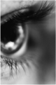
| 12/10/2005 10:08:13 PM |
Watchful Eyeby TranquilComment: ** critique club **
A different approach than the regular eye macro. This sure will have different opinion from people.
my first impression was its just technically flawed, but now that I hav spent some time looking at it, i like it. the grain adds to the overall image IMO. I would have loved the eye placed a little higher in frame though.
at dpc, a photo like this one won't score high as voters spend very little time on one photo while voting
I feel its a good image, but doesn't have appeal for dpc-voters.
If you have any questions, please feel free to pm me
thanks,
Gaurawa
|
| Photographer found comment helpful. |
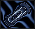
| 12/08/2005 09:15:08 AM |
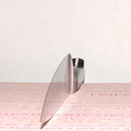
Surface tensionby gaurawaComment: Thank you everyone for your comments and votes. I was happy with the way the photograph came out. |
Home -
Challenges -
Community -
League -
Photos -
Cameras -
Lenses -
Learn -
Help -
Terms of Use -
Privacy -
Top ^
DPChallenge, and website content and design, Copyright © 2001-2025 Challenging Technologies, LLC.
All digital photo copyrights belong to the photographers and may not be used without permission.
Current Server Time: 07/20/2025 11:11:46 AM EDT.