| Image |
Comment |
| 04/18/2006 03:38:54 PM |
DSC_0987.jpgby EnnilComment: very nice treatment.. any tips/tutorials or better a photoshop action for the lazy guys like me :D |
 Photographer found comment helpful. Photographer found comment helpful. |
| 04/18/2006 03:37:40 PM |
|
| Photographer found comment helpful. |
| 04/17/2006 12:29:38 AM |
Intensityby cabaComment: Great expression from your model. I also like the lighting. but the processing seems to be too much, too smooth skin ( may be too much of noise removal ) and also some marks on left cheeck ( close to nose) which could be pixelation.. I think processing can be improved. |
| Photographer found comment helpful. |
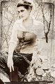
| 04/17/2006 12:27:40 AM |
Essence of Indiaby DigiFotoBuddyComment: Nice portrait. A few things you could do to improve upon the processing.. the saree looks a bit over sharepened. In portrait, you would want to keep attention to face, so don't sharpen the whole image, just sharpen face ( eyes basically ) and keep the other not-so-important things normal. A bit of vignetting may also improve things here. |
| Photographer found comment helpful. |
| 03/19/2006 07:26:37 PM |
liz1.jpgby kevrobertsonComment: some hotspots specially on her don't look good in a portrait like this... and also I think you can get rid of some of the black space on top, framing it just at her hair, no space on top... |
| Photographer found comment helpful. |
| 03/18/2006 05:00:39 PM |
Ben Aanby TallblokeComment: Nice picture and great exposure. I think this can be improved compositionally, but I can't figure out how, at this time it seems to be missing the impact. |
| Photographer found comment helpful. |
| 03/16/2006 11:55:44 AM |
|
| Photographer found comment helpful. |
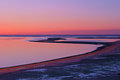
| 03/16/2006 11:54:05 AM |
Sunrise Iby jimmythefishComment: Lovely colors. the branch in water adds interest to the foreground. good work! |
| Photographer found comment helpful. |
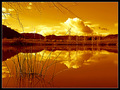
| 03/01/2006 07:15:50 PM |
Desert Snowby rjksteschComment: Its a nice shot. As others have pointed out, this possibly didn't meet the 'duotone' description and was voted down.
compositionally, the left top side IMO, is weak. I would may be add more there of remove it totally...it seems a bit unbalanced as it is.
|
| Photographer found comment helpful. |
| 03/01/2006 10:32:43 AM |
|
| Photographer found comment helpful. |
Home -
Challenges -
Community -
League -
Photos -
Cameras -
Lenses -
Learn -
Help -
Terms of Use -
Privacy -
Top ^
DPChallenge, and website content and design, Copyright © 2001-2025 Challenging Technologies, LLC.
All digital photo copyrights belong to the photographers and may not be used without permission.
Current Server Time: 07/20/2025 12:07:06 AM EDT.