DPChallenge: A Digital Photography Contest You are not logged in. (log in or register
 
Browse Settings
Currently viewing:
Registered Usermarklovell

Show comments:

Per page:

Order:

Comments:


Comments Received by marklovell
Pages:  
Showing 1 - 10 of ~88
Image Comment
IMGP3046-02-01-copy-b&w-web.jpg
02/16/2007 09:20:19 AM
IMGP3046-02-01-copy-b&w-web.jpg
by marklovell

Comment by lovethelight:
Because the sun was behind her you should use a reflector to get more light on her face. I did that with this headshot of my friend matt where the sun was behind him but we still got great light balance because we reflected the back light onto his face. I used one of those silvery sun blocker things you put in the windshield of a car when you leave it in a parking lot to keep the car from becoming a heater. It worked out really cool.

For other ideas you can also check out my portraits collection.
//dpchallenge.com/portfolio.php?USER_ID=70000&collection_id=19927

Message edited by author 2007-02-16 09:23:11.
Photographer found comment helpful.
IMGP3046-02-01-copy-b&w-web.jpg
05/29/2006 06:43:19 PM
IMGP3046-02-01-copy-b&w-web.jpg
by marklovell

Comment by ShutterPug:
the gray tones here look really muted - might try adjusting them some to make this pretty face pop more. The hair has some ovedr exposed highights, so not sure how much tweaking you can do.
Photographer found comment helpful.
Caged
03/14/2006 08:01:49 AM
Caged
by marklovell

Comment by woohoopepper:
I like it and the soft effect! This won't mean a thing to you probably, but this photo looks a lot like David Letterman (tv personality in the US)!
Photographer found comment helpful.
Study in thought...
03/07/2006 03:31:22 AM
Study in thought...
by marklovell

Comment by e301:
from the Critique Club

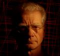
As I've been going through some of these duotones results, the variation in scores is truly remarkable - I really can't seen anything to justify this image scoring way down here where it has. I'm not suggesting it's ribbon material, but really, 4.8?

I think the comments re the pose were right - she does look slightly discomforted, and a large part of portrait photography is the process of getting a natural look, be that knowing whihc poses will work as an image, or knowing when the discomfort starts to show, or simply being able to see through your lens what you may not see otherwise. As this is your girlfriend, it may simply be that you know here too well, and what we're all seeing as discomfort is simply the way she looks. Whatever it is, there is just enough of a sense of tension around the neck and angle of the head to put that feel into the shot.

Your lighting is also a slight let-down. The image-left side of her face is so very evenly lit and exposed that to me all sense of definition there is lost - the tone has become the same as that of the background, and there is a sense of shininess around her forehead and nose, so there's a feeling that you've gone for a high-key shot but not quite pulled it off.

I'm unsure about any of these points - I'm no portrait photographer, and no fan of the genre either - but just trying to explain why I think this scored so very badly. Undeservedly so to my mind.

Difficult to say on a large resolution screen, and therefore with a small image, but I wonder if you could have had more detail. In my experience of this place, I find that the voters like things a touch sharper than I think is 'real' - a final pass of Unsharp mask with settings of 0.6, 70%, clipping 5 makes a useful finalising step after re-sizing, in my experience, for here.

Hope that's helpful

Ed
Photographer found comment helpful.
Study in thought...
02/27/2006 03:56:18 PM
Study in thought...
by marklovell

Comment by Tallbloke:
Couple of positive points, the focus is spot on and the catchlights in the eyes are nicely done. However, the pose is ...awkward due to, i think, you've asked your model to look round just a bit tooo far. The toning of the shot is nicely done high key but the rigid, awkward pose really lets the whole thing down.
Photographer found comment helpful.
Study in thought...
02/27/2006 06:57:51 AM
Study in thought...
by marklovell

Comment by hotpasta:
gorgeous eyes
Photographer found comment helpful.
Study in thought...
02/25/2006 05:24:58 PM
Study in thought...
by marklovell

Comment by jnpalma:
She's beautiful. I didn't like the angle though.
Photographer found comment helpful.
Study in thought...
02/25/2006 04:04:51 PM
Study in thought...
by marklovell

Comment by persimon:
I love the tones, but the model has a strange look on her face. Not that she isn't beautiful - her eyes are great. Her expression looks forced.
Photographer found comment helpful.
IMGP1902-tritone-web.jpg
02/25/2006 10:37:44 AM
IMGP1902-tritone-web.jpg
by marklovell

Comment by loseme:
This is a nice relaxed, comfortable feeling shot (for me). The blue seems a little odd for the happy expressions they have, I would be curious to see it in the sepia as well. I personally like this one the best, but if they need the shot for professional representation I would go with the other shot(the sepia one) over this one.
Photographer found comment helpful.
IMGP1917-sepia-web.jpg
02/25/2006 10:33:35 AM
IMGP1917-sepia-web.jpg
by marklovell

Comment by loseme:
From a professional stand point this is a nice shot. I just say professional because of their expressions. I like the idea of the circle and the include of their instruments. I also think the coloring is a great choice.
Photographer found comment helpful.
Pages:  
Showing 1 - 10 of ~88


Home - Challenges - Community - League - Photos - Cameras - Lenses - Learn - Prints! - Help - Terms of Use - Privacy - Top ^
DPChallenge, and website content and design, Copyright © 2001-2024 Challenging Technologies, LLC.
All digital photo copyrights belong to the photographers and may not be used without permission.
Current Server Time: 04/17/2024 08:23:20 PM EDT.