| Image |
Comment |
| 10/27/2006 06:39:09 AM |
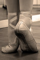
Graceby danica22Comment by PHOTOKID: Very beautifully done, I like the B&W on theis shot, the detail shows very well with it. There is nothing I see that in this photo I do not like.
Excellent Shot!
Rich |
 Photographer found comment helpful. Photographer found comment helpful. |
| 10/16/2006 11:48:12 PM |
nudeby danica22Comment by stwells: Excellent work Danica. The lighting combined with the cracked effect works so well. Could you share with us no-so-knowledgable how the cracked painting type effect was done? |
| Photographer found comment helpful. |
| 10/06/2006 02:05:04 PM |
|
| Photographer found comment helpful. |
| 10/06/2006 01:58:34 PM |
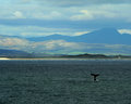
whale season.jpgby danica22Comment by Cheerz: I don't know what sort equiptment you have but it would be good to really zoom in on the whale..
It'll make a much more impactful shot.
I would try a portrait orientation for this.. :) |
| Photographer found comment helpful. |
| 10/06/2006 01:52:08 PM |
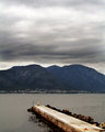
the pier.jpgby danica22Comment by Cheerz: The composition is nice
You might want to reshoot this when the weather is better..
1) Sky without blue is really gloomy, but that doesn't seemed like the way you'll want this photo to turn out.
2) You seemed to have tweaked the curves a little for this shot lossing some details in mean while..
I agree with going B/W for this.. |
| Photographer found comment helpful. |
| 10/05/2006 04:11:22 AM |
the pier.jpgby danica22Comment by whiteroom: think if you converted to b/w these holiday pics would have more impact.
same tones as your nudies.... :) |
| Photographer found comment helpful. |
| 10/05/2006 04:07:33 AM |
whale season.jpgby danica22Comment by BigK: You gotta love the whale watcher at hermanus!
What a character.
Anyhow, wont comment as extensively as I did on the previous one, but I think the same law applies.
Your subject here isnt singled out dramatically and feels a little lost with all the other colours. Judging by the overcast conditions, there wasnt a lot you could do though! |
| Photographer found comment helpful. |
| 10/05/2006 03:53:59 AM |
the pier.jpgby danica22Comment by BigK: COmposition in this shot is great. I like the way the pier moves deeper into your picture.
I dont know if it's my screen but the clouds above are a little 'too' intense and adds a bit too much of a grey feel to the overall photo. Also, I think if you cropped a little off the clouds on top, it'd be a little more impactful perhaps!
Hope it helps :) |
| Photographer found comment helpful. |
| 09/26/2006 07:42:18 AM |
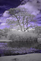
at the lake 2by danica22Comment by PHOTOKID: I like the tilt also, works well as a lead in. The composition isnt as strong in this photo as in the other IR, but the tonal diferences of the entire photo make up for it, tonals are almost like candy for the eye. You should try and extended IR of a river. I wonder what that would look like. Might be a fun experiment. Keep shooting.
Rich |
| Photographer found comment helpful. |
| 09/26/2006 07:39:06 AM |
At the lakeby danica22Comment by PHOTOKID: I like the surreal feeling you get from the IR, I like the purples and the toning that it does. I like your composition in this one as well. Having some of the water to reflect the sky works well here with the water being so calm.
Rich |
| Photographer found comment helpful. |
Home -
Challenges -
Community -
League -
Photos -
Cameras -
Lenses -
Learn -
Prints! -
Help -
Terms of Use -
Privacy -
Top ^
DPChallenge, and website content and design, Copyright © 2001-2024 Challenging Technologies, LLC.
All digital photo copyrights belong to the photographers and may not be used without permission.
Current Server Time: 04/25/2024 10:03:39 AM EDT.