| Image |
Comment |
| 11/11/2002 01:43:00 PM |
Apparition From The Pastby ChaszmyrComment: Good idea and effective use of colour. I think perhaps cropping the shot with the keys at more of an angle would have added something to the final composition? Also, on my monitor the shadow on the bottom left-hand edge of the central key is a little too dark and hence distracting (but that's probably my monitor so not affecting the score). |
| 11/11/2002 01:53:00 PM |
|
 Photographer found comment helpful. Photographer found comment helpful. |
| 11/11/2002 02:07:00 PM |
|
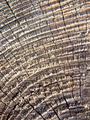
| 11/11/2002 01:37:00 PM |
Annular Ringsby MaYzComment: Nice use of light and a good treatment of the subject. It is just a *little* bit dull for my personal taste, though - perhaps boosting the saturation slightly (nothing ridiculous) would help? But technically spot-on. |
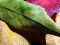
| 11/11/2002 01:51:00 PM |
Autumnby fsieradzkiComment: Really great colours here, and the extreme close-up definitely adds something to the idea of a "leaves" shot - the textures are really made into a feature. Well done. |
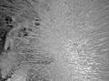
| 11/11/2002 01:32:00 PM |
iceby hedonistComment: Good idea. I'd have liked to see this in colour (with a coloured light, maybe?). |
| 11/11/2002 02:16:00 PM |
|
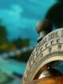
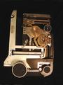
| 11/11/2002 01:21:00 PM |
Partsby DigipixerComment: Something about the composition on this bothers me ... possibly that it's not straight but isn't at enough of an angle to look "deliberately not straight"? Or possibly that the overall shape isn't interesting enough to justify the negative space framing against the black background, but is distracting enough to divert attention away from some of the interesting details in the shot? I think the shot might have been improved by moving in/cropping in closer on a detail section (depending on what your camera features and resolution are like, of course). Sorry this is a bit rambling - I've decided that this week I'm never going to manage to vote on all the entries, so I'm trying to leave detailed comments on the ones that I *do* get to. |
| Photographer found comment helpful. |
| 11/11/2002 01:28:00 PM |
Bootby DazzermasComment: An interesting shot. I find the slightly-out-of-focus background elements a bit distracting - the depth of field is too large to put them right out of focus and they're busy enough that there's quite a lot of detail there to draw the eye away from the focal point. A very inventive choice of subject, though. |
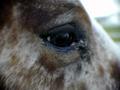
| 11/11/2002 01:25:00 PM |
Eye See Youby scottmattinglyComment: I think that the lighting conditions under which you were shooting haven't done you any favours here... the area around the eye, which is in focus and so should be the centre of attention, is very dark compared with the rest of the image, which is out of focus. Maybe cropping in tighter and then tweaking brightness/contrast would have helped (depending on how many pixels you had to play with, of course)? |
| Photographer found comment helpful. |
Home -
Challenges -
Community -
League -
Photos -
Cameras -
Lenses -
Learn -
Prints! -
Help -
Terms of Use -
Privacy -
Top ^
DPChallenge, and website content and design, Copyright © 2001-2024 Challenging Technologies, LLC.
All digital photo copyrights belong to the photographers and may not be used without permission.
Current Server Time: 04/25/2024 04:54:48 PM EDT.