| Image |
Comment |
| 07/27/2005 07:23:53 PM |
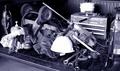
Blue Collarby hideoutComment: 7 - I like the toning of this one. I don't like the hard hat as it appears as a big white spot in the middle of the shot and is rather distracting. |
 Photographer found comment helpful. Photographer found comment helpful. |
| 07/27/2005 07:10:43 PM |
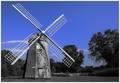
Weatheredby JayWalkComment: 6 - I don't like the effect of the black & white against electric blue sky at all, however, it is a very nice composition. |
| Photographer found comment helpful. |
| 07/27/2005 07:05:27 PM |
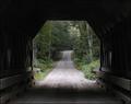
the covered bridgeby U622Comment: 6 - This is a nice shot and I like the framing, but I would like to see more of the inside of the bridge. Perhaps a flash could have helped. |
| Photographer found comment helpful. |
| 07/27/2005 07:02:38 PM |
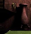
Still Life in Wood #1 Desk & Vaseby lytaComment: 4 - The shot is a little soft for my taste. I like all the various textures of the wood, but I would definitely crop the green thing from the bottom as it is very distracting. |
| Photographer found comment helpful. |
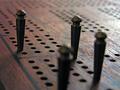
| 07/27/2005 06:51:29 PM |
Cribbageby LadeeMComment: 7 - I like the shallow depth of field on this one, but at the same time I find the blurry peg front and center to be distracting. |
| Photographer found comment helpful. |
| 07/27/2005 06:39:19 PM |
An Old Rugged Crossby kmbr2001Comment: 6 - I like th toning very much, but the shot just seems to be missing something. Also, I would have cloned out the speck just to the left of the cross. |
| Photographer found comment helpful. |
| 07/06/2005 11:49:03 AM |
Kiss Meby jab119Comment: 9 - The eyes have it. This shot is just striking. |
| Photographer found comment helpful. |
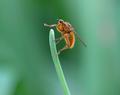
| 07/06/2005 11:48:27 AM |
Hairy Little Buggerby Judith PolakoffComment: 8 - This shot is very good. The only thing that I would change is the composition. I would crop some off the right so the subject was on the thirds line instead of centered. Still a great capture. |
| Photographer found comment helpful. |
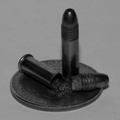
| 07/06/2005 11:46:19 AM |
.22 Caliberby LesleyNelsonComment: 4 - This shot is just too dark. Bumping up the contrast to bring out the details might help, but it may just be in need of better lighting. |
| Photographer found comment helpful. |
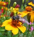
| 07/06/2005 11:34:39 AM |
B's Dinerby barbaraanneComment: 7 - I love the composition, the bright colors, and even the little spider. I would just like to see sharper focus on the bee, especially around the head. |
| Photographer found comment helpful. |
Home -
Challenges -
Community -
League -
Photos -
Cameras -
Lenses -
Learn -
Prints! -
Help -
Terms of Use -
Privacy -
Top ^
DPChallenge, and website content and design, Copyright © 2001-2024 Challenging Technologies, LLC.
All digital photo copyrights belong to the photographers and may not be used without permission.
Current Server Time: 04/23/2024 01:07:13 PM EDT.