| Image |
Comment |
| 01/05/2006 10:12:18 AM |
grass and water, drawing shapesby thehitterComment: I really like this type of shot with the grass, water, and reflections. The composition is beautiful. I don't, however, like the diffused look. It make the grass look too soft. It is also just a little grey for my taste. |
 Photographer found comment helpful. Photographer found comment helpful. |
| 01/05/2006 10:09:20 AM |
Shape in timeby marcelliebComment: Small images are very hard to judge. This one just looks a little too cluttered. |
| Photographer found comment helpful. |
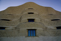
| 01/05/2006 10:08:22 AM |
Civilization Buildingby Steveo77zComment: I like the composition, the shapes in this building, and the bright blue reflections in the lower window but the lighting isn't great. Perhaps shooting at a different time of day with the sun at a better angle would help. |
| Photographer found comment helpful. |
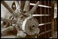
| 01/04/2006 05:17:11 PM |
CDustby boricua_eyeComment: Larger images are easier to judge. I like the composition on this one and the black and white works, but it is hard to tell if the focus is sharp at this size. |
| Photographer found comment helpful. |
| 01/04/2006 05:12:09 PM |
|
| Photographer found comment helpful. |
| 01/04/2006 05:10:05 PM |
Guitarby ElaineComment: It's a nice, strong shape, but the toning really doesn't work for me. |
| Photographer found comment helpful. |
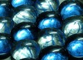
| 01/04/2006 05:09:16 PM |
Crowded Marblesby SpitfyrComment: This one could be sharper and the reflections are a little too harsh. I would like to see more of the pattern in the glass and less of the reflections. |
| Photographer found comment helpful. |
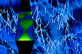
| 01/04/2006 05:07:31 PM |
Amorphous Moodby strangeghostComment: I really like the contrast between the smooth shape of the 'lava' and the jaggy lightning. There is something about this shot though, perhaps the focus is a little soft, that keeps me from saying 'Wow!' - 6 |
| Photographer found comment helpful. |
| 01/04/2006 05:04:14 PM |
derranged seatingby Bus352Comment: This one is a little dark. I think lightening it a little would show the contrasting textures more. |
| Photographer found comment helpful. |
| 01/04/2006 05:03:26 PM |
toddler geometry 101by hexnymphComment: I think this would be a better shot in color. Kids toys tend to have lots of bright colors with strong contrast (like the yellow, red, and blue of this one). In black and white, this looks rather dull. Also, all the shapes are cropped. I think the composition would be stronger if you had at least one complete shape. |
| Photographer found comment helpful. |
Home -
Challenges -
Community -
League -
Photos -
Cameras -
Lenses -
Learn -
Prints! -
Help -
Terms of Use -
Privacy -
Top ^
DPChallenge, and website content and design, Copyright © 2001-2024 Challenging Technologies, LLC.
All digital photo copyrights belong to the photographers and may not be used without permission.
Current Server Time: 04/25/2024 08:43:22 AM EDT.