|
|
| Image |
Comment |
| 12/19/2005 06:01:59 PM | Impact?by nico_blueComment: Greetings from the Critique Club! : )
First impression upon viewing this image: "gee, he looks so calm for being about to get hit on the head with a soccer ball!"
In terms of composition, I like the position of your subject in the frame, I like how the soccer ball is cut off, I love the eyes...how they're looking up for the ball. I think that previous comments about the static feel of the image are accurate, though. I wonder how a longer exposure would have turned out...adding some motion to the ball descending. I also wonder how a different expression would have worked on the model's face...that anticipation for impact. The background works well, and gives the impression of the shot being taken outdoors.
The lighting also implies that the image was taken outdoors...nicely achieved! I wonder how this would have looked with a bit of fill light or bounce for the left side of the image...just to soften those shadows just a bit.
Another thing that keeps demanding my attention is the size and position of the soccer ball. It appears to be behind the subject's head. If the ball were positioned over or slightly in front of the subject's head, the ball would appear to be more in scale with the subject. But then, you'd probably have some shadow issues which would require some lighting changes, and that could be a pain, too. I do think that the ball coming more from in front would made this image more powerful. That, and the facial expression.
It's not a long critique, but I hope this information is helpful! If you have any questions or comments regarding this post, please feel free to PM me!
Cheers to you, and see you 'round the site,
Jeannel |  Photographer found comment helpful. Photographer found comment helpful. |
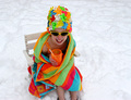
| 12/19/2005 05:24:00 PM | Who!!!! Says Its Too Late!! by cheegirlComment: Greetings from the Critique Club! : )
Congrats on the ribbon for this image. It's clear from the many comments you received that it's a real crowd pleaser in its colors and fun idea. Here are some of my observations, and I hope that they are helpful!
My initial thought upon viewing this image was: "Wow! What awesome colors! What a great contrast against the snow."
In terms of composition, there are a few things that make me go "hmmm." (And it's not about rules of thirds or cutting off feet...rules are to be applied when they work and broken when they don't, imho.) One thing I wonder about is "where's the pool?" Is the subject just sitting in a field of snow, is she supposed to be sitting next to something pool-related? The other thing I keep returning to (related) is the angle of her head. She's not looking at the camera from her head position, so what is she looking at? That pool element I was wondering about earlier? It makes me wonder what I'm missing...the way she's looking and grinning.
I love the way you were able to capture the vividness of the colors, along with the whiteness and DETAIL in the snow. You are to be congratulated for that. The snow adds some great texture to the image, and the choice of props (flower cap, towel, cup and straw) work very well. I like the choice of focus, allowing all that detail to shine.
With regard to the challenge, I thought it was a "too early" entry until I looked at the topic. This picture works well either way, imo.
What more can I say? The members have already spoken with their votes, and it's well-deserved. The image is vivid, energetic, creative, it makes me smile. Why didn't it blue? Voter capriciousness is my guess.
Congrats again on the ribbon, and especially for capturing such a novel and creative image for the challenge.
If you have any questions or comments about this critique, please feel free to send me a PM.
Cheers, and keep shooting!
Jeannel
| | Photographer found comment helpful. |
| 12/14/2005 05:38:52 PM | | | Photographer found comment helpful. |
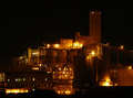
| 12/13/2005 05:59:23 PM | Feel the Powerby AzCKellyComment: Greetings from the critique club! : )
Initial impression upon viewing: "love the light...where's the rest of that tower, though?"
In terms of composition, the image works well for my eye. I like the rise that the tower provides, and the angle back down in the right third of the frame. The lines and lights provide visual interest and energy to the image. The one thing that bothers me when looking at the composition is the almost-disappearing of the electrical tower in the left third of the frame. My eye keeps wanting to either make the tower appear as whole against the building and night sky, or recompose the shot so that the tower is in a less conflicted spot, visually.
I think the focus looks good...the sharpen application worked well with this image. In terms of lighting, that's what really sells this image. Actually, the combination of that wonderful warm glow juxtaposed against the cluster of industrial shapes. There's a spot in the lower left corner of the image that appears to have an odd lighting blur by the office windows...with actually a slightly greenish cast on my monitor...that is a bit distracting to my eye as well. I think the length of your exposure worked well--it gives a warm, almost firey glow to the shot. There are points in the lights that are blown out as a result of the longer exposure (which, around here, some folks may have scored you lower for). Did you experiment with shorter exposures? You may have and decided that the visual effect was stronger with the longer exposure.
In general, I think that this image was a great choice for the "Industrial" challenge. The industrial lines, rich night sky and warm lights combine to make a visually appealing image.
I hope this information is helpful. If you have any questions/feedback about this critique, please feel free to send me a PM.
Cheers to you, and keep shooting! : )
Jeannel | | Photographer found comment helpful. |
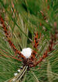
| 12/12/2005 04:35:24 PM | Natural Forkby pidgeComment: Hi Pidge, and Greetings from the Critique Club! : )
My first impression upon viewing this image was "cool colors! Too bad the needles are so blurry."
On to the critique: I like the placement of the base of the fork with the bit of snow in the lower third of the frame. It anchors the image and allows the prongs of your fork to display fairly well. The colors are nice and rich, with the browns, greens and white. The natural light plays those colors well in this image. I also like the contrast in texture between the branck and snow. The placement of the rightmost prong is problematic because of what it does to your focus (with those distracting blurred needles), and I wonder if a slightly different angle for the shot was available so that the focus could be more balanced amongst the fork prongs. The slight change in angle may also have allowed more of the "handle" of your fork to display from behind the needles that currently hide it (and would help some viewers see your natural fork more clearly). The needles spraying away from the bit of snow makes for an energetic and interesting composition, to my eye.
Since the image was submitted for an advanced editing challenge, I would have liked to see some of those distracting needles edited out (in particular, the needles in the lower right corner of the shot). This would limit the blur to the top third of the photo or so, and may help balance out the overall image.
Overall, I like this image. Outside of the blur issue, the colors, pattern of the needles, and bit of snow really make it work for me. The natural fork of the tree branch stands out to my eye, so I would have considered this as meeting the challenge. Congrats on a creative take on knife/fork/spoon! If you have any questions about this critique, please feel free to PM me.
Cheers,
Jeannel | | Photographer found comment helpful. |
| 12/11/2005 12:23:48 PM | Too early for Wimbledon?by rvigoComment: my absolute favorite for this challenge! congratulations on such a creative idea, well executed. i love the detail in the early strawberry and the energy in the splash. the top of the glass could use a hair more definition for my taste (e.g. the glass rim disappears at points), but you have achieved quite a striking image! good luck to you!!
jeannel | | Photographer found comment helpful. |
| 12/08/2005 09:50:36 AM | | | Photographer found comment helpful. |
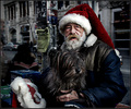
| 12/08/2005 09:49:38 AM | Street Santaby Joey LawrenceComment: this was one of my absolute favorites of the challenge. you rock, joey! great job!
Jeannel | | Photographer found comment helpful. |
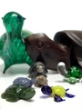
| 12/06/2005 09:23:34 PM | Turtlesby KivetComment: i love turtles! : )
i like how you've varied the height and size of the turtles in this composition, but would have liked to see either wider focus or the focus be on only one turtle, just for additional visual impact. looks like you have a cool collection! | | Photographer found comment helpful. |
| 12/06/2005 09:23:30 PM | Collecting Christmasby KarenNfldComment: these ornaments look really interesting in b&w, and they appear to float against the background. a very cool picture. | | Photographer found comment helpful. |
Home -
Challenges -
Community -
League -
Photos -
Cameras -
Lenses -
Learn -
Prints! -
Help -
Terms of Use -
Privacy -
Top ^
DPChallenge, and website content and design, Copyright © 2001-2024 Challenging Technologies, LLC.
All digital photo copyrights belong to the photographers and may not be used without permission.
Current Server Time: 04/23/2024 01:14:26 PM EDT.
|