| Image |
Comment |
| 07/31/2006 03:00:25 AM |
Gold Dust Womanby KelliComment: Trading post Comment
I've read your "Perils of Pauline" explanation of this shot. I'm not sure I blame your daughter...she's a saint. When voting I didn't think the gold was working (now I know why), but I thought your daughter's expression was cute...so I didn't vote too harshly. 5. (Next time use her in a photo that won't cover her face...she'll probably appreciate it and you'll probably score higher.
|
 Photographer found comment helpful. Photographer found comment helpful. |
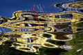
| 07/31/2006 02:53:19 AM |
Liquid Goldby MelethiaComment: What I liked about this image is your creativity and the overall design of the photo. Despite the obvious effects of reflections in water, the shot is clear and technically well made. I scored this a 5 and struggled to rate it higher. However on my monitor the building looks yellow to beige rather than gold. (I hope it's not my monitor. I don't think it is because calibration information suggests it's ok.) In the end, I stuck with 5 because I liked the image but felt it wasn't really "gold". (no DNMC, just a shade off.) |
| Photographer found comment helpful. |
| 07/31/2006 02:46:11 AM |
Goldschlagerby timfythetooComment: What I liked about this photo was the lighting and the perspective. The bottom up view made this look like a advertisement photo. It is clear and well lit. What I was not so wild about was the slim link to "Gold" - the word is there and a bit of the color, but not enough for me to really appreciate the link. That said, I scored it a 6 and would have scored it higher if I thought the color was better represented. |
| Photographer found comment helpful. |
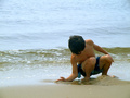
| 07/30/2006 02:39:00 PM |
A moment in timeby KelliComment: Trading post Comment
This is a beautiful photo, capturing the moment very well. The exposure is right on. The composition works too...nice placement of the boy within the photo. Colors are good...pastel water does not compete for attention with the primary subject of the photo. The simplicity of this photo is very appealing. All in all I would have to say this is my favorite shot of all photos you have produced. The average commenters score of 7.571 is a fairer score than the average all users score IMHO. Well done. |
| Photographer found comment helpful. |
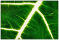
| 07/30/2006 02:29:17 PM |
Vein of Lifeby ericwooComment: Trading post Comment
I like the green portion of the leaf and the many small veins. Unfortunately, the brilliance of the main vein is overpowering. It's too blinding IMHO and works against the rest of the image. I also wonder if you could have toned down the noise in the green area. You don't indicate what post processing you performed, but I think running the image through the NeatImage plug-in would have taken care of that. There is potential here...but the focus should be on the green, not the white, portions of the photo. |
| Photographer found comment helpful. |
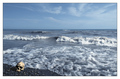
| 07/30/2006 02:18:35 PM |
Landfallby LouisComment: Trading Post Comment
Macabre photo executed well. (Not your everyday item found on the beach.) It's the idea that makes this photo...the technical aspects are very good (especially the sea foam)...but the idea is very creative. Congrats on your high finish. |
| Photographer found comment helpful. |
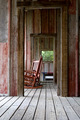
| 07/30/2006 02:07:34 PM |
Relaxing Linesby MelethiaComment: My first reaction when viewing this photo is that it should place high in this challenge. My second thought was that there was so much going on in this shot that DPC voters might not appreciate it. I am glad to see that my first thought was accurate.
I love the colors and the floor boards most. I also think the rustic subject matter adds much charm. The whole photo is excellent, the way various lines work together. The lighting is also perfect.
|
| Photographer found comment helpful. |
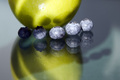
| 07/30/2006 01:54:09 PM |
Abstrappleberryby MelethiaComment: Trading Post Comment
I am afraid I am not a fan of this shot (although I like the quad quite a bit) because the lighting seems a bit blown out on a couple of the blueberries and the focus is not real sharp on the apple. Then there are the white marks on the table (which I assume could have been cleaned off before the shot was taken). I always like your work, but this one looks like something I might have done... ;-P |
| Photographer found comment helpful. |
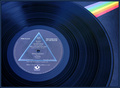
| 07/30/2006 01:42:49 PM |
Lines of Extinctionby timfythetooComment: Trading Post Comment
Great album. I like everything about this picture except the rainbow stripe. While lines is the theme, I think the unity of lines in the album was enough to carry this shot...it almost looks like you were unsure people would accept the lines in the album and on the label so you added a rainbow to satisfy the DNMC crowd. Without the rainbow you get simplicity and harmonious color tones. IMHO this photo is about the album; the rainbow competes for attention. Other than that, I think this is a terrific shot...and I would have scored this higher than most people did. |
| Photographer found comment helpful. |
| 07/30/2006 01:33:30 PM |
Fanby timfythetooComment: Trading Post Comment
Great use of complementary colors and composition. Suits the challenge very well. It seems to me, though, the lighting is so even that the zucchini appears to be two-dimensional. It's almost as if you are making a photo of a photo. (...not that there's anything wrong with that.) I like the crop and the proportions of paper, plate and food. As an abstract this does very well (of course as a top 10 you already knew that). The only thing this photo lacks is the dip. Mmmmmmmmm, delicious.
(I checked Ranier out. I agree with your assessment.) |
| Photographer found comment helpful. |
Home -
Challenges -
Community -
League -
Photos -
Cameras -
Lenses -
Learn -
Help -
Terms of Use -
Privacy -
Top ^
DPChallenge, and website content and design, Copyright © 2001-2025 Challenging Technologies, LLC.
All digital photo copyrights belong to the photographers and may not be used without permission.
Current Server Time: 08/06/2025 03:59:30 PM EDT.