| Image |
Comment |
| 12/16/2002 10:20:25 PM |
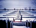
Marina in Decemberby MorganComment: ...from Critique Club...
Hi Michael
FIRST IMPRESSION:
Nice...very nice.
COMPOSITION:
Kill the bottom third of the photo...that's all, IMHO. I think that the stair railing not being symmetric like the rest of the photo really ruins it. It's too bad that the stairs don't line up with the pier leading into the water. (Is this by Ontario Place or Harbourfront?? I'd like to know...so I can have a shot at this setup :)
TECHNICAL:
Focus is great. I like how you used DOF to try and eliminate the railings. Lighting is nice and even...perhaps a bit overexposed in the middle, to the left of the 'E'. :)
ARTISTIC:
Michael, I think this is an awesome scene to shoot. I love the colors, the branches peeking from the sides. The mood is very nice. :)
OVERALL:
If it weren't for the railings on the foreground, I would say this is a perfect shot.
Best of luck in the future. Don't hesitate to PM me if you have any questions about this critique.
Cheers...zadore. |
 Photographer found comment helpful. Photographer found comment helpful. |
| 12/16/2002 09:57:09 PM |
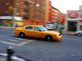
taxi!by tomzinhoComment: ...from Critique Club...
Hi Tom
FIRST IMPRESSION:
Very nice. :)
COMPOSITION:
A bit centered, but it works. It could be that a bit more space in front of the car would give it 'room to drive into'. I am not sure about the car seeming to be going 'downhill' :|
TECHNICAL:
Perfect. The focus on the car is very nice. Your panning technique worked nicely (even though the car is a tad blurred :) I wonder if bit longer exposure would get a better effect...hard to do if you are doing it hand held. :)
ARTISTIC:
Tom, I must admin that this is not an original shot, IMO. BUT...I think you did a better job than most would. The colour of the cab contrasting with the 'blueish' road works nicely.
OVERALL:
A strong image that could easily appear in an ad for 'Crazy NY taxi drivers....glad to see a nice finish of a photo taken with the same camera as mine :)
Best of luck in the future. Don't hesitate to PM me if you have any questions about this critique.
Cheers...zadore. |
| Photographer found comment helpful. |
| 12/16/2002 08:46:03 PM |
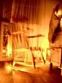
ROCKING CHAIRby howzaComment: ...from Critique Club...
Hi Alan
FIRST IMPRESSION:
Freaky!! I like it!
COMPOSITION:
Perhaps the weakest point of the photo. There seems to be too much stuff in the frame distracting from the main subject..'da chair' (still freakin' me out). The shot also doesn't seem to be leveled. The lamp reflection is the biggest distraction though. :(
TECHNICAL:
Good. I don't mind the 'brightness' of the shot as it sure sets the 'freaky' mood. Focus is good...just by looking at the floor. But that lamp, Alan...it's gotta go. :|
ARTISTIC:
Awesome. It sure is an original shot. The tones you used and the harsh lighting make this a creative shot, IMO....and that chair is still freakin me out..I swear, it's moving on the screen. :)
OVERALL:
Very cool idea which could be improved by 'removing' alot of the useless elements...IMO. :))
Best of luck in the future. Don't hesitate to PM me if you have any questions about this critique.
Cheers...zadore. |
| Photographer found comment helpful. |
| 12/14/2002 01:29:55 AM |
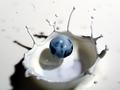
Blueberry Splash by JackoComment: ...from Critique Club...
Hi Jacko (fellow Canuck)
FIRST IMPRESSION:
WOW with a capital Wh!
COMPOSITION:
Jacko, I think it works nicely. The elements all come together in the frame and keep the shot very balanced as they are. I wonder what it would have looked like if there was a bit more of the image on the bottom. :)
TECHNICAL:
Great. Focus is good on the BBerry. The directional lighting is superb and I love how it creates the shadows. :)
ARTISTIC:
This is where you take the cake, buddy. This is simply incredible. Great patience to create this shot. I would not even attempt it. :)
OVERALL:
Deserving of first place? Sure! This is one of the few 'WOW' shots one comes across here on DPChallenge.
CONGRATULATIONS FROM THE CRITIQUE CLUB!
Cheers. |
| Photographer found comment helpful. |
| 12/14/2002 01:21:38 AM |
abstract blueby shutterflyComment: ...from Critique Club...
Hi Wendy
FIRST IMPRESSION:
Good gosh, where is this suppose to be inserted into??? :)
COMPOSITION:
Awesome! No matter where you look first, you end up following every curve on this 'probe'. :)
TECHNICAL:
I would have prefered for the tip to be in focus, but it still works nicely this way. Lighting really brings out the shapes. Very nice. :)
ARTISTIC:
Meet the challenge? Duh!...of course. Interesting subject? Well, if I don't know what it is, then it sure is interesting. :)
OVERALL:
Great shot. Works well with the white background. I didn't get to vote on your photo, but if I had, I'd give it a strong 9.
Cheers. |
| Photographer found comment helpful. |
| 12/14/2002 01:07:31 AM |
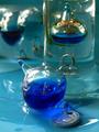
Left out, feeling Blueby gerardComment: ...from Critique Club...
Hi Gerard
FIRST IMPRESSION:
Cool...looks liquid. :)
COMPOSITION:
I think the composition could be a bit better. There is so much going on on the photo, that it's hard to focus on one thing only. Eliminating some elements, or shooting at a different angle could help. :|
TECHNICAL:
Pretty good. I think a bit more DOF could help...especially for those who don't quite know what they're looking at. Focus on the front 'ball' is good, and I guess that is what you wanted. I guess you used whatever lighting was available, the problem, I find is that it reflects quite a bit off the glass. :(
ARTISTIC:
Awesome. I think you picked out a very interesting subject whose physical properties make it almost liquid like. I love the shapes and sofness of the shot. :)
OVERALL:
I would love to have one of these so I could shoot a ton of shots. I think you would be suprised at the potential of this subject...especially using the colors you have chosen for this one.
Cheers. |
| Photographer found comment helpful. |
| 12/01/2002 09:51:00 AM |
|
| Photographer found comment helpful. |
| 12/01/2002 09:48:00 AM |
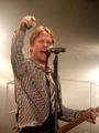
Come Party with Meby CreativeFlyPhotoComment: Perfect timing...like how you 'blurred' out the bg...lighting iis very nice, comp wise you could have gotten a bit more of the guitar....9 zadore |
| Photographer found comment helpful. |
| 12/01/2002 09:37:00 AM |
|
| Photographer found comment helpful. |
| 12/01/2002 09:52:00 AM |
Street Child and his Dogsby andrewmComment: really like this photo...the way you are showing this kid's connection to his dogs works beautifully...something odd with the way you framed it though :) |
| Photographer found comment helpful. |
Home -
Challenges -
Community -
League -
Photos -
Cameras -
Lenses -
Learn -
Prints! -
Help -
Terms of Use -
Privacy -
Top ^
DPChallenge, and website content and design, Copyright © 2001-2024 Challenging Technologies, LLC.
All digital photo copyrights belong to the photographers and may not be used without permission.
Current Server Time: 04/25/2024 08:13:38 AM EDT.