| Image |
Comment |
| 08/22/2005 02:03:29 AM |
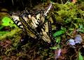
Butterfly Orgyby SJCarterComment: A bewildering array of colors and objects makes for a chaotic scene, though this may be what you were trying to convey. The rarity of such a collection gives it interest, but the chaos leaves me unsure of what exactly I should be looking at, costing it a point. The choice of a wide aperture leaves both the far and near butterflies slightly out of focus, and grates on the sense a bit. Since the upper left is already dark, I would have burned it out to get rid of the hanging bits of vegetation.
Challenge scoring:
Relevance: 5
Technical: -1
Interest: +1
Emotion: +0
Bias: +0
Total: 5 |
 Photographer found comment helpful. Photographer found comment helpful. |
| 08/19/2005 01:01:05 AM |
stepping awayby armelleComment: Originally posted by armelle:
Zed Pobre: I do like your color rendition! I'll have to try your steps later tonight (although I don't know if Elements has 'selective color' and smart sharpen?). BTW, the figure was some stranger in the distance and I think he was wearing a backpack :) |
Hrm. It probably doesn't have Smart Sharpen, since that's new to CS2. You can buy a plugin called Focus Magic that does pretty much exactly the same thing, though. I don't know if Elements has a Selective Color layer, but that's probably my most commonly used adjustment after Shadow/Highlight. You might be able to get some similar effects out of Hue/Sat, but it's nowhere near as precise. |
| Photographer found comment helpful. |
| 08/18/2005 09:29:23 PM |
stepping awayby armelleComment: I've put together my own color rendition of this (I hope you don't mind):

Steps are in the image description. This may just be a matter of differing taste, however. |
| Photographer found comment helpful. |
| 08/18/2005 09:10:11 PM |
re-edited-horse.jpgby sheapodComment: Much better looking, the best of the three, I think. He (she?) looks cheerful. My only complaint is that now the scene seems a little dark. Do you have a Selective Color adjustment in whatever you're using? Try pulling some black out of the red and yellow channels to lighten up the browns without blowing the whites. |
| Photographer found comment helpful. |
| 08/18/2005 05:54:30 PM |
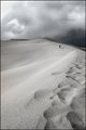
stepping awayby armelleComment: I much prefer the original to this version, but I think that's because there isn't anything particularly compelling about the image as it stands to warrant the loss of color. The heavy white blown area in the upper left doesn't seem to be present in the original, so I can only attribute it to overdodging. One thing the shift did do is bring out the arcs in the sand on the upper left, but I suspect contrast adjustment might have done that in color as well. I may comment again later tonight after I've had a chance to play with this.
As a composition note unrelated to exposure, the posture of the figure in the distance is odd and hunched, which detracts a bit from the mood. Otherwise, the composition is excellent, with the ridgeline drawing the eye nicely into the distance and up to the clouds. |
| Photographer found comment helpful. |
| 08/18/2005 03:52:43 PM |
Edited-small.jpgby TallblokeComment: The basic exposure looks good. I'm not a fan of the overburned sky look, with the visible dark/light shifts and the upper left corner in particular looking very unreal to me. I prefer using the shadow/highlight tool to a burn brush when emphasizing a sky to make sure the colorization stays even. On the other hand, this is a very popular look among DPC voters, so don't mind my gritching too much.
There's nothing else to complain about. |
| Photographer found comment helpful. |
| 08/18/2005 01:33:05 AM |
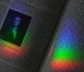
1666by pinotkenComment: I suspect the problem was that you forced the voters to read. Remember, you get only about three seconds from the average viewer, even if you do highlight the exact text they need. This got a 9 from me at the time, though in protest over the poorly designed challenge description, I didn't comment on anything.
My breakdown:
Relevance: 5
Technical: +1 (flawless highlighting of "each color is refracted by the prism" across three refracted colors gets you one of my very rare technical bonuses)
Interest: +2
Emotion: +0
Bias: +1 (I like anything that promotes science)
|
| Photographer found comment helpful. |
| 05/25/2005 02:55:11 PM |
Sexy Sandby rscorpComment: The use of sex appeal here actually fits the photo. It works well as a duotone.
Base: 5
Technical: +0
Interest: +2
Emotion: +0
Bias: +0
Total: 7 |
| Photographer found comment helpful. |
| 05/25/2005 02:53:10 PM |
A Salty Breezeby J_EhratComment: An interesting, but unnatural-looking shot. The constrast between the surreal sharpness of the grains and the blur of the face bothers me.
Base: 5
Technical: +0
Interest: +1
Emotion: +0
Bias: +0
Total: 6 |
| Photographer found comment helpful. |
| 05/25/2005 02:45:04 PM |
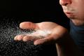
what eating rocks will get youby myceliumComment: Interesting colors, and a very disturbing grin. Sand flecks seem slightly out of focus, though the hair is sharp, making me wonder if the aperture was set very wide.
Base: 5
Technical: +0
Interest: +2
Emotion: +1
Bias: +0
Total: 8 |
| Photographer found comment helpful. |
Home -
Challenges -
Community -
League -
Photos -
Cameras -
Lenses -
Learn -
Prints! -
Help -
Terms of Use -
Privacy -
Top ^
DPChallenge, and website content and design, Copyright © 2001-2024 Challenging Technologies, LLC.
All digital photo copyrights belong to the photographers and may not be used without permission.
Current Server Time: 04/19/2024 09:01:11 PM EDT.