| Image |
Comment |
| 04/30/2005 11:27:04 PM |
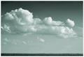
Soaring in the heavensby snackwellsComment: For me this could have been improved by cropping the bottom. Just my opinion and obviously you have intentionally chosen to leave it in (photography is so subjective...), but otherwise I love the tones in the upper portion of the frame. |
 Photographer found comment helpful. Photographer found comment helpful. |
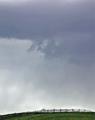
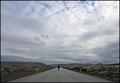
| 04/28/2005 11:49:52 PM |
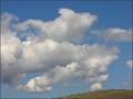
Glassford Hillby justineComment: There was another similar entry to this and I will say the same thing: I think the image could have been enhanced with a subject on the hill such as a person, horse, building etc. I do like the cloud formations and the colour in the sky. |
| Photographer found comment helpful. |
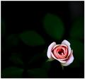
| 04/28/2005 11:46:52 PM |
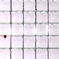
Thicker than Waterby conglettComment: Nice idea. The blown out highlights concern me. I would have preferred to see the blood droplet completely framed - perhaps it was intentional to crop off the left wire - just a personal preference. Overall an solid entry for this challange in my view. |
| Photographer found comment helpful. |
| 04/28/2005 11:42:17 PM |
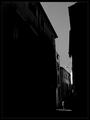
Brief encounterby jjbeguinComment: I like this a lot. Perhaps would have considered cropping more off the top, but then you would have lost some of the sense of hight which is an appealing factor. Well done - one of the better entries I have come across so far. |
| Photographer found comment helpful. |
| 04/28/2005 04:40:46 AM |
Boundariesby dahkotaComment: IMO a subject such as a horse in the bottom right would have turned a good image into a great one. |
| Photographer found comment helpful. |
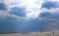
| 04/28/2005 04:38:43 AM |
Out of Wall St.by charmayneComment: I like the lighting and the wind on the sand. The only suggestion I would make would be to crop out the top of the frame as the highlights and the blue sky detracts from an otherwise dark and ominous feel. Overall a very solid entry and deservard of a good placing. |
| Photographer found comment helpful. |
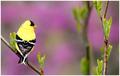
| 04/28/2005 04:33:51 AM |
Springby elsapoComment: Great image. Nice tone and texture. You deserve to place very high with this entry. |
| Photographer found comment helpful. |
| 04/28/2005 04:32:06 AM |
|
| Photographer found comment helpful. |
| 04/28/2005 04:30:26 AM |
|
| Photographer found comment helpful. |
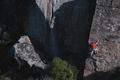
| 04/28/2005 04:29:11 AM |
The Climberby grahampComment: Good shot. IMO it would have served you even better to wait until he was higher than the tree line - the tree tops create a reference point that detracts from the sense of scale. On the plus side I like that there is no reference point at the top. I would suggest cropping out the highlights on the left too. Overall I like this idea... |
| Photographer found comment helpful. |
Home -
Challenges -
Community -
League -
Photos -
Cameras -
Lenses -
Learn -
Prints! -
Help -
Terms of Use -
Privacy -
Top ^
DPChallenge, and website content and design, Copyright © 2001-2024 Challenging Technologies, LLC.
All digital photo copyrights belong to the photographers and may not be used without permission.
Current Server Time: 04/19/2024 01:13:31 AM EDT.