| Image |
Comment |
| 12/19/2002 09:40:22 AM |
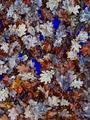
Empty pool autumn bluesby jjbeguinComment by jimmsp: Critique Club Critique
(1) COMPOSITION (CONTENT) - At first appearance, seems very busy. My eye tends to wander around quite a bit. I seem to be looking for your subject. It�s not until later that I realize the whole canvas is your subject, at least to me. I don�t like the two horizontal lines across the picture, though they are mostly covered; a minor distraction.
(2) BACKGROUND � See comment above. I�m not sure what is the background is, and what the main subject is. It�s hard for me to call the leaves the background
(3) CAMERA WORK ,TECHNICAL � Very good for what you intended. Focus is dead on.
(4) DIGITAL PROCESSING ,TECHNICAL � At first glance, it appears you over saturated the blues. The material under the leaves is too blue for my tastes (I know the challenge is �blue�). But you probably needed to do that to get the blue in the leaves.
(5) MY OPINION ON THE PHOTO � Overall, pretty good, an �artsy� photo, tending to the abstract. I like it. I think it could have been a much better abstract if you had played with the focus some, shooting the leaves well out of focus. Then the over saturated blues would have worked better. It may not have scored better, as the majority of voters here don�t appreciate abstract photos, but I think you may have been happier with it.
Jim msp
|
 Photographer found comment helpful. Photographer found comment helpful. |
| 12/18/2002 12:45:43 AM |
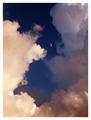
From a distance anyway.by jjbeguinComment by smellyfish1002: I love cloud shots (in fact, my entry is a cloud shot this challenge). I really like the composition here, and the moon in the center is a huge bonus, and actually 'makes' the shot! I see some red/purple/green/bluish artifacts in the midtones and in the blues of the sky. This is a tough situation to get rid of, especially with the 'no spot-editing' rule. The best I have been able to do is desaturate the reds, greens, and magentas, and to lower the saturation on the yellows (not all the way). I then run the despeckle filter, then an unsharp mask. I believe this is all legal, and it's the best combination I've come up with to clean up cloudscapes. Nice shot and good luck! smellyfish1002 |
| Photographer found comment helpful. |
| 12/16/2002 11:27:50 PM |
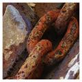
Linksby jjbeguinComment by indigo997: Wow. The member challenge certainly got a lot more feedback than the open challenge, but here's some more for ya...
You obviously have a very nice photo here. Competition was stiff in this challenge.
Composition is great. I am so glad that we have the new cropping rules because this is an excellent example of where a rectangular shot just wouldn't be as strong. The diagonal and placement of the open link are great. Part of what makes this image so strong is how close you got to the subject. Exposure is good. You've made an interesting photo out of a mundane object which is quite an accomplishment.
Minor gripes: The lack of focus in the bottom right corner is distracting - especially because it is one of the few light colored spots and, therefore, draws the eye. Overall, I wonder if the focus couldn't be even sharper. Texture shots don't often work well with post-processing sharpening, but maybe you could have tried something different during shooting. It is helpful if you include the aperture, shutter, and iso in the photo details.
I agree with the frame comments. I'm not sure that such a bright color is the best choice - especially since it further accentuates that lower corner. |
| Photographer found comment helpful. |
| 12/08/2002 10:56:48 PM |
Empty pool autumn bluesby jjbeguinComment by Arachnophilia: fills the frame very nicely. the blue and the earthen tones are nice, but i would have played with the balance of those two in the shot a little. i think it could use a bit more blue. 7 |
| Photographer found comment helpful. |
| 12/08/2002 08:26:13 PM |
Water level on the rise againby jjbeguinComment by lionelm: INITIAL RESPONSE: Nice 'flod' picture with a touch of humor. Very adequate to the challenge. Brown picture with touch of color drawing the eye.
Composition/Background :
Nice comosition (like framing the center of the picture) . Maybe would have been a little better with the toy truck not 'touching' the reflection of the house (maybe). I like the contrast bertween the gree/red and the brown of the rest of the picture. Maybe some 'unused and distracted space' at the bottom. (Maybe try to crop less to remove the bottom part and the 'block( in the reflection at the bottom. Try to crop a 640x427 for this one (maybe)
TECHNICAL : I like the exposure a little bark/somber ....it makes the picture a good 'flood documentary' picture. Good depth of field.
DIGITAL PROCESSING : Not too oversharpened wich I like , the surface of the water has details which I like.
MY OPINION ON THE PHOTO - I like that picture .. I do not find it 'appealing' but I like it. I wish you had done a little better in that challenge.
Lionel
Critique Club
|
| Photographer found comment helpful. |
| 11/20/2002 06:50:00 PM |
1 / 0 , The Binary Paradigmby jjbeguinComment by ambaker: Clever. Good exposure and lighting. Book leads the eye out of the picture a bit, but the shot would have been so much less without it. Not sure what could have been done different. Overall 8 |
| Photographer found comment helpful. |
| 11/18/2002 08:41:00 AM |
|
| Photographer found comment helpful. |
| 11/14/2002 12:54:00 PM |
Home Studiesby jjbeguinComment by FranziskaLang: challenge -- met technical -- very good lighting, i like that you have a limited range of colors but a large range of tones. very nice. composition -- love it. this tells such a nice story, there are so many things to look at, and that connect ... just perfect. the only thing that i don't like (and this is minor) is the pencil. it looks too new and the lines on it are a bit distracting. -- gr8photos. |
| Photographer found comment helpful. |
| 11/11/2002 02:45:00 PM |
Home Studiesby jjbeguinComment by Bitz: Congratulations. You have taken what could have been a boring subject matter and made it into something very appealing to the eye. I love the detail you have included. The photo is well thought out. The only detraction for me is the lighting. 8. bitz |
| Photographer found comment helpful. |
| 11/08/2002 09:00:00 AM |
|
| Photographer found comment helpful. |
Home -
Challenges -
Community -
League -
Photos -
Cameras -
Lenses -
Learn -
Prints! -
Help -
Terms of Use -
Privacy -
Top ^
DPChallenge, and website content and design, Copyright © 2001-2024 Challenging Technologies, LLC.
All digital photo copyrights belong to the photographers and may not be used without permission.
Current Server Time: 04/19/2024 10:55:16 AM EDT.