| Image |
Comment |
| 01/10/2003 05:41:56 AM |
Getting there before dark.by jjbeguinComment by Natasha: Critique Club
Composition-Content
This was a great idea and very original, while fitting the challenge well. I love the almost silhouette here, which adds atmosphere to the shot. I agree with Bod, I think that cropping off the sides of the picture, especially the main part of the car on the left, would be a very effective composition, more abstract, but this would also fit the atmosphere of the car and man in silhouette. Perhaps it would have been good to have kept the bottom of the wheel in and cropped a bit of the sky off.
BACKGROUND
I like the bright background, it contrasts well with the darkness of the foreground. Not sure about the bush on the right, perhaps would have lookeda bit cleaner without it.
TECHNICAL
Focus is sharp here and the lighting is good, with no hot spots. Use of exposure was very good to get this silhoutte while maintaining the bright background.
MY OPINION
Great picture, perhaps a bit more cropping would enhance the composition and make the picture bolder. But, I already like it just as it is! Good Luck in the next challenge! Natasha |
 Photographer found comment helpful. Photographer found comment helpful. |
| 01/04/2003 07:34:08 PM |
|
| Photographer found comment helpful. |
| 01/04/2003 03:42:13 PM |
A good prospectby jjbeguinComment by GeneralE: The bottom 40% doesn't do that much for me, so I'd consider cropping just below his hands to make a nearly square rectangle. I really like to tone range, detail, and composition/expression of the upper part. |
| Photographer found comment helpful. |
| 01/02/2003 08:47:53 AM |
A good prospectby jjbeguinComment by autool: Very good except the item he is sitting on. It is unusual and it makes one try to guess what it is and distracts my eye from the main subject. If it were a more common chair or stool then I would have to shut up. |
| Photographer found comment helpful. |
| 01/01/2003 10:36:27 PM |
A good prospectby jjbeguinComment by wingy: The shadow behind him detracts from the shot. At the bottom of the shot there isn't enough contrast between the background and his legs, which tend to look awkward because of it. The striped thing he's sitting on tends to distract as well. Perhaps cropping just above the knee would have been a good idea. I like the pose, but it's hard to see the details of the face and such. Perhaps a closer shot with a horizontal orientation would have worked well. Overall this is a good shot, but it has some detracting factors to it. 5 |
| Photographer found comment helpful. |
| 01/01/2003 12:57:25 PM |
Getting there before dark.by jjbeguinComment by bod: Heheh excellent shot. Been there, done that. I hope it was just a pose and not a real breakdown.
I like the way you've almost created a silhouette from the car & 'mechanic'. Composition is good, though I would probably have cropped into both sides to make more of a portrait ratio.
Nice work, well done. |
| Photographer found comment helpful. |
| 12/30/2002 07:30:31 PM |
A good prospectby jjbeguinComment by hardwaybets: The shadows in the background are a bit distracting. I would have tightened this image up to show his face and the bottle only. IMHO. Good luck! |
| Photographer found comment helpful. |
| 12/24/2002 07:58:40 PM |
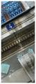
There we areby jjbeguinComment by brandonarbini: Great color, a great crop, and an intersting subject. My only criticism would be to give it a better title. But, I give it a 9! |
| Photographer found comment helpful. |
| 12/23/2002 06:45:24 PM |
There we areby jjbeguinComment by sylandrix: Love the different textures and justposition of the railing and tile's blue clors to the muted earth tones of the building. Nicely composed, with all the lines in the photo all diaganal, and interesecting at right angles. Though you needed the sign to fit the challenge, it seems out of place in the abstract though and the shot (outside of the dpchallenge context) would have been probably nicer without the sign. One of my favorites this week. |
| Photographer found comment helpful. |
| 12/20/2002 01:30:52 PM |
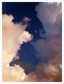
From a distance anyway.by jjbeguinComment by FranziskaLang: challenge met. good title. i love the clouds and how they open up just around the moon. good photo. i think the frame does not work well with this shot ... it's the only white thing and makes the clouds look even more yellow than they are. but that may just be my personal taste. |
| Photographer found comment helpful. |
Home -
Challenges -
Community -
League -
Photos -
Cameras -
Lenses -
Learn -
Prints! -
Help -
Terms of Use -
Privacy -
Top ^
DPChallenge, and website content and design, Copyright © 2001-2024 Challenging Technologies, LLC.
All digital photo copyrights belong to the photographers and may not be used without permission.
Current Server Time: 04/25/2024 06:15:59 AM EDT.