|
|
|
Showing 7481 - 7490 of ~7517 |
| Image |
Comment |
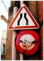
| 01/23/2003 07:04:42 PM | -by jjbeguinComment by Silver Fox: love the color. Look at the rust on the bottom sign. the cracking of the concrete building, the red brick wall, the peeling of the tape on the top sign, the decay. You've shown it all, yet the window to the left of the other building looks newly painted. Well done! |  Photographer found comment helpful. Photographer found comment helpful. |
| 01/23/2003 07:04:05 PM | -by jjbeguinComment by Lustre: Those signs have some real history to them. The agressive cropping really draws attention to them. You're image has a lot of texture and even though I'm not a fan of black and white I suspect this is an image that could look really powerful converted to black and white - There are some articles on using Photoshops "Channel Mixer" to create powerful black and white images. Your border is ok, but not really necessary in my opinion - that might change after converting to b&w though. Focus and exposure are great, except perhaps the building on the left which is a bit overexposed (not much you could do about that). Well done. | | Photographer found comment helpful. |
| 01/23/2003 03:04:16 PM | -by jjbeguinComment by PTLParsons: Obviously I don't understand the road signs. But they look tucked in tightly agains, and almost inside of, two walls. Appears to be a narrow street on the left, but can't really tell, because the photo is cropped so tightly. Would help if there was more photo on each side of the signs. Might could even figure out what they mean. It is a nice clear focus, with good texture. Appears to be someone or something in the window on the left. Could be an interesting photo is there were a little more of it. Good photo just needs better execution. 5 | | Photographer found comment helpful. |
| 01/22/2003 10:45:57 PM | -by jjbeguinComment by joshua: open up the picture more so we can get a better idea of what the signs mean | | Photographer found comment helpful. |
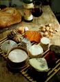
| 01/22/2003 05:13:02 PM | Then bring friends around it. by jjbeguinComment by Patella: This is a great shot. Pure and simple. Three things about it, however, bother me -- one is relatively stupid and can be ignored, another is probably just an overactive imagination (and is actually a compliment), and the third I'm not entirely certain what more you could have done to minimize. First, the cheese on the cheese board/tray look a little too symmetricaly laid out. Like I said, dumb, but there ya go. Second, something about the shot makes me feel like it was literally taken from a magazine. I think it has something to do with the colors. If it was, shame on you. If it wasn't, then congratulations and well done. *grin* Finally, the far background is a little distracting because my eyes are led around the picture and objects seem to keep leading me up to it. I start down with the cheeses, move up to the bread and knife, over to the wine and glass and then over to that empty spot of table and background. Then I start looking around back there to see what I can see. Perhaps a slightly more shallow depth of field to blur that out a bit -- coupled with perhaps a bit more light to darken it down a tad? At any rate, know that I'm not a voter, so you can take the comments for what they're worth. | | Photographer found comment helpful. |
| 01/20/2003 03:27:27 AM | | | Photographer found comment helpful. |
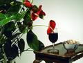
| 01/15/2003 01:36:03 PM | When was the last time you watered the plants, dear? by jjbeguinComment by amonteforte: There are no technical flaws in this execution. The background illumination is very well achieved bringing the viewers sight directly to the subject. At that point, there is a little lack of light right at the union of the flower and the wine (and I am guessing it's wine, since it's too dark) If the glass of wine had it's own transparency with light, the color would nicely match with the red flowers, and I believe it would make this a very special image. Focus is exact. The nuts detail is very good, although the setting looks a little bit too much of a setting, and the perfection of the flowers provides an artificiality feel. As humour goes, I certainly smiled when I saw this. I like this one very much. Congratulations. | | Photographer found comment helpful. |
| 01/14/2003 04:56:38 PM | When was the last time you watered the plants, dear?by jjbeguinComment by Azrifel: Nice idea!
I like the composition, altough I think that a more horizontal angle would have a better effect on the table. Adding the bowl of (?)nuts(?) makes the scene more interesting.
One thing tough, the scene looks underexposed. The wine is shifting to black, the greens are rather dark, the shadows hold little detail and the white wall doesn't look white. Not because the whitebalance isn't right, its more an underexposure thing. However, the exposure of some of the 'nuts' is very good, and some of the flowers are well exposed too. (This monitor is calibrated)
I think that this picture can benefit from two possibilities:
1) More light from beneath to fill in the shadows, plus perhaps another light on the wall.
2) Exposure compensation / exposure bracketing
I might tell you something you already know; The white wall fools the camera's exposure meter, just like snow. It measures something to bright for its reference of 18% grey and chooses an exposure setting that compensates in the other direction. But that leads to underexposure of the scene. I think that this scene could benefit from a 1/3th to 2/3th wider aperture or the equivalent of shutterspeed for that (1 stop wider aperture is equal to a doubling of the shutter open time). So when you don't wan't to mess with the depth of field, you need a longer shutter.
Good sharpness, focus and depth. Colors look very natural (altough dark), so the whitebalance seems ot be good.
Anyway, I like this pic and there is one of the better humour shots, so I gave it a 9. Would be a 10 if it weren't for the things I told above.
(I was still in Critique Club mode, so that's why I got carried away with this reply) | | Photographer found comment helpful. |
| 01/14/2003 08:07:15 AM | When was the last time you watered the plants, dear?by jjbeguinComment by Morgan: Great fun, nice effort. I would have prefered white wine myself.
The image may have been better if there was a way to backfill the shadow areas with a bit more light. Not necessarily another flash, but a reflector would have been good. All the same, my pick of the week. 8 Morgan | | Photographer found comment helpful. |
| 01/13/2003 12:47:47 AM | | | Photographer found comment helpful. |
|
Showing 7481 - 7490 of ~7517 |
Home -
Challenges -
Community -
League -
Photos -
Cameras -
Lenses -
Learn -
Prints! -
Help -
Terms of Use -
Privacy -
Top ^
DPChallenge, and website content and design, Copyright © 2001-2024 Challenging Technologies, LLC.
All digital photo copyrights belong to the photographers and may not be used without permission.
Current Server Time: 04/24/2024 07:16:32 PM EDT.
|