| Image |
Comment |
| 09/27/2005 11:42:27 PM |
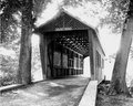
CollinsBridge.jpgby saracatComment by Neil: This is the clear winner of the three. I am mixed about the strong backlighting though. On the one hand, it's different and interesting that way. On the other hand, it seems to dominate. I think some other processing techniques might help to emphasize the bridge, if they are allowed in the contest. For one thing, you could try an "old time" treatment, allowing the edges to vignette with "age".
Anyway, it's hard to see a solution without playing with it, and it's actually nice as is! So when you are satisfied with this one, it's ready for entry! |
 Photographer found comment helpful. Photographer found comment helpful. |
| 09/27/2005 03:08:29 PM |
CollinsBridge.jpgby saracatComment by glad2badad: I'm still thinking about whether I like it or not...
The composition is good, I like the camera level at which it was taken. There are natural leading lines here with the bridge and road - takes me to ???. Ahh...the light. I SEE the light! ;^)
This works well in B/W - probably better than color. Sepia might be interesting also. Did I mention the image is a bit "hot", maybe a bit overexposed? He-he.
Ok, ok...I like it. The extreme exposure in this case works very well. Job well done.
Smile and keep having fun!!! |
| Photographer found comment helpful. |
| 09/22/2005 10:58:32 AM |
Flying Highby saracatComment by davmct: i'd probably give this shot a 5 or a 6. I like the composition, using the clouds to nicely frame the shot. the colours in the balloon are quite nice and vibrant. only wish is that you had more zoom! blowing that balloon up by 5 times would have boosted the shot up to an 8. (although the scale does give it some perspective on how far it is, but i'm always a sucker for in-your-face kind of detail).
|
| Photographer found comment helpful. |
| 09/22/2005 10:56:11 AM |
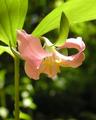
Catesby's Trilliumby saracatComment by davmct: I'd probably give this photo a 3, perhaps a 4 if I were in a good mood. My first impression is that alot more effort could have gone into the preparation of the shot to ensure that the light wasn't so harsh (perhaps using a light reflector to give it some shade?), as there is a LOT of burning along the flower petals, which is the primary point of focus, and the burning, IMO, isn't providing any artistic flair. Also, the colour seems a bit muted or muddy, and the yellow stamens seems to blend in with the pink petals, instead of being more vibrant and popping out. Finally, I think the petals could be a bit sharper in focus, to bring out some of their texture more. |
| Photographer found comment helpful. |
| 09/22/2005 10:34:04 AM |
Catesby's Trilliumby saracatComment by jpeters: I would probably give this a 5. It is a pretty flower and the depth of field is nice, but it needs more contrast and adjusted lighting/exposure. The highlights on right petal are a little too much for me and the underside is in shadow. I would try using a white card or piece of paper to bounce some light up underneath and even out the light in the flower. Then use curves in Photoshop (if you have it) to adjust contrast by making an S-curve. |
| Photographer found comment helpful. |
| 07/11/2005 08:31:57 AM |
|
| Photographer found comment helpful. |
| 07/09/2005 09:53:52 PM |
|
| Photographer found comment helpful. |
| 07/09/2005 09:25:59 PM |
Flamencoby saracatComment by amber: A really nice composition and great colours. The repeating spiral pattern of the petals makes it for me. |
| Photographer found comment helpful. |
| 07/07/2005 04:50:26 PM |
|
| Photographer found comment helpful. |
| 07/07/2005 09:42:21 AM |
|
Home -
Challenges -
Community -
League -
Photos -
Cameras -
Lenses -
Learn -
Prints! -
Help -
Terms of Use -
Privacy -
Top ^
DPChallenge, and website content and design, Copyright © 2001-2024 Challenging Technologies, LLC.
All digital photo copyrights belong to the photographers and may not be used without permission.
Current Server Time: 04/19/2024 07:07:21 AM EDT.